UI Design, BRANDING
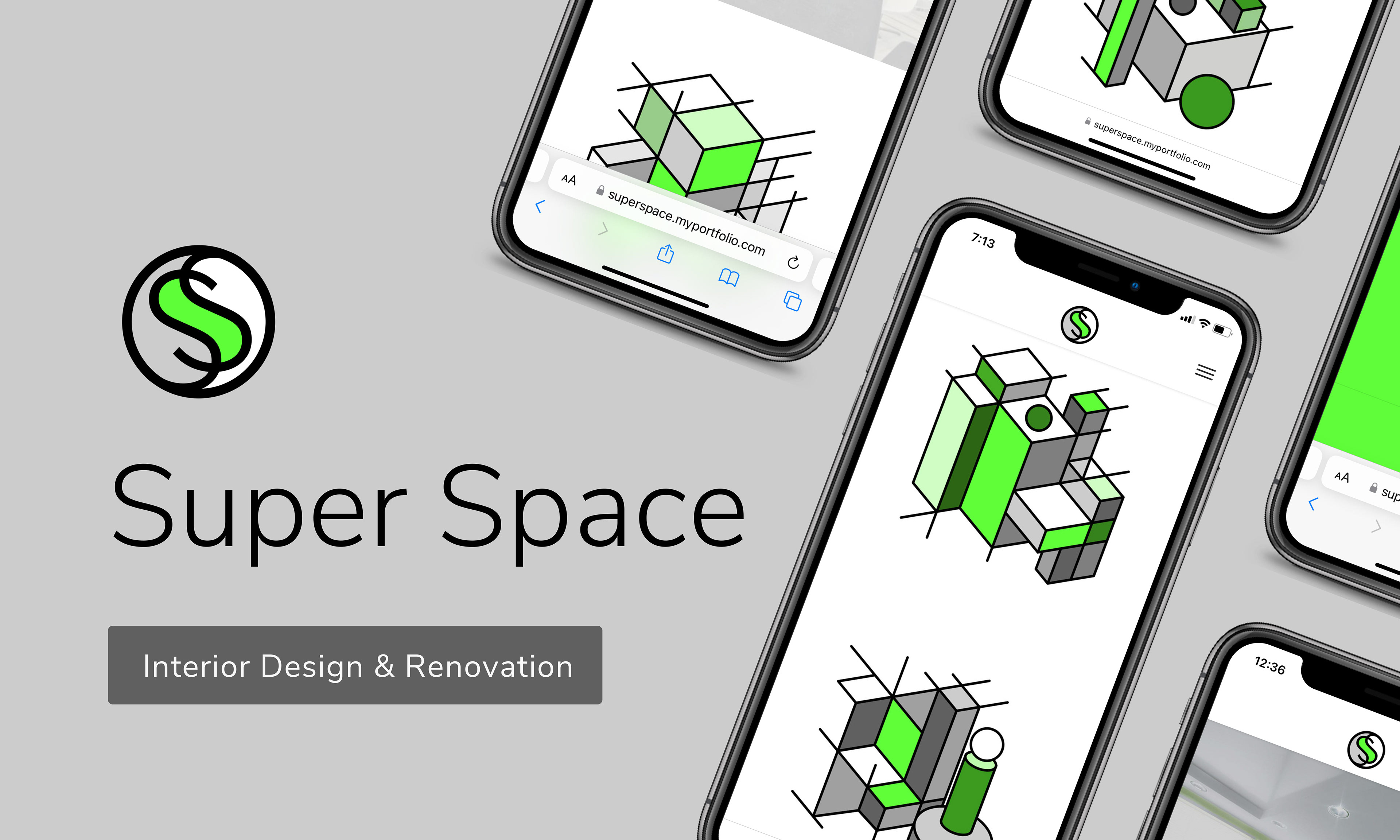
Cover - Project Overview

Project Overview
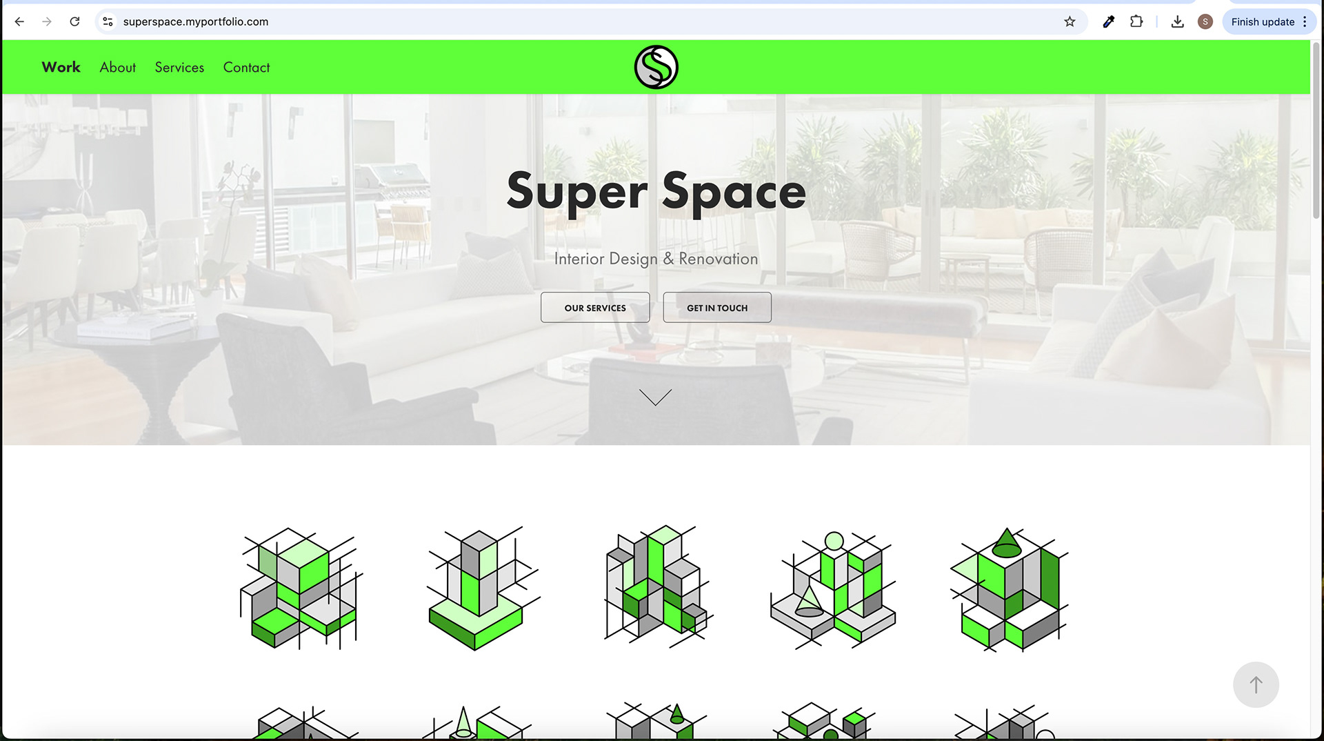
Home - Splash Screen with Down Arrow

Services Screen - Button Hover Effect
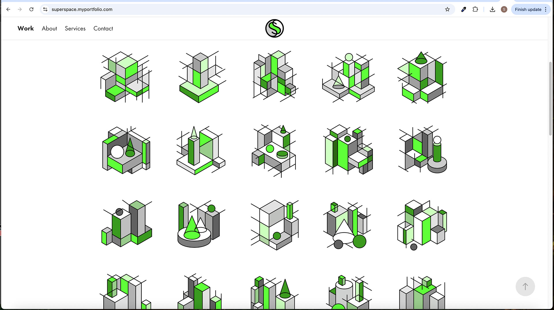
Home Screen Scroll Down

Home - Splash Screen with Down Arrow - Image Hover Effect
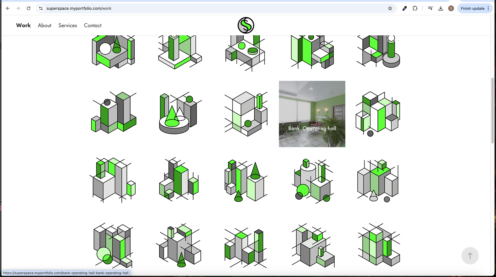
Home Screen Scroll Down - Image Hover Effect
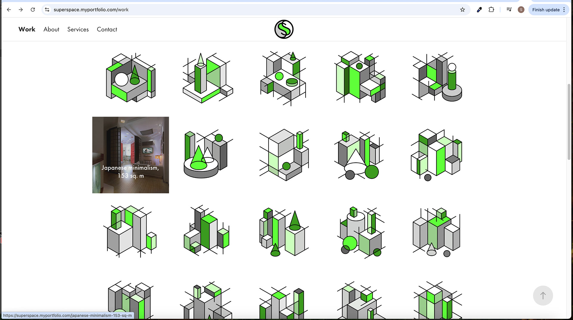
Home Screen Scroll Down - Image Hover Effect
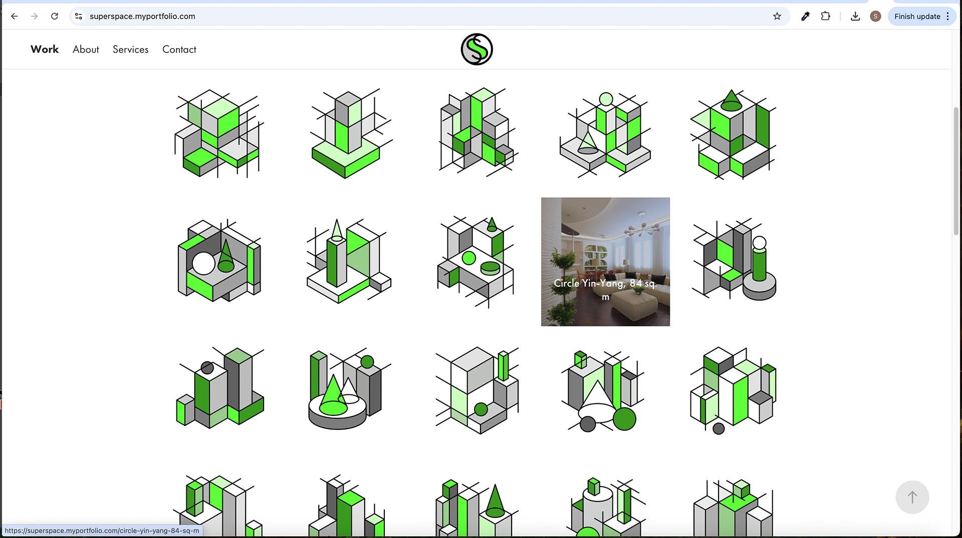
Home Screen Scroll Down - Image Hover Effect
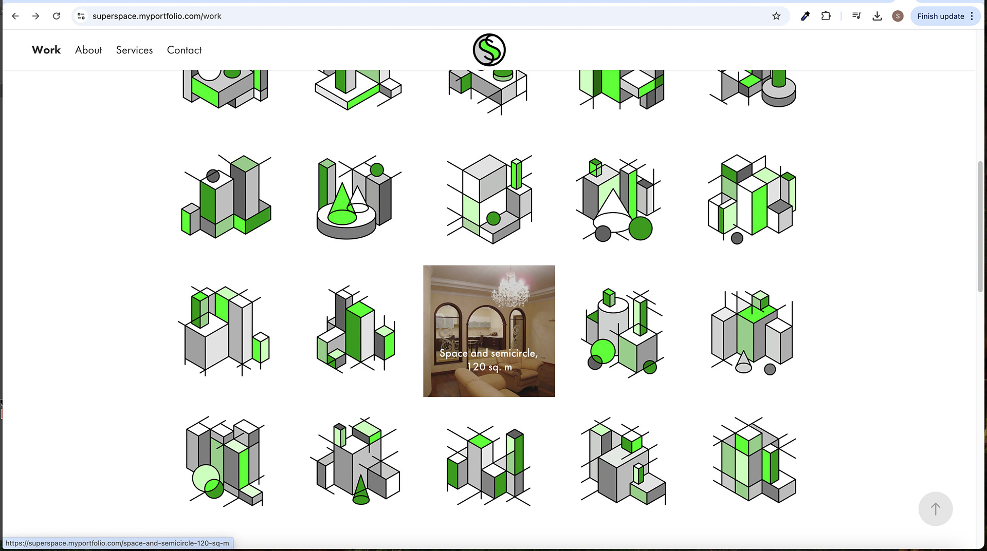
Home Screen Scroll Down - Image Hover Effect
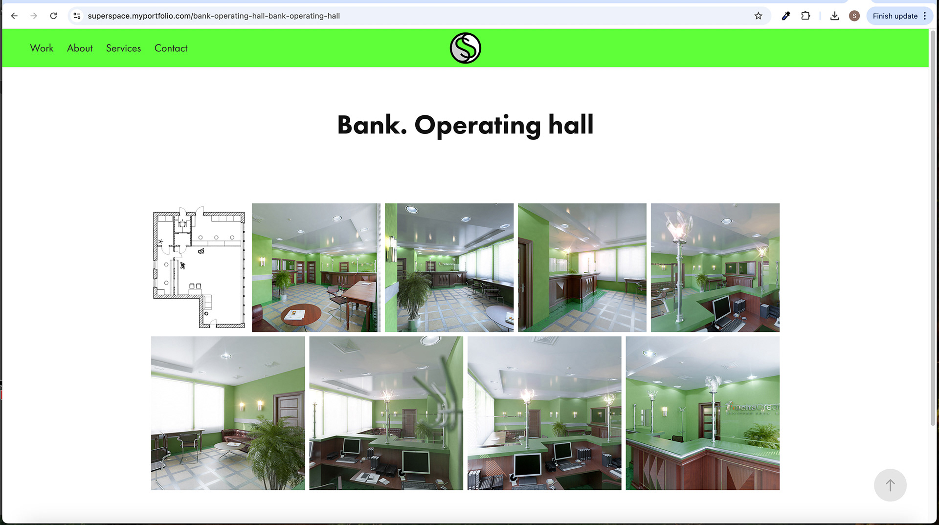
Subpage Screen
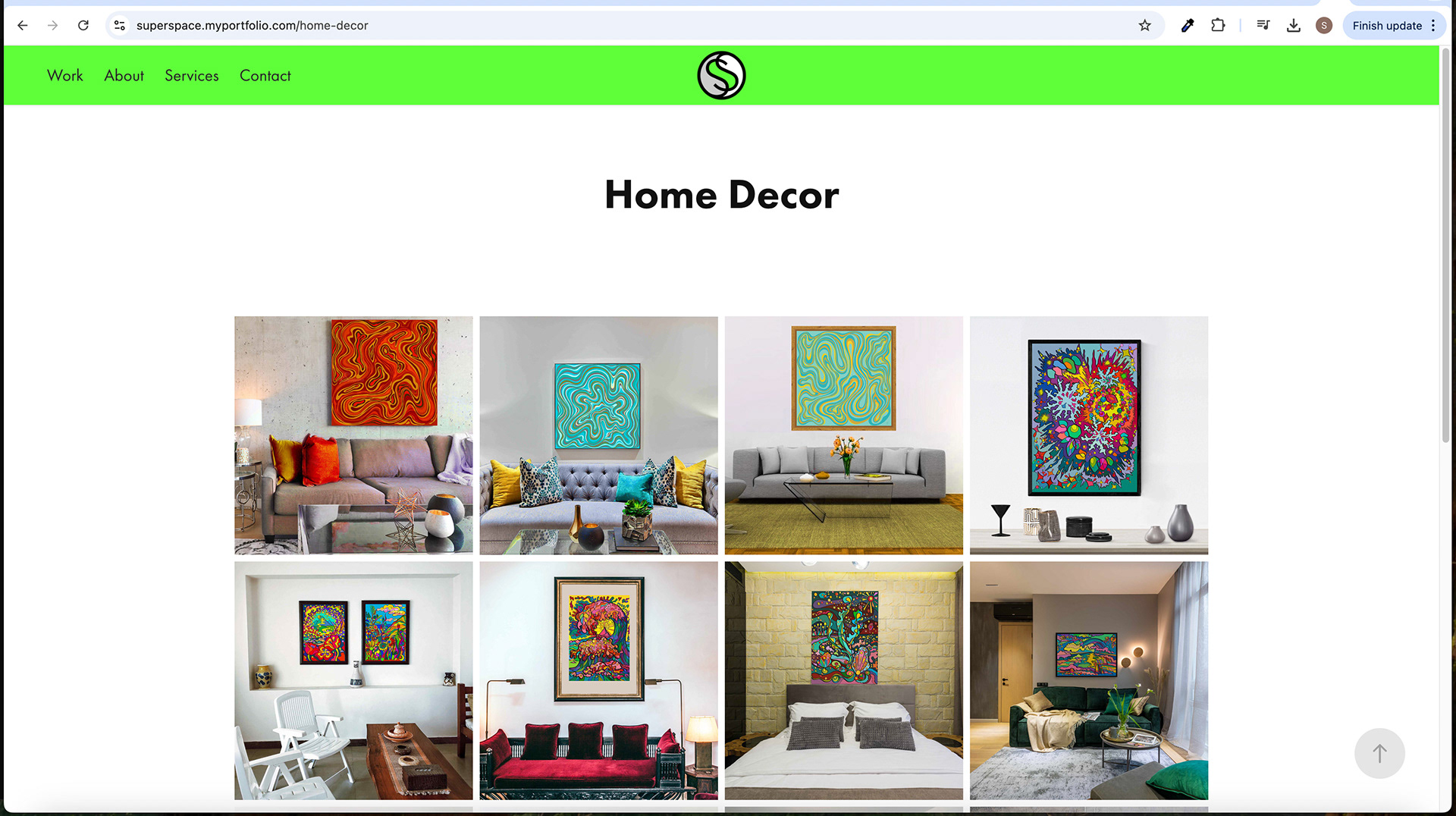
Subpage Screen
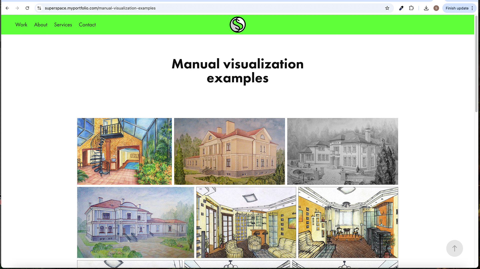
Subpage Screen
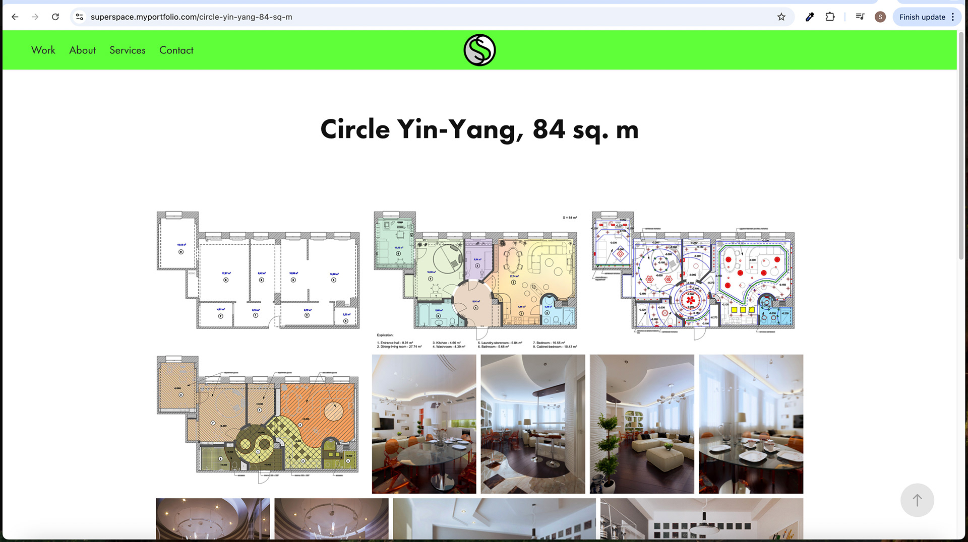
Subpage Screens

Subpage Screen
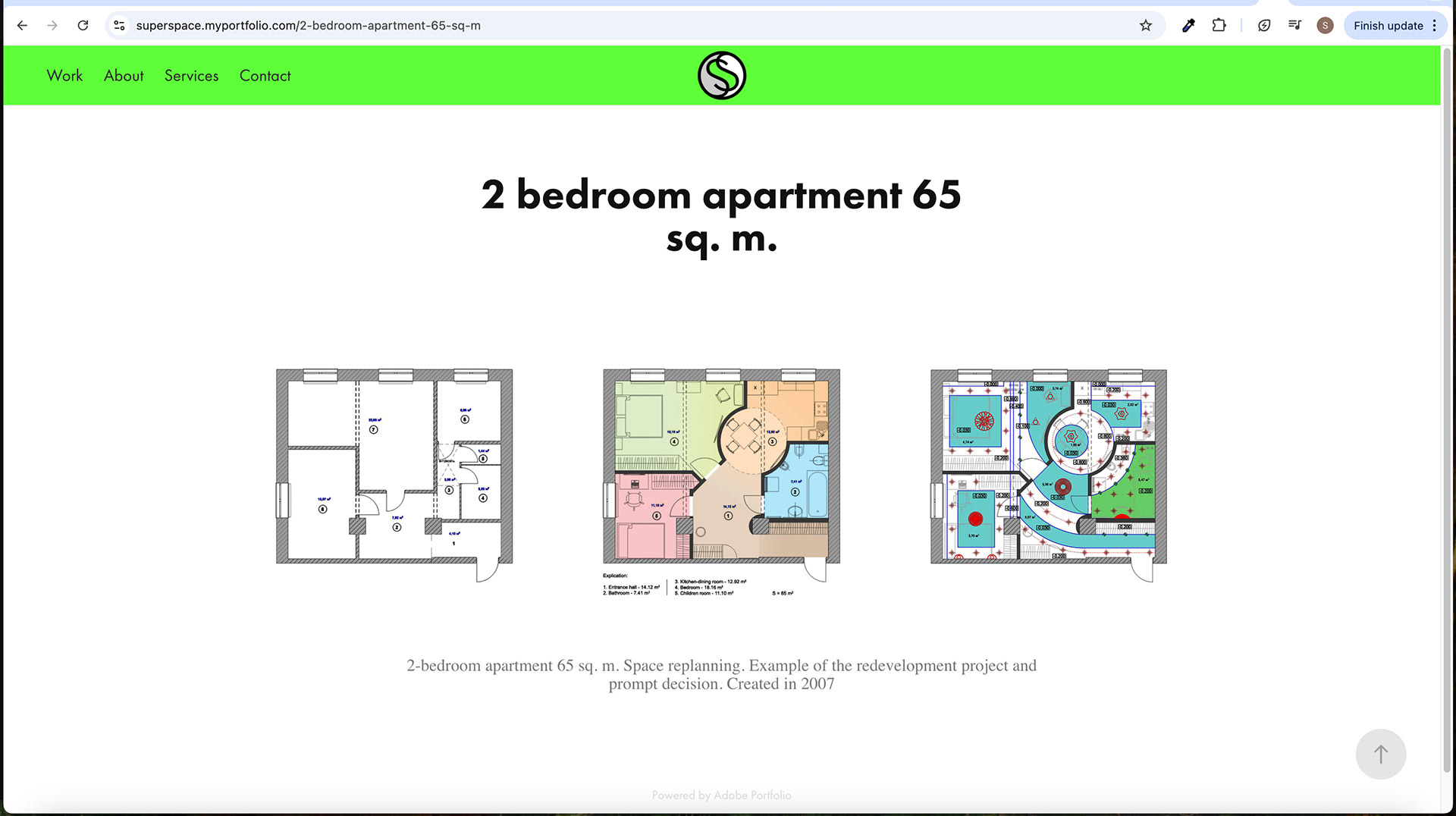
Subpage Screen

Subpage Screen
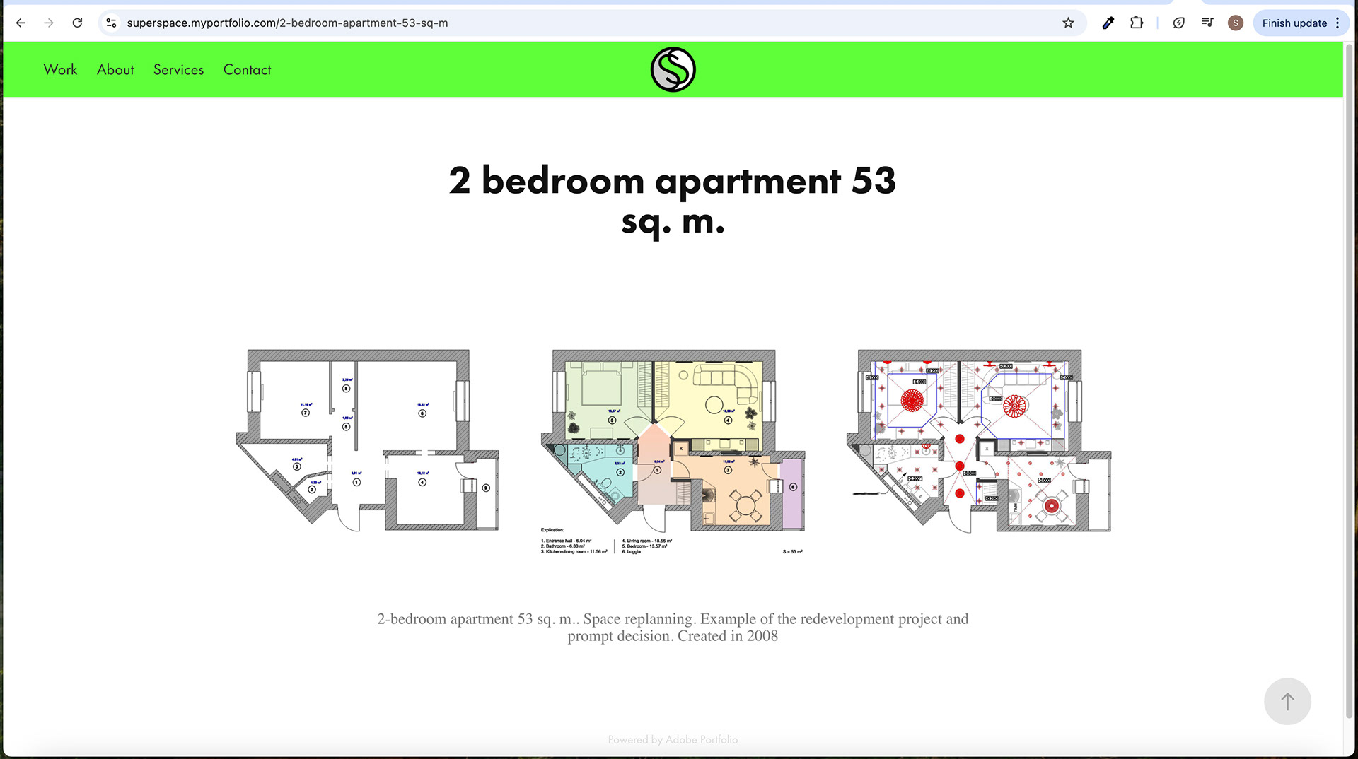
Subpage Screen

Subpage Screen
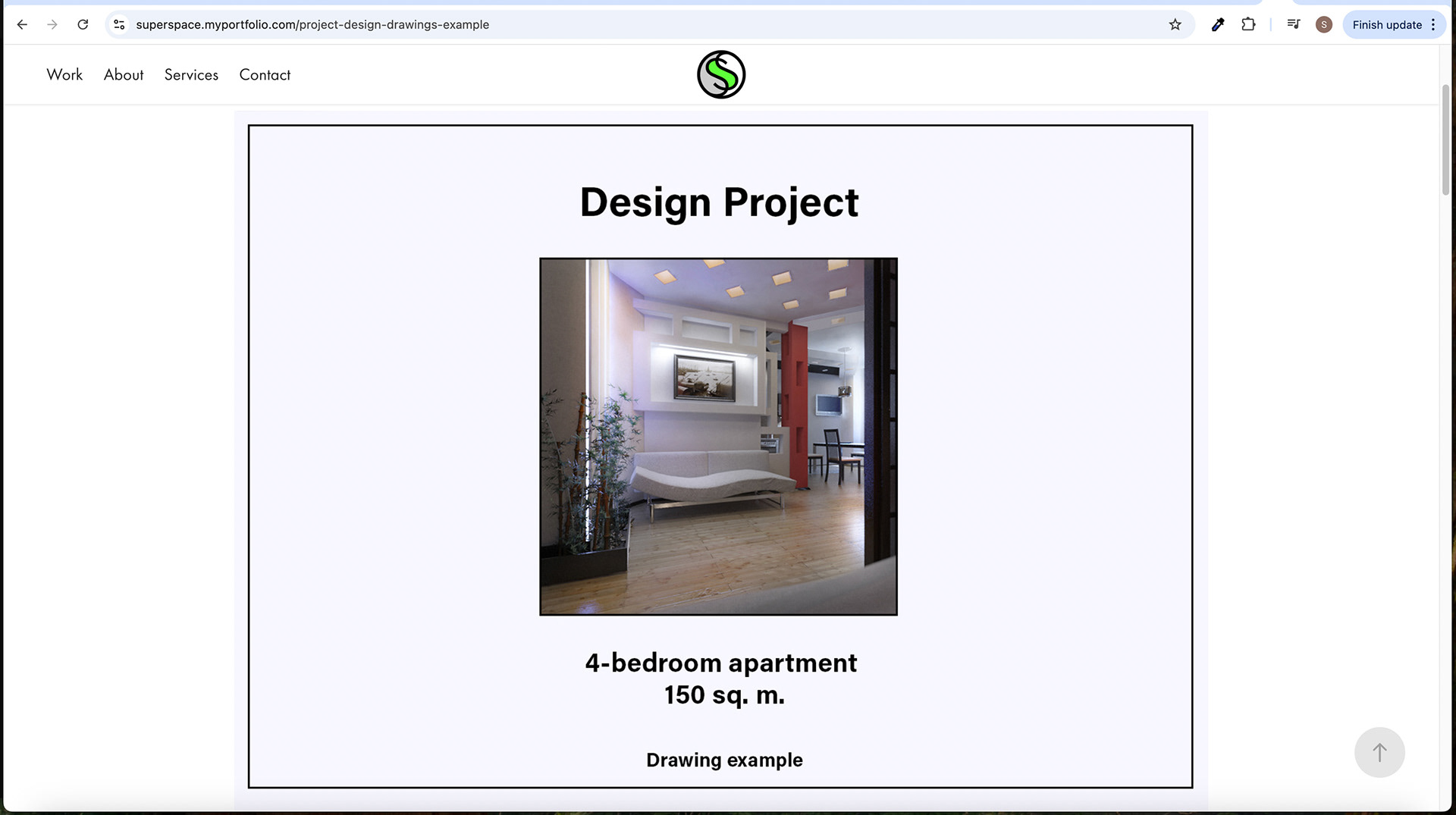
Subpage Screen
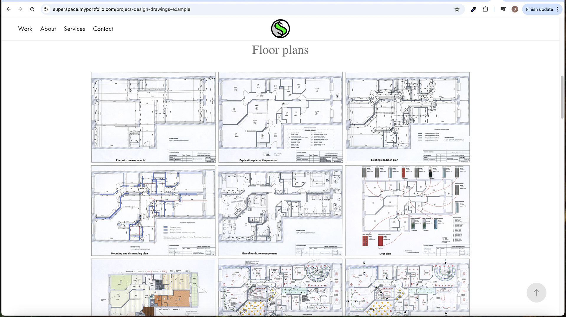
Subpage Screen - Scrolling

Subpage Screen
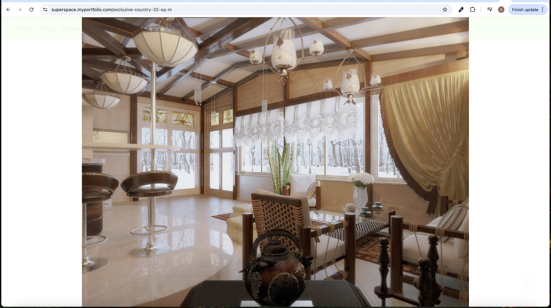
Subpage Screen - Lightbox
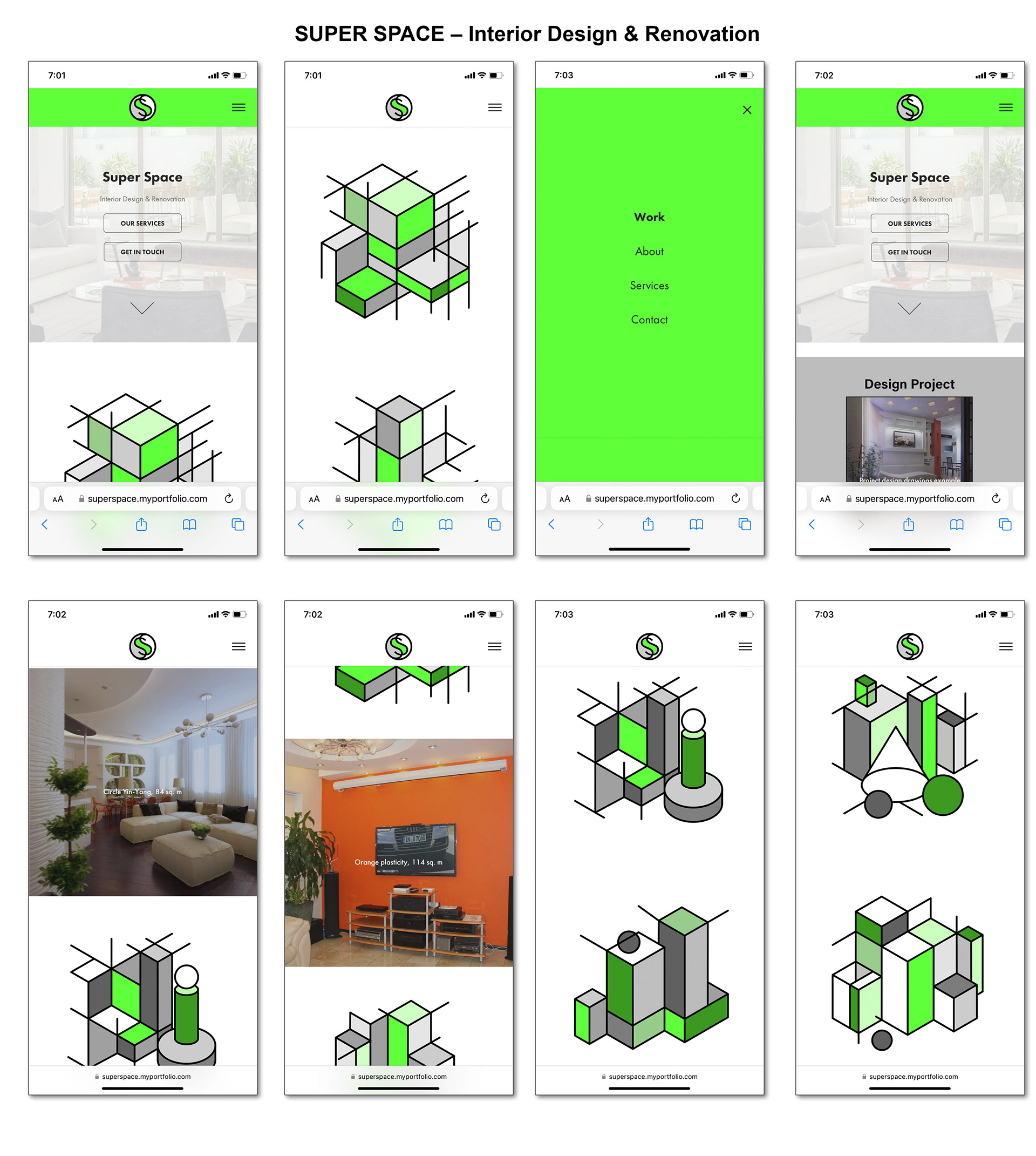
Mobile Screens
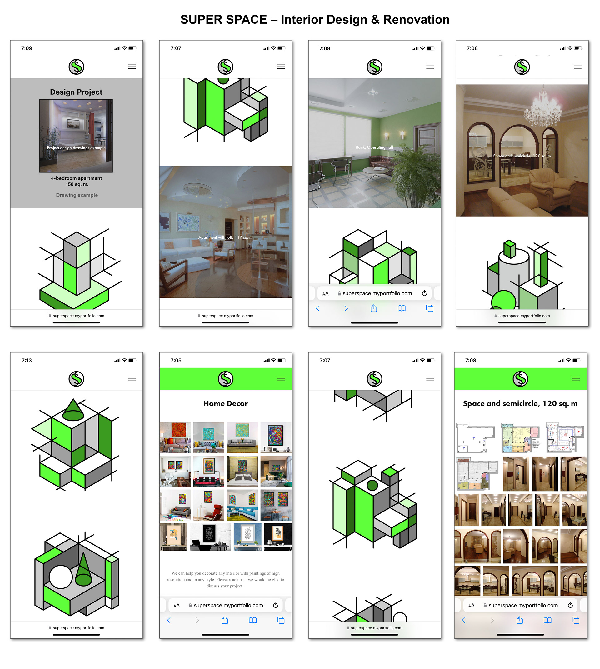
Mobile Screens
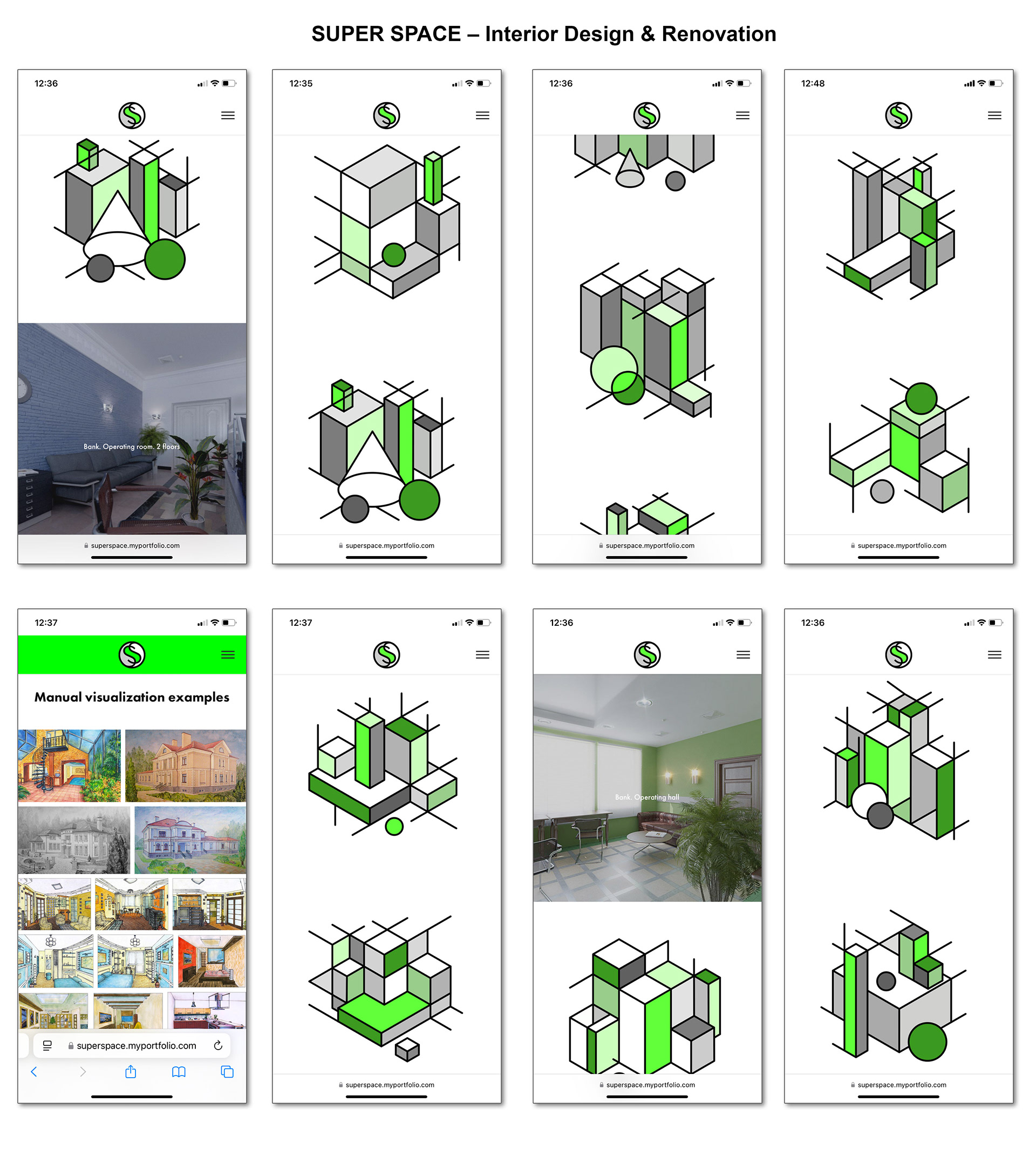
Mobile Screens
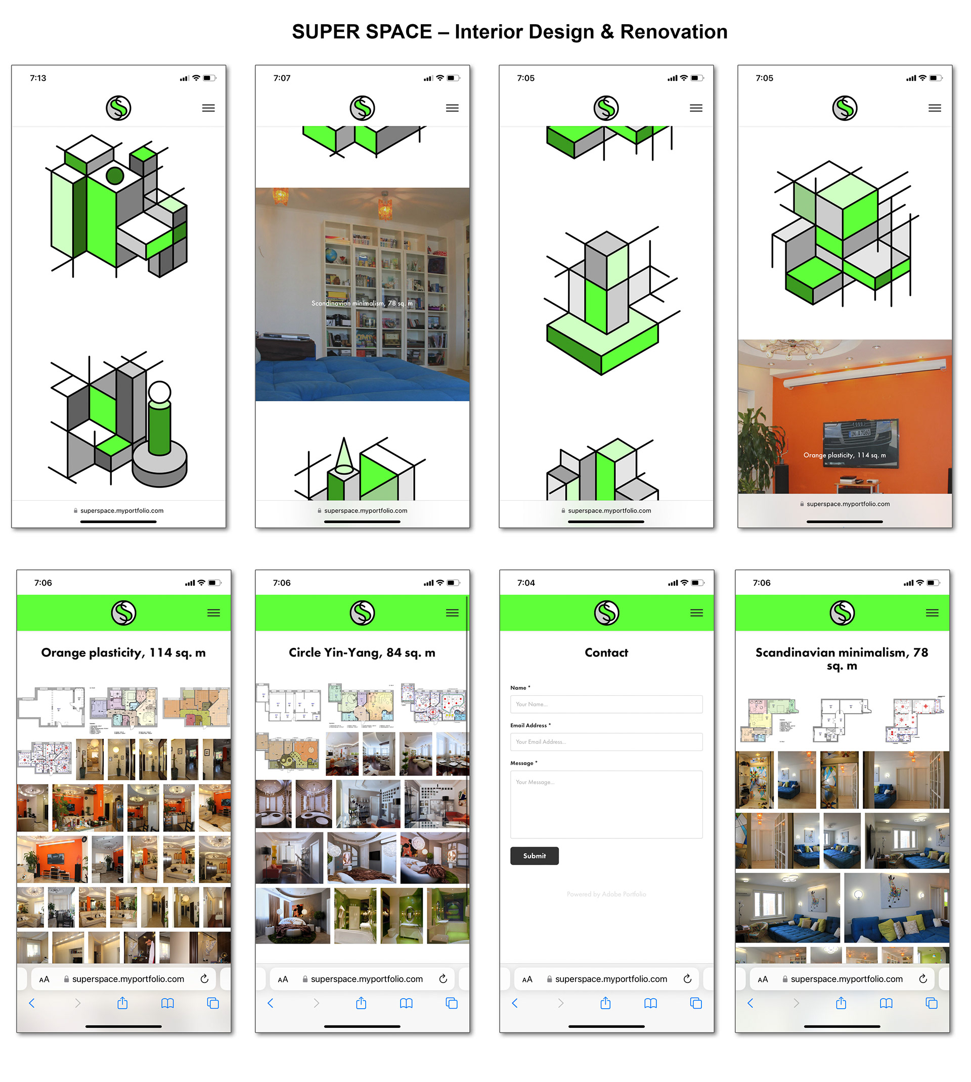
Mobile Screens

Style Guide
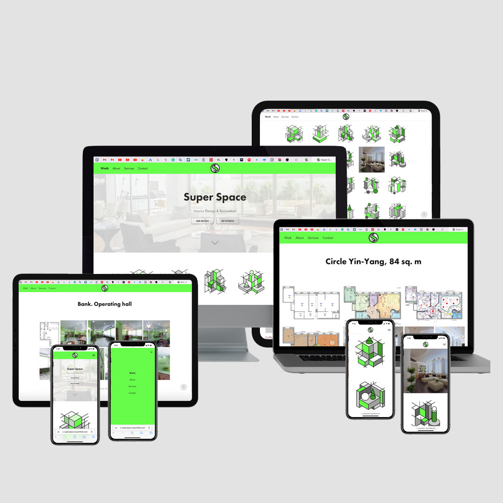
Project Overview - Devices
Live Website
Super Space – Interior Design & Renovation
The stylish design of "Super Space" makes it easy for interior design & renovation services to stand out; the conceptual 3D visuals emphasize the flavour of architecture mindset and creative thinking. A minimalistic colour scheme makes it easy to perceive the content. Bright green colours and grey, black and white tints look stylish and knocked out.
UX Design
Super Space – Interior Design & Renovation
Role and Project Information
Branding, graphic and UX/ UI Design. Web design and development: Adobe Portfolio.
Role: UX/UI Designer. Tools: Figma, Photoshop, Illustrator. Timeline: 1,5 month (2021).
Collaboration: I was a solo UX/UI designer for a small business. I was responsible for branding and determining the overall design direction of the project, creativity and implementation.
Introduction
Overview of the Case Study: This Case Study focuses on the design and user experience (UX/UI) considerations for the Super Space Portfolio Website. The website showcases interior design projects, encompassing residential and business interiors such as apartments, cottages, offices, banks, and more. The goal is to create a visually appealing and user-friendly platform that effectively presents the portfolio's interior design projects, project drawings, redevelopment, and visualizations of painting objects for interior decoration.
Brief Description of Super Space Portfolio Website: The Super Space Portfolio Website is designed to provide an immersive experience for users, allowing them to explore and appreciate the expertise and creativity of the Super Space brand. The website's structure features a prominent navigation menu on the left, offering easy access to key sections such as Work, About, Art, Services, and Contact. Placed at the center of the navigation menu is the symmetrical and balanced logo of Super Space, representing the brand's identity and serving as a visual focal point.
The masthead area of the home page showcases an interior-themed image, setting the tone for the website. A light grey colour overlay covers the image, providing a subtle backdrop for the content. The masthead area also includes the website's heading, slogan, and buttons for quick access to key sections. Notably, the navigation menu remains fixed at the top, ensuring convenient navigation for users as they explore the website.
The interior design gallery is a central website component, presenting a collection of projects through light white squares with axonometric compositions. These compositions symbolize the interior design, architectural projects, and creative thinking behind each endeavour. The brand colours, including vibrant green, white, black, and shades of grey, form grids that tie together the overall visual aesthetic. When users hover over a gallery project image, it transforms into an interior image overlayed with a 30% black colour, allowing for better readability of the project's heading.
Furthermore, the second-level pages dive deeper into each design gallery project, providing a photo gallery and short descriptions. Additionally, the "About" page welcomes visitors with a description and links to specific examples of home décor and space renovation projects. The "Services" page outlines the range of services offered by Super Space and includes links to examples of project design drawings, computer visualizations, and manual visualizations. Lastly, the "Contact" page features a contact form for users to contact the Super Space team.
The Super Space Portfolio Website aims to captivate users with its visually engaging design, intuitive navigation, and seamless user experience, ultimately establishing a solid online presence for the brand and showcasing its impressive interior design expertise.
Project Goals and Objectives
Explanation of Objectives for the Super Space Portfolio Website: The primary objective of the Super Space Portfolio Website is to create a compelling online platform that effectively showcases the interior design projects of the Super Space brand. The website aims to provide visitors with an immersive and visually appealing experience. It allows them to explore various residential and business interior projects, project drawings, redevelopment, and visualizations of painting objects for interior decoration.
Clear Definition of Project Goals:
1. Showcasing Portfolio: The website should serve as a comprehensive portfolio for Super Space, presenting various interior design projects. The goal is to highlight the expertise, creativity, and attention to detail the brand brings to each project.
2. Visual Appeal: The website's design should be visually captivating and aesthetically pleasing. It should reflect the high-quality design standards upheld by Super Space and create a strong visual impact on visitors.
3. User-Friendly Navigation: The navigation menu should be intuitive and user-friendly, allowing visitors to easily explore different website sections, including the gallery, about page, services, and contact information. The menu should remain easily accessible as users scroll through the content.
4. Engaging Interactions: The website should incorporate interactive elements to enhance user engagement and provide a memorable experience. This includes the scrolling interaction with the navigation menu colour change, the hover-in state for gallery project images, and the arrow for navigating the masthead area.
5. Information Accessibility: Each design gallery project page should provide clear and concise information about the project, including relevant images and a short description. Visitors should be able to access project details and navigate between different tasks quickly.
6. Brand Consistency: The website should consistently reflect the brand identity of Super Space. This includes incorporating the brand colours, using the symmetrical and balanced logo in a prominent position, and maintaining a cohesive visual style throughout the website.
7. Conversion and Contact: The website should encourage visitors to take action, whether it's reaching out for inquiries, exploring the services offered, or accessing additional project examples. The contact page should include a contact form facilitating communication between Super Space and potential clients.
By achieving these goals, the Super Space Portfolio Website aims to establish a solid online presence for the brand, attract potential clients, and showcase the exceptional interior design capabilities of Super Space.
Target Audience
Identification of the Target Audience for the Website: The Super Space Portfolio Website is designed to cater to a specific target audience interested in interior design and seeking professional services for their residential or business spaces. The primary target audience can be identified as follows:
1. Homeowners: Individuals who are looking to enhance the interior design of their homes, including apartments, cottages, and other residential spaces. They may have specific design preferences and seek inspiration and professional expertise to transform their living rooms.
2. Business Owners: Professionals who own businesses, including offices, banks, and commercial establishments, are interested in creating aesthetically pleasing and functional interior spaces. They may seek interior design solutions that align with their brand image and enhance the overall customer experience.
3. Potential Clients: Individuals actively searching for an interior design service provider to handle their upcoming projects. They may evaluate different design firms and require a visually appealing and informative website to make an informed decision.
Description of Their Needs and Expectations: The target audience for the Super Space Portfolio Website has specific needs and expectations when it comes to interior design. Some common characteristics and expectations include:
1. Design Inspiration: The audience seeks design inspiration and creative ideas for their interior spaces. They expect the website to showcase various interior design projects demonstrating innovative concepts and unique solutions.
2. Professional Expertise: The target audience expects the website to convey the professionalism and expertise of Super Space. They seek assurance that the brand has a solid track record in delivering high-quality interior design services and can bring their vision to life.
3. Visual Presentation: Visual appeal is crucial for the target audience. They expect the website to present interior design projects visually attractively, with high-quality images and attention to detail. The website should provide a visually immersive experience that engages and captivates visitors.
4. Easy Navigation: The audience expects the website to have a user-friendly and intuitive navigation system. They want to be able to browse through different projects, access detailed information, and navigate between sections seamlessly. Clear and concise menu labels and well-organized content are essential.
5. Contact and Communication: Potential clients expect the website to provide easy and accessible ways to contact Super Space. They may have inquiries or project-specific questions, and they anticipate a responsive and prompt communication process. The contact page should provide a contact form and other relevant contact information.
By understanding the needs and expectations of the target audience, the Super Space Portfolio Website can be designed and optimized to meet their requirements, resulting in a positive user experience and increased engagement with the brand.
Research and Analysis
Conducted Research on Interior Design Industry Trends and User Preferences: To ensure the Super Space Portfolio Website aligns with industry trends and user preferences, thorough research was conducted. This research involved studying the latest trends in interior design, including emerging styles, colour schemes, and spatial arrangements. It also involved examining user preferences through surveys, online forums, and social media platforms to gain insights into what aspects of interior design resonate with the target audience. This research allowed for informed design decisions that would appeal to users and stay relevant in the ever-evolving interior design landscape.
Analysis of Competitor Websites and Their Strengths and Weaknesses: A study of competitor websites was conducted to understand the competitive landscape. This analysis involved reviewing the websites of other interior design firms and similar platforms showcasing interior design projects. By examining competitor websites, their design choices, and user experience, valuable insights were gained regarding industry standards, successful design practices, and potential areas for improvement. Strengths of competitor websites were identified to identify opportunities for differentiation, while weaknesses were analyzed to avoid similar pitfalls and enhance the Super Space Portfolio Website's offering.
Gathering User Feedback and Conducting Usability Testing: User feedback played a crucial role in shaping the design and functionality of the Super Space Portfolio Website. Usability testing sessions were conducted with individuals who represented the target audience. Participants were given tasks on the website, and their interactions were observed and recorded. This testing provided valuable insights into the user experience, identifying any usability issues, navigation challenges, or confusing elements that needed improvement. User feedback was collected through surveys and interviews to understand their preferences, expectations, and pain points. This iterative feedback loop allowed for continuous refinement of the website's design and ensured that it met the needs and expectations of the target audience.
By conducting comprehensive research on industry trends, analyzing competitor websites, and gathering user feedback through usability testing and surveys, the design and user experience of the Super Space Portfolio Website were informed by data-driven insights. This approach ensured that the website catered to the target audience's preferences stood out among competitors, and provided visitors a seamless and engaging experience.
Information Architecture
Description of the Website Structure and Organization: The Super Space Portfolio Website follows a well-organized and intuitive information architecture that enables users to navigate and explore the content seamlessly. The website structure is designed to present various sections and project galleries in a logical and easily accessible manner. The website's main areas include Work, About, Art, Services, and Contact.
The Work section comprises the interior design gallery, showcasing residential and business projects. A thumbnail image and a short description represent each project. Clicking on a project opens the second-level page, providing a detailed photo gallery and additional information about the project.
The About section provides a welcoming description of Super Space and includes links to specific examples of home décor and space renovation projects. This section aims to establish a connection with the audience and provide insights into the brand's values and expertise.
The Art section highlights the artistic aspect of the portfolio, featuring visualization and painting objects used for interior decoration. This section showcases the creativity and creative vision of Super Space, adding a unique dimension to the website.
The Services section offers a comprehensive overview of the range of services provided by Super Space. It includes descriptive text that outlines the different services and their benefits. Additionally, the section includes links to examples of project design drawings, computer visualizations, and manual visualizations, allowing users to get a glimpse of the quality and variety of services offered.
The Contact section provides a dedicated page with a contact form, enabling users to contact Super Space for inquiries, consultations, or project discussions. Contact information such as phone numbers, email addresses, and office locations can also be included for convenience.
Explanation of the Navigation Menu and Its Placement: The navigation menu in the Super Space Portfolio Website plays a vital role in providing easy access to different website sections. It is strategically placed on the left side of the page, offering a vertical menu structure. This placement allows for intuitive navigation, as users are accustomed to finding navigation menus on either the left or top side of a website.
The vertical navigation menu provides a clear visual hierarchy and presents the main sections of the website in a concise and organized manner. Users can quickly identify and click on the desired area to explore the related content. The menu remains fixed at the top of the page as users scroll, ensuring continuous accessibility and easy navigation throughout their browsing experience.
Justification for the Placement of the Logo in the Middle of the Navigation Menu: The placement of the logo in the middle of the navigation menu is a deliberate design choice that carries several benefits. By positioning the logo centrally, it becomes a prominent visual element that draws attention and reinforces the brand identity of Super Space. Placing the logo within the navigation menu also helps to establish a clear visual association between the brand and the website's navigation, creating a cohesive and integrated design.
Additionally, placing the logo in the middle of the navigation menu ensures its visibility and legibility regardless of the user's screen size or device. This consistency reinforces brand recognition and helps users quickly identify the Super Space logo through different website sections.
Overall, the placement of the logo in the middle of the navigation menu in the Super Space Portfolio Website serves both functional and branding purposes, enhancing the overall user experience and reinforcing the brand identity of Super Space.
Visual Design
• Color Scheme:
• Brand colors: #67fd4a (vibrant green), #000000 (black), #cccccc (grey), #ffffff (light grey)
• Vibrant green represents energy, creativity, and nature connection
• Black is used for outlines and text for contrast and legibility
• Grey colours provide a balanced and harmonious backdrop
• Logo Design:
• Features interconnected "S" shapes, representing harmony and visual appeal
• Embodies elegance, creativity, and attention to detail
• Consistent use throughout the website reinforces brand identity
• Navigation Menu:
• Utilizes vibrant green color (#67fd4a) for a visually striking impression
• The colour changes to white (#ffffff) when scrolling, ensuring visibility and accessibility
• Masthead Area:
• Thematic interior image of a spacious living room with sofas and framed doors
• A light grey overlay enhances legibility and focuses on the content
• Prominent "Super Space" heading using FuturaPT font reinforces brand identity
• The "Interior Design & Renovation" slogan communicates core services
• "Our Services" and "Get In Touch" buttons encourage user exploration
• Arrow allows scrolling up and down the narrow picture for easy navigation
Overall, the visual design elements, including the colour scheme, logo placement, vibrant green navigation menu, and masthead area, create a visually appealing and engaging experience for users.
Interaction Design
• Scrolling Interaction and Color Change in the Navigation Menu:
• When users scroll down the page, the navigation menu transitions from vibrant green (#67fd4a) to white (#ffffff).
• This interaction adds visual interest and ensures the menu remains visible and accessible during scrolling.
• The colour change enhances the user experience and clearly indicates the user's position on the page.
• Scrollable Arrow for Navigating the Narrow Picture in the Masthead Area:
• A scrollable arrow is placed at the bottom of the masthead area to allow users to scroll up and down the narrow picture.
• This interactive element provides an intuitive way for users to explore the content within the masthead area.
• Users can easily navigate through the image without traditional scrolling methods.
• Hover-In State for Gallery Project Images and Its Purpose:
• When users hover over a projected image in the interior design gallery, it transitions to an interior overlay with a 30% black colour.
• The hover-in state provides additional information and context about the project.
• The overlay enhances the legibility of the project's heading, displaying the project's name and square meterage.
• This interaction lets users preview and glimpse the interior design projects before clicking for more details.
The interaction design elements, such as the scrolling colour change, scrollable arrow, and hover-in state, enhance the user experience by adding interactivity, guiding navigation, and engagingly providing additional information.
Typography
• Fonts Used:
• FuturaPT: FuturaPT is one of the fonts utilized in the Super Space Portfolio Website. It is a geometric sans-serif typeface known for its clean and modern appearance. The font's straight lines, simple shapes, and distinct letterforms contribute to a sleek and contemporary design aesthetic. FuturaPT conveys a sense of professionalism and sophistication, aligning well with the brand's focus on interior design and renovation.
• AdobeFonts: AdobeFonts is another font used in the website's design. This font provides a wide range of typeface options, allowing for versatility and customization. It offers various styles and weights, allowing designers to choose fonts that suit different sections and content types. By utilizing AdobeFonts, the website can maintain a cohesive visual identity while providing flexibility in typography choices for various elements.
• Relevance to the Overall Design Concept: The choice of FuturaPT and AdobeFonts is intentional and contributes to the overall design concept of the Super Space Portfolio Website.
• FuturaPT: The clean and modern aesthetic of FuturaPT aligns with the contemporary and stylish nature of the interior design industry. It conveys a sense of professionalism and showcases the brand's attention to detail. The font's geometric letterforms create a sense of order and harmony, reflecting the precision and thoughtful approach that Super Space brings to its design projects.
• AdobeFonts: AdobeFonts allows for flexibility and customization within the typography. It gives the website distinct typography choices for different sections, emphasizing important information and providing visual variety. This versatility helps to create an engaging and visually appealing user experience throughout the website.
Overall, the combination of FuturaPT and AdobeFonts enhances the Super Space Portfolio Website's visual appeal, professionalism, and contemporary feel. The typography choices contribute to the overall design concept and help communicate the brand's values and expertise in interior design and renovation.
Second-level Pages
• Design Gallery Project Pages:
• Each design gallery project page showcases a specific interior design project.
• The page includes a photo gallery displaying project images from different angles and perspectives.
• A short description accompanies the gallery, providing key details and highlights of the project.
• Users can click on individual photos to view them in a larger format or enter a lightbox mode for a more immersive experience.
• Photo Gallery and Lightbox Mode View:
• The photo gallery on the design gallery project pages allows users to browse a collection of images related to a specific project.
• Users can navigate the images using intuitive controls, such as arrows or swipe gestures on touch-enabled devices.
• When users click on a photo, it opens in a lightbox mode, which presents the image larger and removes distractions from the surrounding page.
• In the lightbox mode, users can typically view additional information about the photo, such as captions or descriptions, and have options to zoom in or out for more detailed inspection.
• "About" Page:
• The "About" page provides information about Super Space and its background.
• It typically includes a welcoming description introducing the company and its values.
• The page may also feature relevant images or visuals representing the brand's identity.
• Additionally, the "About" page often includes buttons or links to related content, such as examples of home décor and space renovation projects.
• "Services" Page:
• The "Services" page outlines the various services Super Space offers.
• It provides a descriptive text that explains each service in detail.
• The page may include visual elements, such as icons or images, to enhance the understanding of the services.
• Additionally, there are typically buttons or links to examples of project design drawings, computer visualizations, and manual visualizations to showcase the quality and range of Super Space's work.
• "Contact" Page:
• The "Contact" page contains a contact form that allows users to get in touch with Super Space.
• The form typically includes fields for name, email, subject, and message, enabling users to provide their inquiries or requests.
• Along with the contact form, relevant contact information, such as phone numbers or office addresses, may be displayed.
• The "Contact" page ensures a convenient and straightforward way for users to connect with Super Space for further communication or collaboration.
The second-level pages of the Super Space Portfolio Website, including the design gallery project pages, "About," "Services," and "Contact" pages, are designed to provide detailed information, showcase project images, and facilitate user engagement. These pages contribute to the overall user experience and support the website's goal of presenting Super Space's interior design projects and services effectively.
Colour Scheme
• Brand Colors Used Throughout the Website:
• #67fd4a (vibrant green)
• #000000 (black)
• #cccccc (grey)
• #ffffff (light grey)
• #66fd4a (green shade)
• #282828 (dark grey)
• #99cb8d (light green)
• #3f992b (dark green)
• #d1fec5 (pale green)
• #a0a0a0 (medium grey)
• #e5e5e5 (pale grey)
• Other shades of greys
• Justification for the Chosen Colors and Their Significance to the Brand:
• #67fd4a (vibrant green): This deep green colour represents energy, creativity, and a connection with nature. It symbolizes the brand's fresh and innovative approach to interior design, making it visually striking and memorable for users.
• #000000 (black): Black is used for outlines and text, providing high contrast and ensuring legibility. It adds sophistication and elegance to the design while creating a strong visual hierarchy.
• #cccccc (grey): The grey colour serves as a neutral background, allowing other colours and visual elements to stand out. It conveys a sense of balance, professionalism, and timelessness.
• #ffffff (light grey): This light grey shade is used for overlays and subtle effects. It softens the background images, ensuring readability and adding a touch of sophistication to the overall design.
• #66fd4a, #282828, #99cb8d, #3f992b, #d1fec5, #a0a0a0, #e5e5e5, and other shades of greys: These additional shades of greens and greys are carefully selected to complement the brand colours and create visual harmony. They provide depth, contrast, and variety, enhancing the overall visual appeal of the website.
The chosen colour scheme reflects the brand's identity and values. The vibrant green colour represents the brand's energy and creativity, while using black and greys adds sophistication and professionalism. The colours create a visually pleasing and harmonious composition, capturing users' attention and reinforcing the Super Space brand presence.
Button Design
• Explanation of the Button Design and its Color Variations: The buttons on the Super Space Portfolio Website are thoughtfully designed to be visually appealing and intuitive for users. The button design incorporates a clean, modern style that aligns with the website's aesthetic.
The buttons in their normal state are black (#000000), creating a high contrast against the background and ensuring readability. The black colour adds a touch of elegance and professionalism to the design.
In the hover state, the buttons undergo a colour change to a vibrant green shade (#3f992b). This hover effect provides visual feedback to users, indicating that the button is interactive and can be clicked. The vibrant green colour, consistent with the brand colour scheme, adds a dynamic and engaging element to the website's design.
• Description of the Normal and Hover States of the Buttons:
• Normal State: In the normal state, the buttons appear black (#000000). They have a clear, concise label describing the button's action or purpose. The buttons are designed with a consistent size and shape throughout the website, maintaining a cohesive visual language.
• Hover State: When a user hovers over a button, it undergoes a colour change to a vibrant green shade (#3f992b). This colour change provides visual feedback, highlighting the interactive nature of the button. The hover effect enhances the user experience by adding interactivity and responsiveness to the website's design.
The colour variation between the normal and hover states of the buttons adds subtle visual interest and interactivity to the website. It guides users' attention and encourages them to engage with the buttons, leading to a more intuitive and enjoyable user experience.
Results and Impact
• Evaluation of the Website's Performance Against the Project Goals: The Super Space Portfolio Website has achieved significant results in line with the project goals. The website successfully showcases interior design projects for residential and business interiors, effectively presenting apartments, cottages, offices, banks, and other spaces. The navigation menu's placement and design provide easy access to different website sections, allowing users to navigate seamlessly.
• Analysis of User Feedback and Satisfaction: User feedback has been positive, indicating a high level of satisfaction with the Super Space Portfolio Website. Users have praised the visually appealing design, intuitive navigation, and overall user experience. The website has effectively captured the target audience's attention and engaged them with its interactive elements.
• Explanation of How the Design Elements and Interactions Added Visual Interest and Improved User Experience: The carefully chosen colour scheme, including the vibrant green accent colour and the use of greys, has contributed to the website's visual appeal. The brand colours and logo design have reinforced the Super Space brand identity throughout the website.
The scrolling interaction, where the navigation menu changes colour, adds a dynamic and engaging element to the design. This interaction ensures the navigation menu remains visible and accessible, enhancing the user experience as they explore different website sections.
With its thematic interior image and overlay effect, the masthead area creates a visually captivating introduction to the website. Using typography, such as the FuturaPT font for the heading, adds a bold and eye-catching element.
The hover-in state for the gallery project images improves user engagement by previewing the interior and displaying essential information about each project. This interaction adds visual interest and encourages users to explore further.
Overall, the design elements and interactions on the Super Space Portfolio Website have effectively captured users' attention, improved the visual appeal, and enhanced the user experience. The positive user feedback and satisfaction indicate the successful implementation of these elements, contributing to the website's overall impact.
Conclusion
In conclusion, the Super Space Portfolio Website has successfully achieved its objectives of showcasing interior design projects for residential and business interiors. The website's design elements, including the carefully selected colour scheme, logo placement, typography, and interactive features, have contributed to its visual appeal and improved user experience.
The research and analysis conducted during the project helped identify industry trends and user preferences, which were incorporated into the website's design. Usability testing and gathering user feedback further ensured that the website met the needs and expectations of the target audience.
The website's performance has been evaluated against the project goals and received positive user feedback and satisfaction. Users have praised the visually appealing design, intuitive navigation, and engaging interactions. The Super Space brand identity has been effectively reinforced through the consistent use of colours and logo placement.
Through this case study, valuable lessons have been learned. Conducting thorough research and analysis to understand industry trends and user preferences is essential. Usability testing and gathering user feedback should be prioritized to ensure a user-centric design. Visual elements and interactions can significantly enhance the user experience and make the website more engaging.
For future improvements, it is recommended to continue gathering user feedback and monitoring website analytics to identify areas for enhancement. Regular updates to the website's content and visuals will help maintain its freshness and relevance. Additionally, staying abreast of emerging design trends and technological advancements in web design will ensure that the Super Space Portfolio Website remains competitive and appealing to its target audience.
Overall, the Super Space Portfolio Website has been a successful project, effectively showcasing interior design projects and providing an engaging user experience. It is a strong example of how thoughtful design choices, user-centred approaches, and visual elements can create an impactful and visually appealing portfolio website for an interior design business.
References
During the development of the Super Space Portfolio Website, the following resources were used for research and inspiration:
1. Industry Reports and Publications:
• Interior Design Magazine
• Architectural Digest
• Houzz
2. User Feedback and Usability Testing:
• Surveys and interviews conducted with target audience members
3. Design Tools and Software:
• Adobe Photoshop for image editing and manipulation
• Figma for prototyping and design collaboration
• Adobe Fonts for accessing and implementing typography
4. Colour Palette Tools:
• Coolors (coolors.co)
• Adobe Color (color.adobe.com)
5. Fonts:
• FuturaPT font from Adobe Fonts (fonts.adobe.com)
6. Stock Photos and Graphics:
• Unsplash (unsplash.com)
• Pexels (pexels.com)
• Freepik (freepik.com)
7. Design Inspiration Platforms:
• Dribbble (dribbble.com)
• Behance (behance.net)
Credits for third-party assets or tools used in the design:
• Lightbox image gallery functionality powered by Lightbox2 (lokeshdhakar.com/projects/lightbox2/)
• Icon set by Font Awesome (fontawesome.com)
Just so you know, all the resources and references listed above were used for inspiration, research, and design purposes. Proper attribution and permissions have been obtained for any third-party assets used in the design.
