

UI Design, BRANDING

Cover - Project Overview

DIGITAL DESIGN Screens - Overview
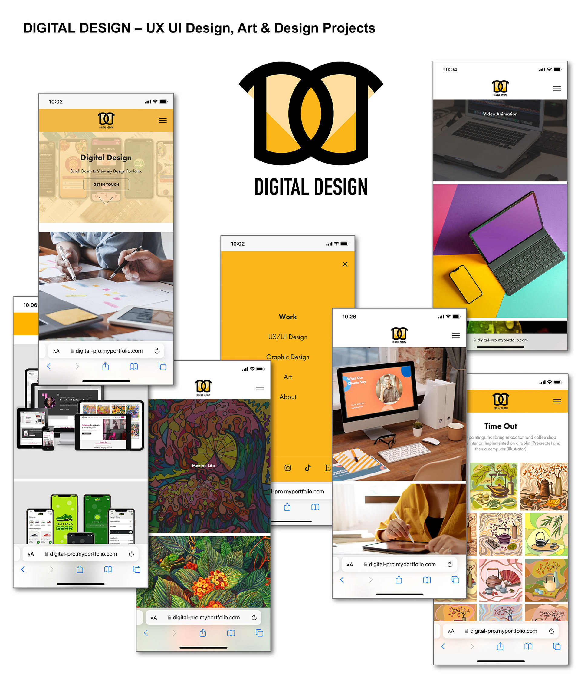
DIGITAL DESIGN Screens - Overview
Home - Splash Screen with Down Arrow
Home Screen Scrolling
Home Screen - Image Hover Effect Screen

UX / UI Design Screen - Image Hover Effect

Graphic Design Screen
UX / UI Design Screen
UX / UI Design Screen
About Screen
UX / UI Design Project Subpage

Art Screen

Mobile Screens
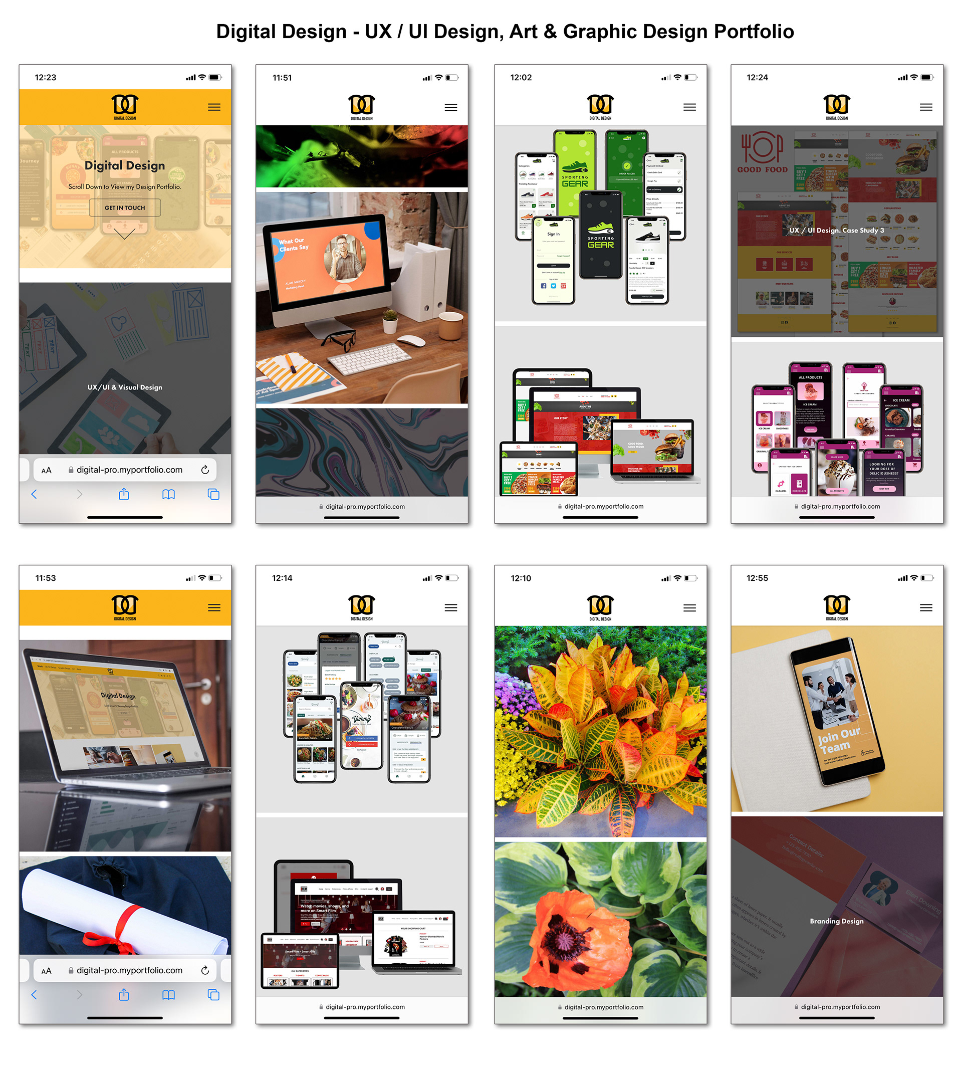
Mobile Screens
Style Guide
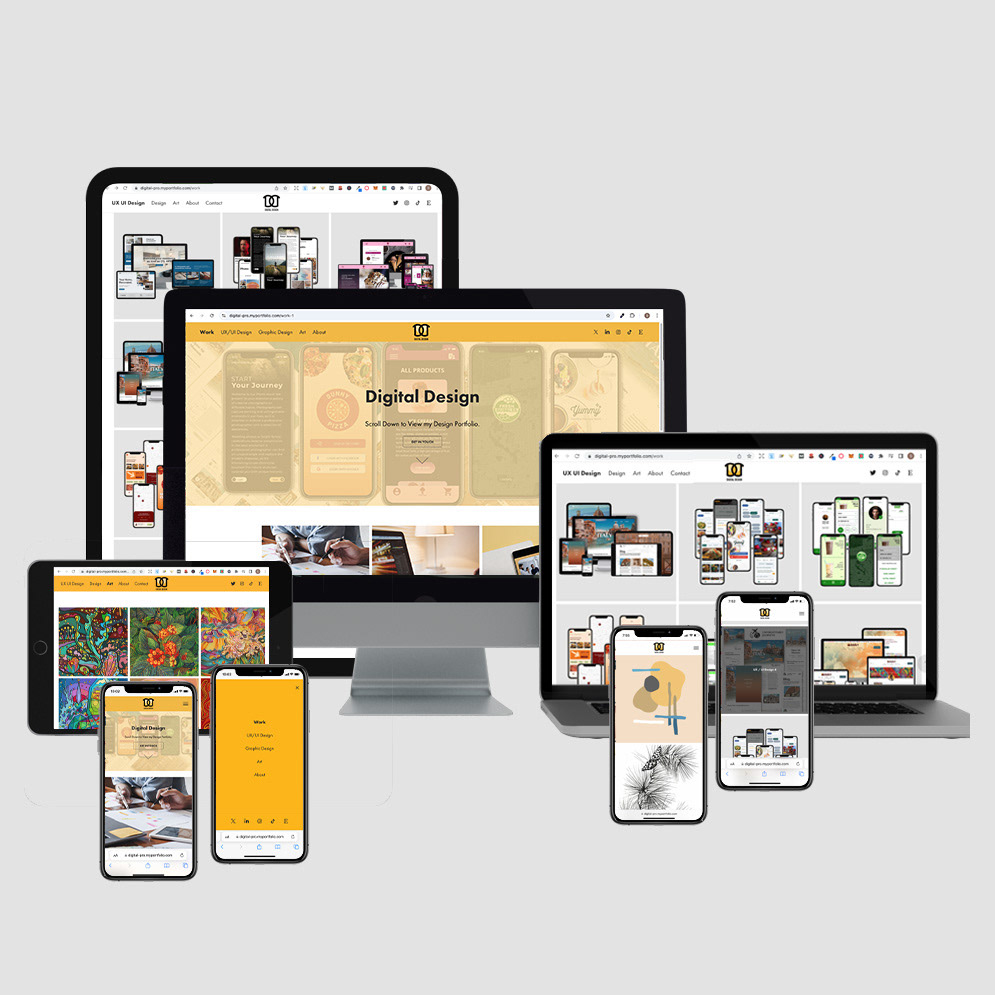
DIGITAL DESIGN Screens Overview - Devices
Live Website
Digital Design – UX / UI Design Portfolio
The "Digital Design" website is a UX UI / Product design and other projects of Art & Design portfolio with a detailed explanation of every project. UX UI / Product design projects have Case Studies. The website idea is to showcase digital designs with websites and app screens of projects in vibrant beige-orange with contrasting business-appealing navy blue, black & white and grey colours. The website has a fresh modern look with interactive elements. The feeling of the masthead image goes well with the logo and is very appropriate to a theme of current technologies. The website is elegant and business appealing. Bright orange elements for the logo are in cohesion with a Masthead and navigational panel. The grey backgrounds and navy-blue buttons create contrasts. The design is colourful, up-to-date, and minimalistic. The navigation on the website has submenus to tell a good and detailed story.
UX Design
UX UI Design Portfolio Website
Role and Project Information
Branding, visual and UX/ UI Design. Web design and development: Adobe Portfolio.
Role: UX/UI Designer. Tools: Figma, Photoshop, Illustrator. Timeline: 1,2 month (2021).
Collaboration: I was a solo UX/UI designer for a small business. I was responsible for branding and determining the overall design direction of the project, creativity and implementation.
Project Overview
This case study aims to showcase the design and development process of a Digital Design portfolio website catering to UX UI designers, graphic designers, and artists. The goal is to create an efficient and creative platform for these professionals to showcase their competency and attract potential clients or employers.
The context of the project revolves around the need for a visually appealing and user-friendly website that effectively displays the designer's portfolio, artwork, and design skills. The project's background includes understanding the target audience, their preferences, and the industry standards for portfolio websites in the digital design field.
By creating an engaging and well-structured website, the case study aims to demonstrate how the design decisions were made to enhance the user experience, showcase the designer's work effectively, and align with the overall branding and aesthetic goals. The project considers the importance of usability, visual appeal, and clear communication of the designer's competencies and services.
Throughout the case study, we will delve into the design process, the specific features and elements incorporated in the website, and the rationale behind various design choices. The ultimate goal is to create a compelling portfolio website that showcases the designer's work and reflects their professionalism and creativity in the digital design industry.
Client Profile
1. Target Audience and Their Needs:
The target audience for the Digital Design portfolio website comprises UX UI designers, graphic designers, and artists. They are professionals seeking to showcase their competencies and artwork effectively and creatively. Their needs include:
• A platform to display their design and artistic portfolio.
• A visually appealing and user-friendly website that reflects their skills.
• A way to attract potential clients or employers is by showcasing their work.
2. Client's Industry and Specific Requirements:
• The client operates in the digital design industry. This industry encompasses various sectors, including UX UI design, graphic design, and digital art. The specific requirements for the portfolio website include:
• A design that aligns with the aesthetics and branding of the client's work.
• Precise categorizing of different design disciplines (UX UI Design, Design, Art).
• Inclusion of case studies and project details to highlight expertise.
• Integration of social media links to connect with the audience.
• Contact page with a contact form and relevant contact information.
Understanding the target audience's needs and the specific requirements of the client's industry is crucial in designing a portfolio website that effectively meets their expectations and showcases their skills and artwork.
Design Process
Developing the Digital Design portfolio website involved several key steps, including research, creativity, concept development, and user testing. The following outlines the design process:
1. Research:
• Conducted research on the target audience, their preferences, and industry standards for portfolio websites in the digital design field.
• Explored existing portfolio websites to gather inspiration and identify best practices.
• Analyzed competitor websites to identify unique selling points and differentiate the client's website.
2. Ideation:
• Brainstormed and generated ideas for the website's overall structure, layout, and visual elements.
• Created sketches and wireframes to visualize different sections' design concepts and layouts.
• Explored various colour schemes, typography options, and imagery to align with the client's brand and aesthetic goals.
3. Concept Development:
• Developed a design concept focused on a visually appealing and user-friendly experience.
• Refined the layout, navigation structure, and placement of key elements such as the logo, navigation menu, masthead, and gallery sections.
• Incorporated the vibrant orange colour (#fbb434) for the navigation menu and other design elements to create a cohesive visual identity.
• Choose Futura for headings and Arial for body texts to ensure legibility and hierarchy.
4. User Testing and Feedback:
• Conducted user testing sessions with individuals from the target audience to gather feedback on the website's usability and visual appeal.
• Collected user feedback on the navigation, layout, clarity of information, and overall user experience.
• Incorporated the feedback received to make iterative improvements to the website design, addressing any usability or user experience issues identified.
The design process involved research, creativity, concept development, and user testing to ensure that the Digital Design portfolio website met the target audience's needs and aligned with the client's requirements. Incorporating user feedback allowed for iterative improvements, resulting in a website that effectively showcases the designer's work and provides an engaging user experience.
Design Solution
Overview of Website Structure and Layout:
The Digital Design portfolio website follows a structured layout with a left-side navigation menu, a central logo, and social media links on the right. The main sections include UX UI Design, Design, Art, About, and Contact. Each section has its dedicated page with relevant content and visuals.
Rationale Behind the Chosen Navigation Menu Design:
The navigation menu was placed on the left side for easy access and improved usability. Its vibrant orange (#fbb434) grabs attention and adds visual interest. The menu remains fixed at the top for convenient navigation throughout the website. When scrolling, the menu changes to white (#ffffff) to maintain legibility and ensure a seamless user experience.
Logo Design and Relevance to the Overall Brand:
The logo features two mirrored Ds and the wordmark "Digital Design." Its symmetrical and balanced design represents the brand's professionalism and creativity. Placing the logo in the middle of the navigation menu reinforces its visual prominence and helps establish brand identity.
Use of Colors and Enhancing Visual Appeal:
The colour scheme incorporates #000000 (black) for outlines and text, #fbb434 (vibrant orange) for the navigation menu and design elements, and #fedca2 (light beige) for the masthead background and logo. These colours create a visually appealing contrast and cohesion throughout the website, highlighting essential elements and attracting attention.
Masthead Design and Interactive Features:
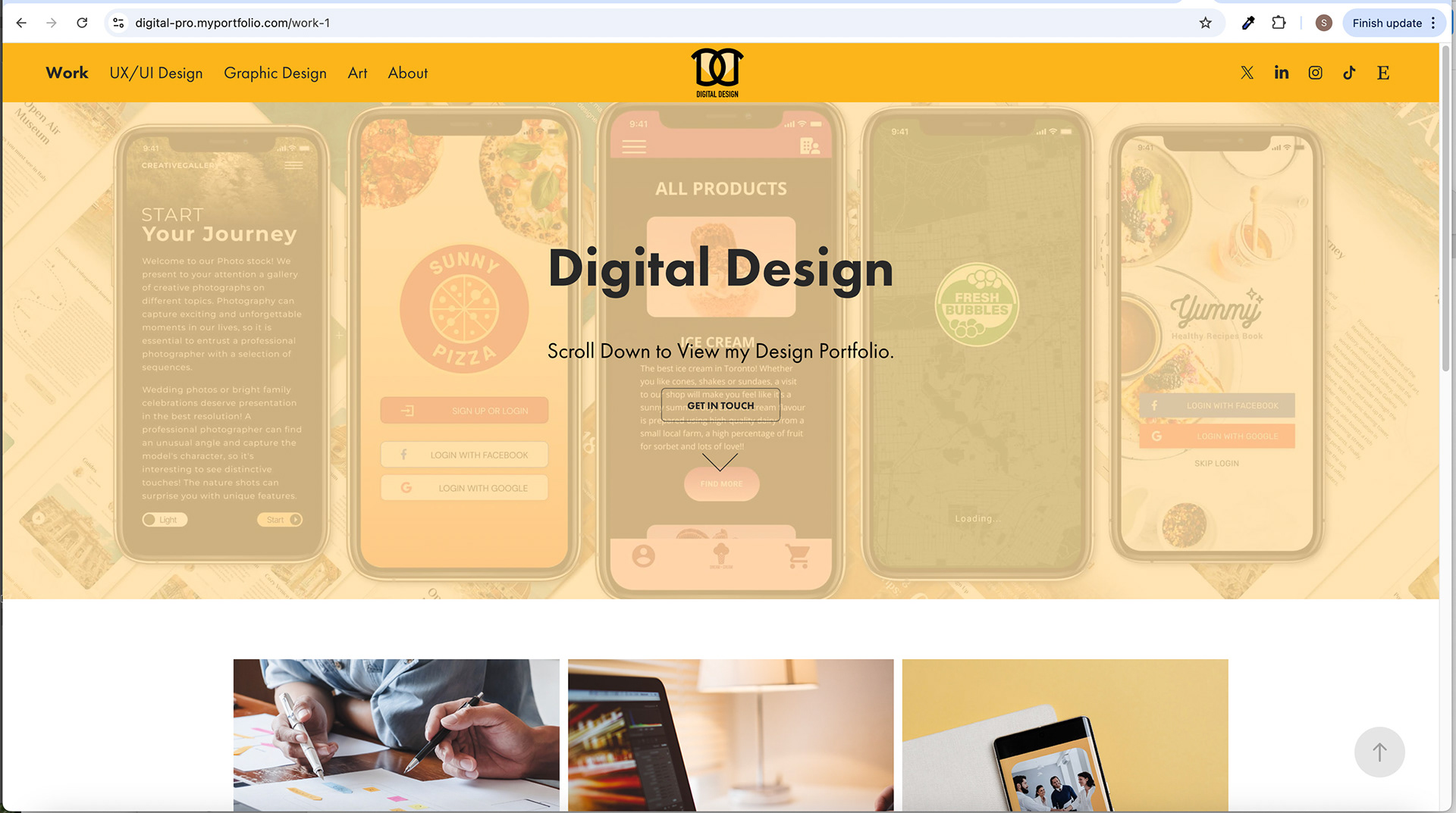
The masthead features a thematic image related to UX UI design, covered with a light beige overlay. The heading "Digital Design," slogan, and "Get In Touch" buttons are on top. An arrow allows users to scroll up and down the image, encouraging engagement and exploration of the UX UI design gallery.
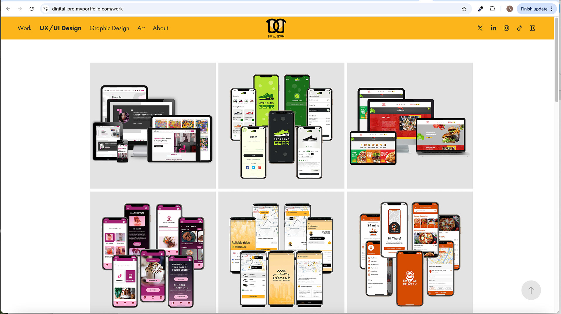
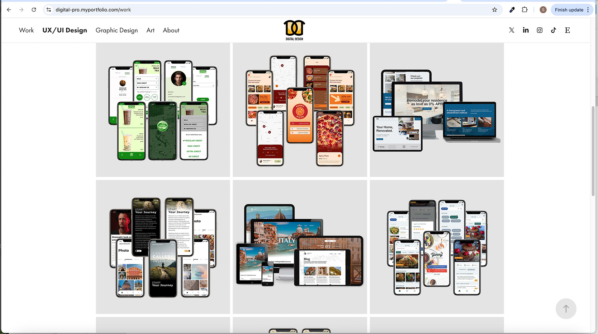
UX UI Design, Design, and Art Gallery Layouts:
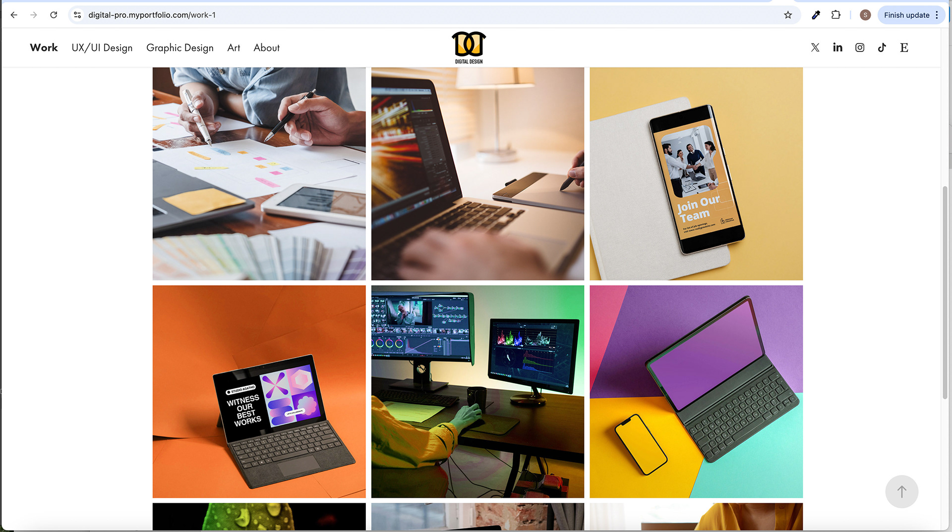
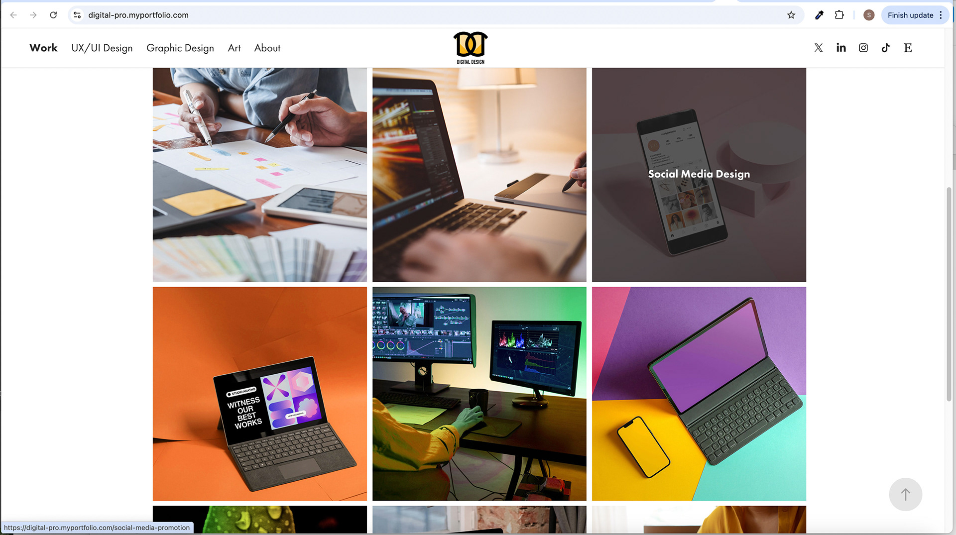
The UX UI Design, Design, and Art gallery sections showcase projects in a grid layout. Each project is represented by a square with a light gray background (#e3e3e3). Hovering over a project reveals a different image composition with screenshots. Case studies, project details, and navigation buttons are included to provide comprehensive information and facilitate easy exploration.
The design solution aims to create a visually appealing, user-friendly, and engaging portfolio website. The navigation menu, logo, colours, masthead, and gallery layouts were carefully chosen to enhance the user experience, highlight the designer's work, and establish a strong brand presence.
Design and Art Galleries
Structure and Content of the Graphic Design Gallery:
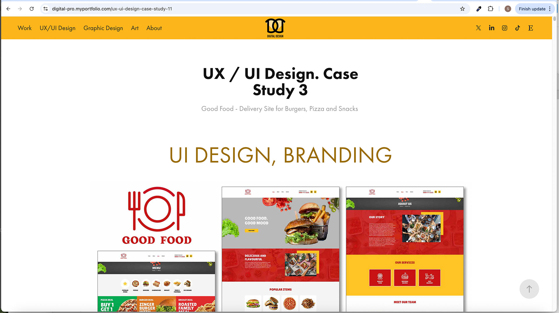
The graphic design gallery showcases various design projects, including "Logo & Sign Design," "Ad Design," "Branding, Ad and Print Design," and more. Each project is presented with a combination of visual design elements, descriptive text, and a "Go Back" button for improved usability. The gallery is structured in a grid layout, allowing users to navigate and explore different projects easily.
Art and Digital Illustrations Gallery:
The art and digital illustrations gallery features projects such as "Marine Life," "Vibrant Flowers," "Batiks," and more. This gallery showcases the artist's creative artwork and digital illustrations. Each project is accompanied by visual representations of the artwork, a descriptive text explaining its inspiration or concept, and a "Go Back" button for seamless navigation.
Project Selection and Presentation in Both Galleries:
The projects selected for the graphic design and art galleries are carefully chosen to represent the designer's or artist's skills, versatility, and creativity. Each project is presented with visually appealing imagery that captures the essence of the design or artwork. The descriptive text provides additional context, giving users insights into the design process, artistic vision, or project objectives.
"Go Back" Functionality for Better Usability:
A "Go Back" button is included with each project to enhance usability and navigation within the galleries. This functionality allows users to easily return to the main gallery page, allowing them to browse through different projects without losing their place or using the browser's back button. The "Go Back" button ensures a seamless and intuitive user experience within the design and art galleries.
The design and art galleries offer a structured and engaging presentation of graphic design projects and art illustrations. The selection of projects, descriptive text, and the inclusion of the "Go Back" functionality contribute to a user-friendly and immersive browsing experience. Users can explore the designer's or artist's work, gain insights into their creative process, and quickly navigate between different projects within the galleries.
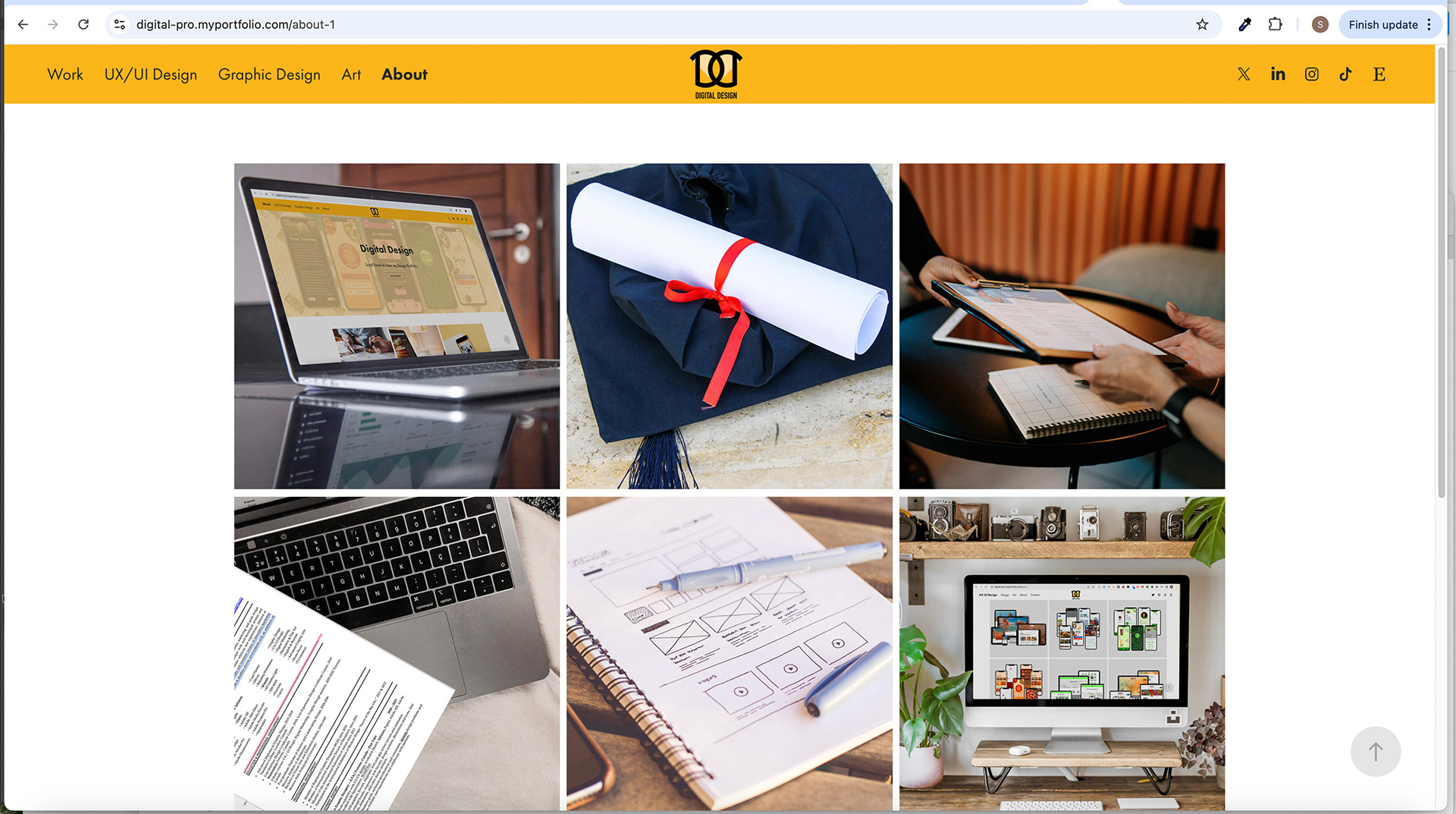
About Section:
The About section of the website serves as a platform to provide comprehensive information about the designer and artist, allowing visitors to learn more about their background, expertise, and services. It aims to connect with the audience and build trust by showcasing relevant professional information.
The About section consists of several subpages that offer different information about the designer and artist. These subpages include:
1. Why Hire Me:
The "Why Hire Me" subpage highlights the designer and artist's unique selling points and key strengths. It emphasizes their value to clients or employers and provides compelling reasons why they should be chosen for design or artistic projects. This section focuses on their skills, experience, and expertise, establishing a persuasive argument for hiring them.
2. About Me:
The "About Me" subpage delves deeper into the designer and artist's personal and professional journey. It provides a narrative or summary that gives visitors a glimpse into their background, education, and career milestones. This section might include personal anecdotes, passion for design or art, and significant achievements or recognitions. It aims to create a connection and provide a more personal perspective.
3. CV (Curriculum Vitae):
The CV subpage presents the designer and artist's detailed resume or curriculum vitae. It includes their educational background, professional experience, skills, certifications, and relevant accomplishments. This section offers a comprehensive overview of their qualifications and serves as a testament to their expertise in design and art.
4. Services:
The Services subpage outlines the services the designer and artist provide. It lists their specific design or art services, such as UX UI design, graphic design, illustration, branding, or other specialized areas. This section may include descriptions of each service, highlighting the value and benefits clients can expect.
5. Bio:
The Bio subpage provides a more in-depth biography of the designer and artist. It delves into their professional journey, including significant projects, collaborations, and achievements. It might also include information about their artistic influences, design philosophy, or unique approach to their work. This section offers a deeper understanding of the designer and artist's background and creative journey.
6. Get In Touch:
The Get In Touch subpage contains contact information and a contact form. It allows visitors to contact the designer and artist for inquiries, collaborations, or project requests. This section typically includes a contact form where users can input their details and message, along with contact information such as email address, phone number, or social media profiles.
Each subpage within the About section contributes to a comprehensive profile of the designer and artist. Collectively, they provide visitors with an understanding of their skills, background, experience, services, and contact information, establishing credibility and fostering potential professional relationships.
Contact Page:
The Contact page serves as a means for visitors to contact the designer and artist. It incorporates a user-friendly design and layout to encourage seamless communication.
Design and Layout of the Contact Form:
The contact form is designed to be visually appealing and easy to use. It typically consists of fields for the user to input their name, email address, subject, and message. The form is presented in a clean and organized layout, making it simple for users to fill out the required information. Appropriate spacing, clear labels, and intuitive input fields ensure a user-friendly experience.
Inclusion of Contact Information:
Alongside the contact form, the Contact page includes contact information such as an email address, phone number, or social media links. This provides users with alternative contact methods or allows them to choose the most convenient way to reach out. Including contact information demonstrates accessibility and responsiveness, making it easier for visitors to engage with the designer and artist.
Use of Vibrant Orange Color for Hover State:
To enhance the interactivity and visual interest of the contact form, the vibrant orange colour (#fbb434) is used for the form's hover state. When users hover over the form fields or submit button, a deep orange indicates the active or interactive state. This colour choice adds a dynamic element to the form, capturing the user's attention and creating a sense of engagement. The use of consistent colours throughout the website, including the vibrant orange, also reinforces the branding and visual cohesion of the design.
Overall, the design and layout of the contact form, including contact information and the vibrant orange colour for the form's hover state, contribute to an inviting and user-friendly Contact page. It encourages visitors to reach out and facilitates effective communication between the designer, artist, and audience.
Colour Scheme
Overview of the Color Palette:
The colour scheme of the website primarily consists of the following colours:
1. #000000 (Black): This colour is used for outlines, text, and essential elements throughout the website. Black provides a strong contrast and adds a sense of sophistication and elegance to the overall design.
2. #fbb434 (Vibrant Orange): The vibrant orange is prominently used for the navigation menu and hover-state button on the Contact page. This colour choice adds energy, excitement, and visual interest to the design concept. It serves as a highlight colour that draws attention to critical elements.
3. #fedca2 (Light Beige): The light beige is used for the masthead background, overflowing the masthead image and in certain image elements. This colour adds a touch of warmth and softness to the design, creating a pleasant and inviting atmosphere.
4. #e3e3e3 (Light Gray): The light gray colour, along with its shades, is utilized for squares in the galleries, background outlines, and texts. This neutral colour provides a clean and modern aesthetic, allowing the main content and visuals to stand out.
5. #052b54 (Navy Blue): The navy blue is used for buttons throughout the website. It adds a sense of depth and professionalism to the design. A lighter shade (#43607f) of navy blue is used for the hover-in state of these buttons, providing a subtle visual effect.
Significance and Impact of Each Color Choice:
• Black represents elegance, sophistication, and readability. It adds a strong contrast to the design and ensures that text and essential elements are easily readable.
• Vibrant orange creates a sense of energy and enthusiasm and draws attention to key navigation elements. It adds a pop of colour and visual interest to the design, making it engaging and memorable.
• Light beige brings a warm and inviting atmosphere to the design, evoking a sense of comfort and approachability. It also complements the brand's logo and enhances the overall visual harmony.
• Light gray is a neutral background, allowing the main content and visuals to take center stage. It creates a clean and modern look, ensuring readability and ease of navigation.
• Navy blue adds a touch of professionalism, stability, and trustworthiness to the design. It creates a visual hierarchy and guides users' attention to critical interactive elements.
Application of Colors Throughout the Website:
The chosen colour scheme is applied consistently across the website, ensuring visual cohesion and a unified brand identity. The black and vibrant orange colours are used for key navigation elements and important text, while the light beige and light gray colours provide background and accent colours, respectively. The navy blue is used for buttons, creating a clear call to action.
By using colours strategically and consistently, the website achieves a visually appealing and harmonious look. The colour scheme enhances the overall user experience, grabs attention, reinforces branding, and creates a memorable visual impression for visitors.
Typography
Font Choices and Usage:
The website utilizes two main fonts: Futura and Arial. Each font serves a specific purpose and is applied thoughtfully throughout the design.
1. Futura: Futura is used for all headings and subheadings on the website. Its clean and geometric design gives the typography a modern and sleek appearance. Futura's bold and distinct letterforms make the headers visually striking and attention-grabbing. This font choice helps to establish a sense of professionalism, sophistication, and a forward-thinking aesthetic.
2. Arial: Arial is employed for body texts, minor subheadings, and description texts. Arial is a widely recognized sans-serif font with excellent readability across different devices and screen sizes. Its simplicity and straightforwardness make it suitable for conveying information in a clear and accessible manner. Arial ensures that the website's content is easy to read, providing a comfortable reading experience for visitors.
The Rationale for Font Selection:
The choice of Futura and Arial fonts is driven by their specific characteristics and compatibility with the overall design concept. Futura's modern and bold appearance complements the cutting-edge nature of the UX UI and digital design showcased on the website. Arial, on the other hand, balances readability and simplicity, making it an ideal choice for body text and supporting content.
Enhancement of the Overall Design:
Typography plays a crucial role in enhancing the overall design of the website in several ways:
1. Visual Hierarchy: Using Futura for headings and subheadings creates a clear visual hierarchy, guiding users' attention and making scanning and navigating the content easily. The contrast between Futura and Arial also helps differentiate headings and body text, providing a clear and organized structure.
2. Brand Consistency: Using Futura and Arial throughout the website reinforces the brand's identity and creates a cohesive visual experience. The typography aligns with the modern and professional aesthetic of the designer and artist, strengthening their brand presence.
3. Readability: The careful selection of Arial for body text ensures that the content is easily readable and accessible to visitors. Arial's legibility enhances the user experience, allowing users to consume information effortlessly.
By choosing appropriate fonts and utilizing them effectively, the typography enhances the overall design by creating visual appeal, establishing a hierarchy, maintaining brand consistency, and ensuring readability. It contributes to the overall user experience and reinforces the professionalism and expertise of the designer and artist showcased on the website.
Conclusion
The project has succeeded, achieving its goal of creating a compelling and efficient portfolio website for UX UI, digital, and graphic designers and artists to showcase their competency. Throughout the design process, there were some challenges, but they were effectively overcome to deliver a high-quality end product.
One of the notable achievements of this project is the effective implementation of UX UI principles. The navigation menu's design, with its vibrant orange colour and scrolling state, enhances user interaction and visual interest. The layout and structure of the website prioritize easy navigation, allowing users to explore different sections and projects seamlessly.
The website's ability to showcase competency efficiently and creatively is evident in various aspects. The UX UI Design gallery presents projects in a visually appealing and organized manner, with hover states and compositions that engage users and provide additional context. Including detailed case studies for each project adds depth and demonstrates the designer's thought process and problem-solving skills. Integrating Figma clickable prototypes further enhances the user experience by allowing users to interact with the designs.
Despite challenges faced during the design process, such as balancing aesthetics with usability and incorporating feedback, the result is a well-executed website that effectively represents the client's brand and capabilities. The colour scheme, typography choices, and overall design contribute to the website's visual appeal and professionalism.
In conclusion, this case study showcases the successful development of a portfolio website that meets the needs of UX UI, digital, and graphic designers and artists. Implementing UX UI principles and the efficient and creative presentation of competency make this website a valuable tool for designers to showcase their work and attract potential clients and employers.
Future Enhancements
While the current website design successfully showcases the competency of UX UI, digital, and graphic designers and artists, there are opportunities for future enhancements to keep the website up-to-date and aligned with evolving design trends. Here are some suggestions for potential improvements and additions:
1. Responsive Design: Ensure the website is fully optimized for mobile devices to provide a seamless experience across different screen sizes. This can involve refining the layout, adjusting font sizes, and optimizing image sizes to enhance mobile usability.
2. Interactive Elements: Consider incorporating more interactive elements throughout the website to engage users further. This could include animations, micro-interactions, or dynamic transitions that add visual interest and interactivity, enhancing the overall user experience.
3. Incorporate Video Content: Explore the integration of video content to showcase the designers' work in a more dynamic and immersive way. Video presentations or walkthroughs of projects can provide a deeper understanding of the design process and highlight the interactive aspects of the work.
4. Integration of Social Proof: Add client testimonials or reviews to the website to build trust and credibility. Sharing positive feedback and success stories from satisfied clients can reinforce the designers' expertise and attract potential clients.
5. Blog or Resource Section: Consider adding a blog or resource section where designers can share their insights, design tips, and industry trends. This demonstrates their knowledge and expertise and keeps the website updated with fresh content, encouraging visitors to return and engage with the site.
6. Continuous Improvement: Regularly review and analyze user feedback and website analytics to identify areas for further optimization. This could involve refining the navigation structure, improving page load times, or enhancing accessibility to ensure an exceptional user experience.
The website can stay relevant and adaptable to evolving design trends by implementing these future enhancements. It will continue to attract and engage users, provide a platform for designers to showcase their work effectively, and serve as a valuable resource for clients and employers seeking design expertise.
Overall, the website should strive to stay current and innovative, embracing new technologies and design approaches to maintain its efficiency, creativity, and competitive edge in the digital design industry.