

UI Design, BRANDING
Cover - Project Overview
Graphic Design Project Overview
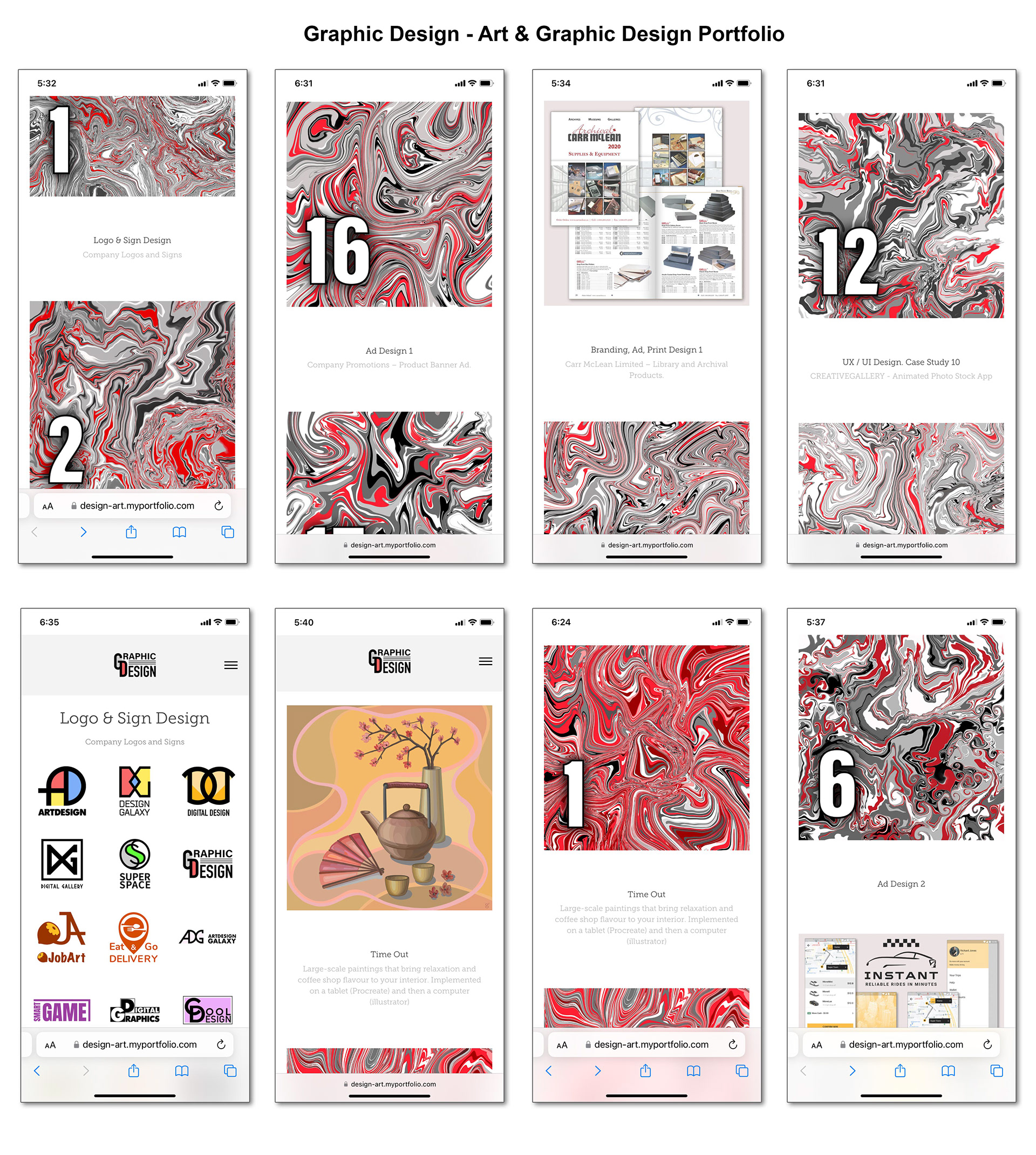
Home Screen Scroll Down - Design Screen

Home Screen Scroll Down - Design Screen
Design Screen
Home Screen Scroll Down - Design Screen
Design Screen - Logo Hover Effect
Design Screen - Image Hover Effect
Design Screen - Image Hover Effect
Design Screen - Image Hover Effect
Design Screen - Image Hover Effect

Design Screen - Image Hover Effect

Home - Splash Screen with Down Arrow - Button Hover Effect
Design Screen - Image Hover Effect

Art Screen - Logo Hover Effect
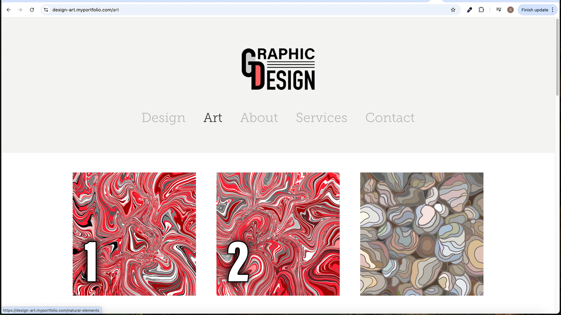
Art Screen
Art Screen - Image Hover Effect

Art Screen - Image Hover Effect
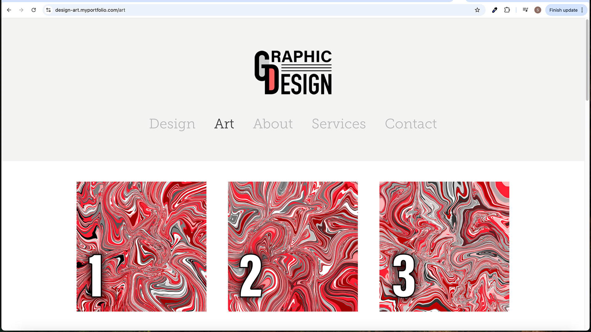
Art Screen
Art Screen - Image Hover Effect
Art Screen - Image Hover Effect
Design - Subpage Screen

Art - Subpage Screen
Art - Subpage Screen
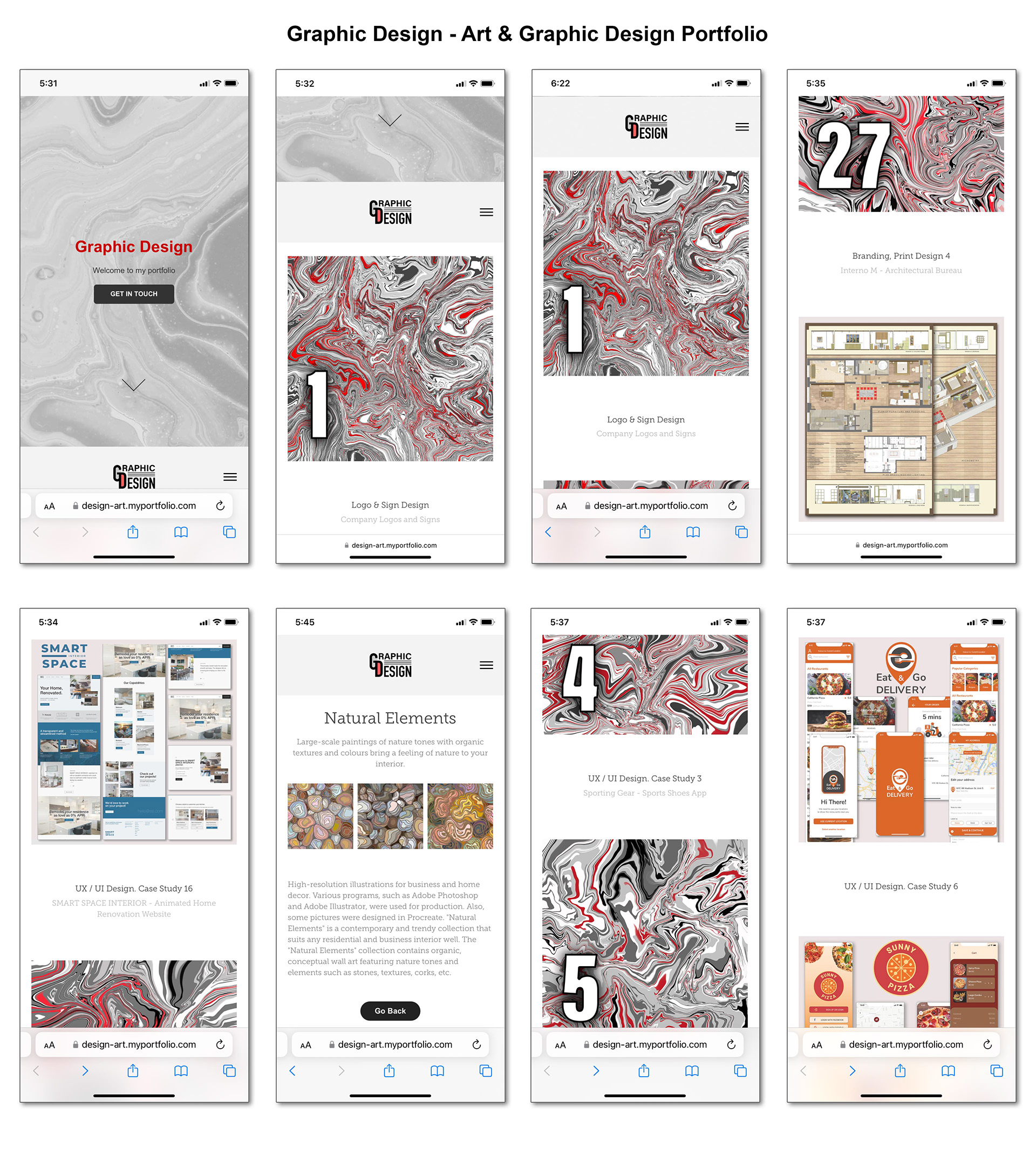
Mobile Screens
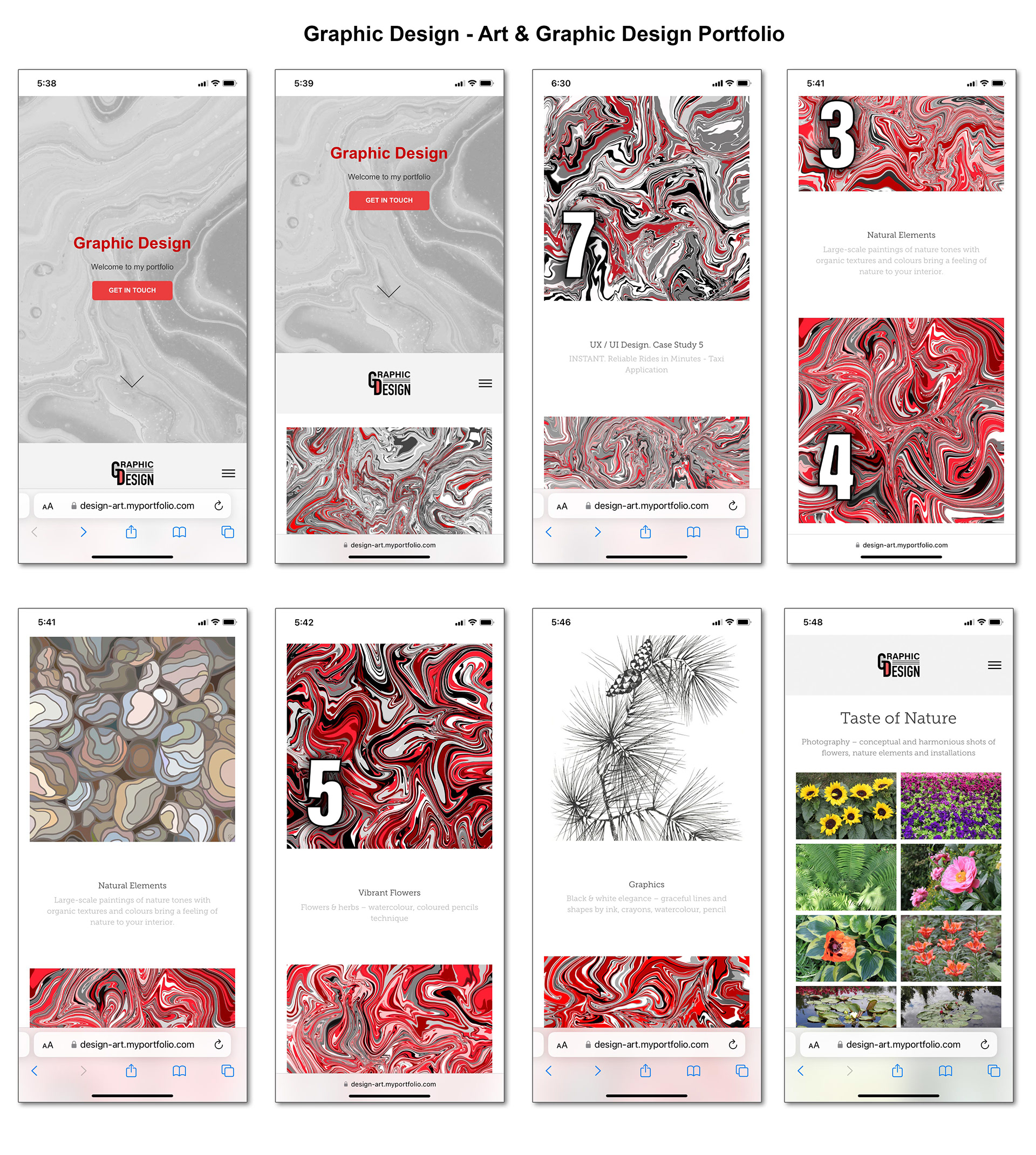
Mobile Screens
Mobile Screens
Mobile Screens
Style Guide
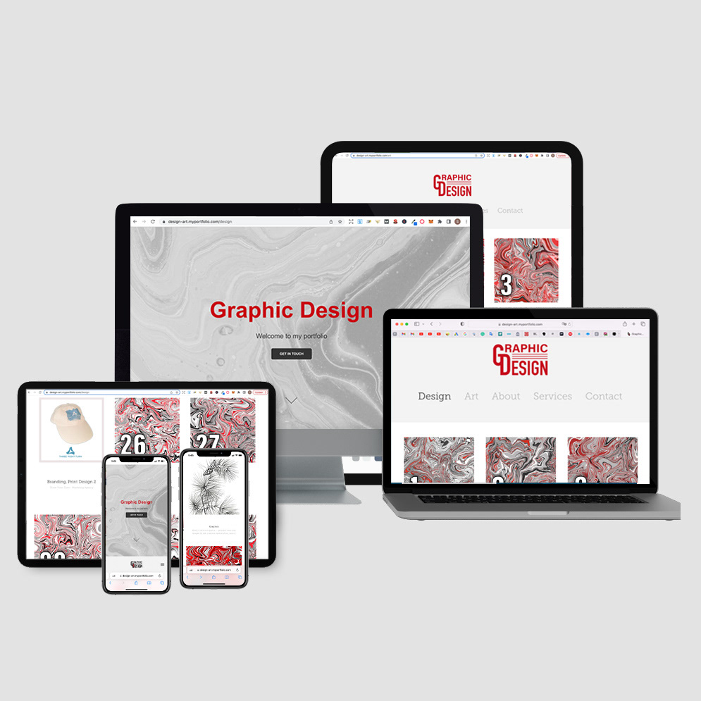
Graphic Design Project Overview - Devices
Live Website
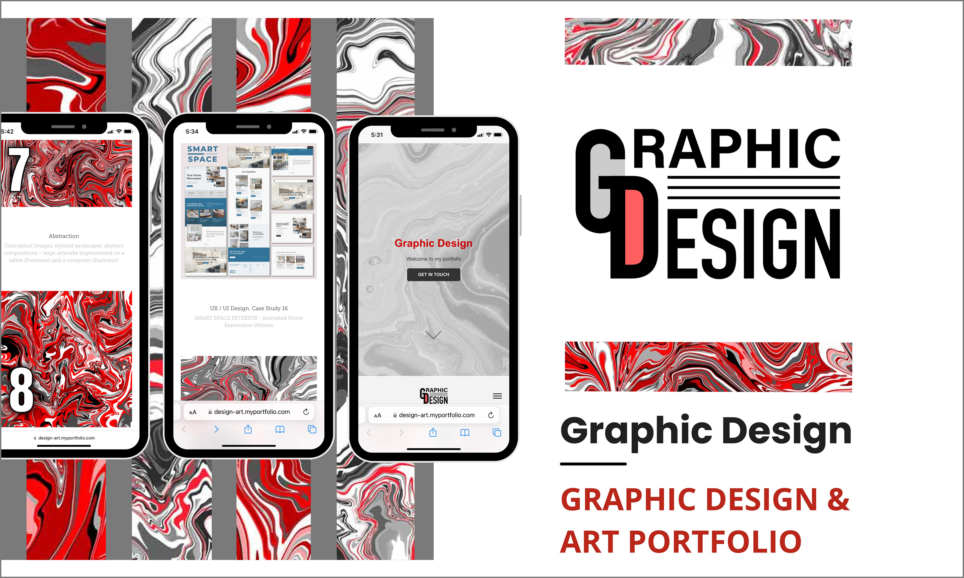
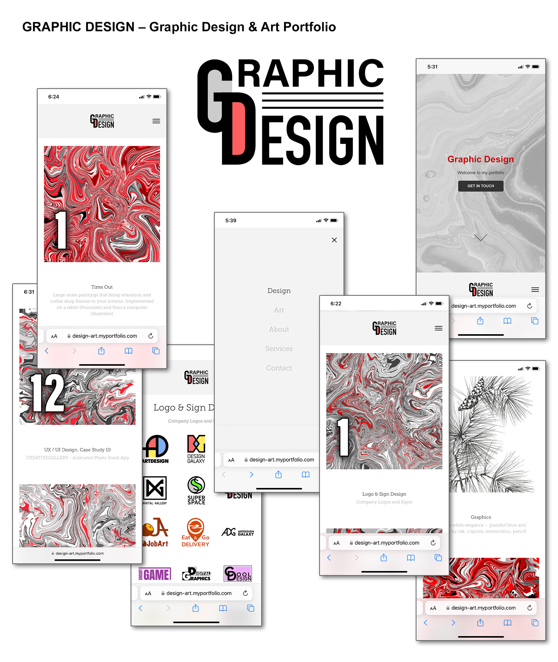
Graphic Design – Graphic Designer & Artist Portfolio
The "Graphic Design" website is a portfolio with a detailed explanation of every design and art project. The website idea is an Avangard-style conceptual approach with red, grey and black & white colour schemes. The texture of the masthead image goes well with the logo and is very neutral and elegant because some bright red elements, such as textures, logos, and buttons, create visual accents. The main chapters of the portfolio, "Design and "Art," stand out by using stunning textures of grey and red colours. There are many buttons to make an easy UX and navigation.
UX Design
Graphic Design – Graphic Designer & Artist Portfolio
Role and Project Information
Branding, graphic and UX/ UI Design. Web design and development: Adobe Portfolio.
Role: UX/UI Designer. Tools: Figma, Photoshop, Illustrator. Timeline: 1,2 month (2021).
Collaboration: I was a solo UX/UI designer for a small business. I was responsible for branding and determining the overall design direction of the project, creativity and implementation.
Introduction
This case study aims to outline the design and user experience considerations for a Graphic Design Portfolio Website. The portfolio website aims to provide digital and graphic designers and artists with an efficient and creative platform to showcase their competencies and artworks.
The primary goal of the portfolio website is to create an engaging and visually appealing user experience that allows visitors to explore and appreciate the designer's work. By presenting a well-structured and visually captivating website, the portfolio aims to attract potential clients, employers, and collaborators seeking talented individuals in graphic design and art.
Additionally, the portfolio website seeks to effectively communicate the designer's skills, expertise, and unique style. It is a digital portfolio, enabling users to view a comprehensive collection of projects, including digital designs and artworks. The website highlights the final results and provides context, descriptions, and details about each project, allowing visitors to gain insights into the designer's creative process and problem-solving abilities.
Overall, the Graphic Design Portfolio Website aims to impress, engage, and inspire visitors while showcasing the designer's competency, creativity, and professionalism in graphic design and art.
Target Audience
The Graphic Design Portfolio Website is designed with a specific target audience. Identifying and understanding this audience's needs, preferences, and expectations is crucial for creating a user-centred and practical design.
The primary target audience for the website includes:
• Potential Clients: Individuals or businesses seeking graphic design services for their projects, such as branding, web design, advertising, or print materials. These clients are looking for talented designers who can demonstrate their expertise and showcase a diverse range of high-quality work.
• Employers: Design agencies, creative studios, or companies looking to hire graphic designers or artists. These employers are interested in evaluating potential candidates' skills, creativity, and professionalism.
• Collaborators: Other designers, artists, or creative professionals interested in networking, collaborations, or seeking inspiration. They seek like-minded individuals who can bring a unique perspective and contribute to creative projects.
The target audience's needs, preferences, and expectations can vary, but some common aspects to consider are:
• Visual Appeal: The audience expects a visually engaging and aesthetically pleasing design. They appreciate creativity, attention to detail, and a high level of craftsmanship in the presented work.
• Portfolio Showcase: The audience wants a clear and well-organized presentation of projects. They expect a comprehensive overview of the designer's capabilities, with detailed information about each project, including objectives, challenges, and outcomes.
• Navigation and Usability: Users expect intuitive navigation and seamless user experience throughout the website. They appreciate easy access to project categories, quick loading times, and responsive design that works well on various devices.
• Inspiration and Innovation: The audience seeks fresh ideas, innovative approaches, and unique design solutions. They are drawn to designers who can demonstrate their ability to think outside the box and push creative boundaries.
• Professionalism and Credibility: Clients and employers expect professionalism, reliability, and a strong portfolio that reflects the designer's expertise and experience. They appreciate testimonials, client references, and examples of successful collaborations.
By understanding the target audience's needs, preferences, and expectations, the Graphic Design Portfolio Website can be tailored to effectively engage and resonate with its intended users, increasing the chances of attracting clients, employers, and collaborators.
Design Strategy
Designing a successful Graphic Design Portfolio Website requires a clear design strategy encompassing both the design approach and methodology. Critical user experience (UX) and user interface (UI) design considerations are crucial in creating an engaging and efficient website.
Design Approach and Methodology: The design approach for the portfolio website should focus on showcasing the designer's competency and creativity while providing an intuitive and seamless user experience. The following design methodology can be adopted:
1. Research and Analysis: Conduct thorough research on the target audience, competitors, and industry trends. Analyze successful portfolio websites to understand best practices and identify areas for innovation.
2. User-centred Design: Adopt a user-centred design approach by prioritizing the target audience's needs, preferences, and goals. User research techniques such as interviews, surveys, and usability testing can provide valuable insights.
3. Information Architecture: Create a logical and intuitive information architecture for the website. Group projects into relevant categories, allowing users to navigate easily and find the desired content. Consider the hierarchy of information and ensure essential details are easily accessible.
4. Visual Design: Develop a visually appealing design that aligns with the designer's style and aesthetic. Use appropriate colours, typography, and imagery to enhance the visual impact of the portfolio. Pay attention to composition, balance, and consistency throughout the website.
5. Interaction Design: Design interactive elements that enhance the user experience. Implement intuitive navigation menus, clear calls-to-action, and engaging hover states to provide feedback and guide users through the website seamlessly.
6. Responsive Design: Ensure the website is optimized for various devices and screen sizes. Implement a responsive design that adapts to different resolutions, allowing users to access and enjoy the portfolio on desktops, tablets, and mobile devices.
Key Considerations for UX and UI Design: To create an exceptional user experience and user interface design, the following considerations should be taken into account:
• Clarity and Simplicity: Design a clean, uncluttered layout emphasizing the showcased projects. Use clear headings, concise descriptions, and visual hierarchy to guide users' attention and facilitate easy comprehension.
• Intuitive Navigation: Develop a user-friendly navigation system that allows users to explore the website effortlessly. Ensure the navigation menu is easily accessible, with descriptive labels and logical content grouping.
• Seamless Interaction: Create smooth and intuitive interactions throughout the website. Focus on providing immediate and meaningful feedback to user actions, such as hover effects and smooth transitions, enhancing the overall user experience.
• Consistency: Maintain consistency in design elements, including colours, typography, icons, and spacing. Consistent design helps users understand the website's structure and builds trust and familiarity.
• Accessibility: Consider accessibility standards to ensure that the website can be used by a wide range of users, including those with disabilities. Implement proper colour contrast, alt text for images, and keyboard navigation options.
• Performance Optimization: Optimize the website for fast loading times and optimal performance. Compress images, minimize code, and utilize caching techniques to provide a seamless browsing experience.
By following a comprehensive design strategy and considering the key UX and UI design considerations, the Graphic Design Portfolio Website can provide an immersive and engaging experience for the target audience, effectively showcasing the designer's competency and creativity.
Home Page Design
The home page of the Graphic Design Portfolio Website serves as the initial landing page, captivating visitors and providing an enticing introduction to the designer's work. The following elements and features contribute to an engaging home page design:
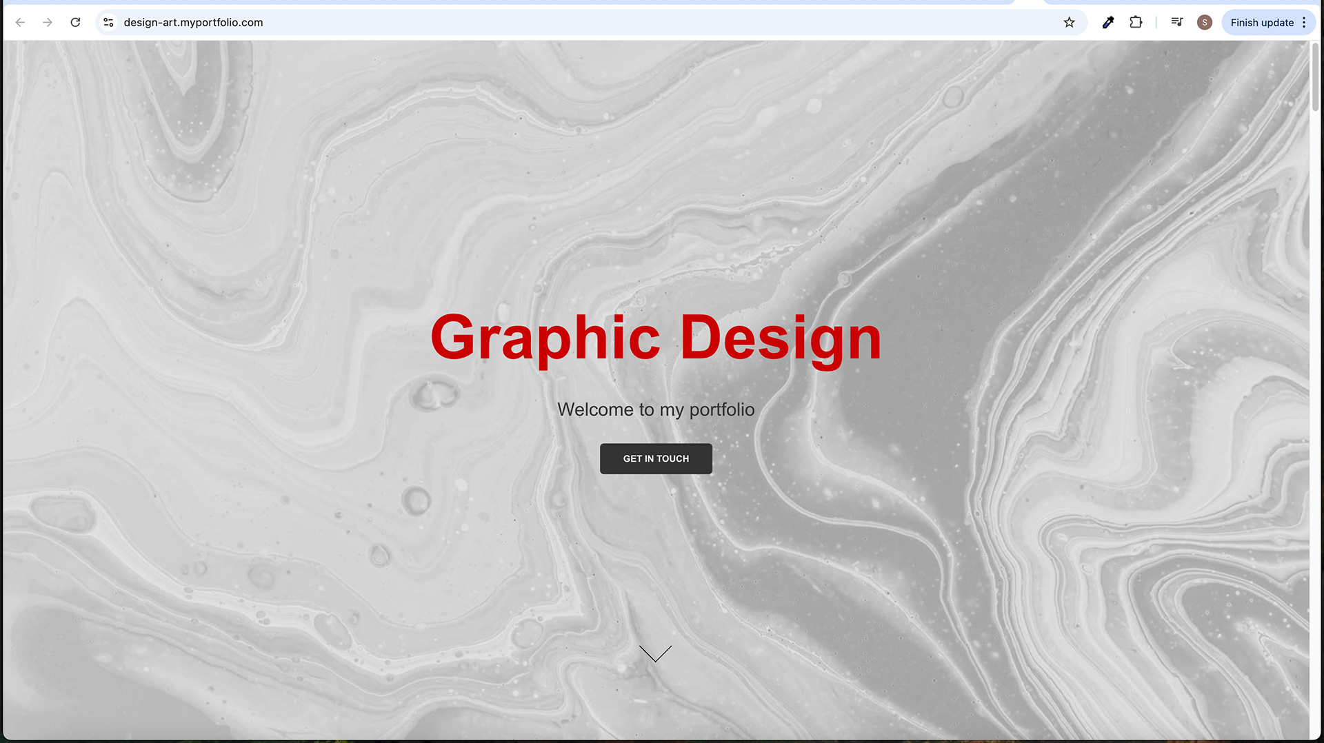
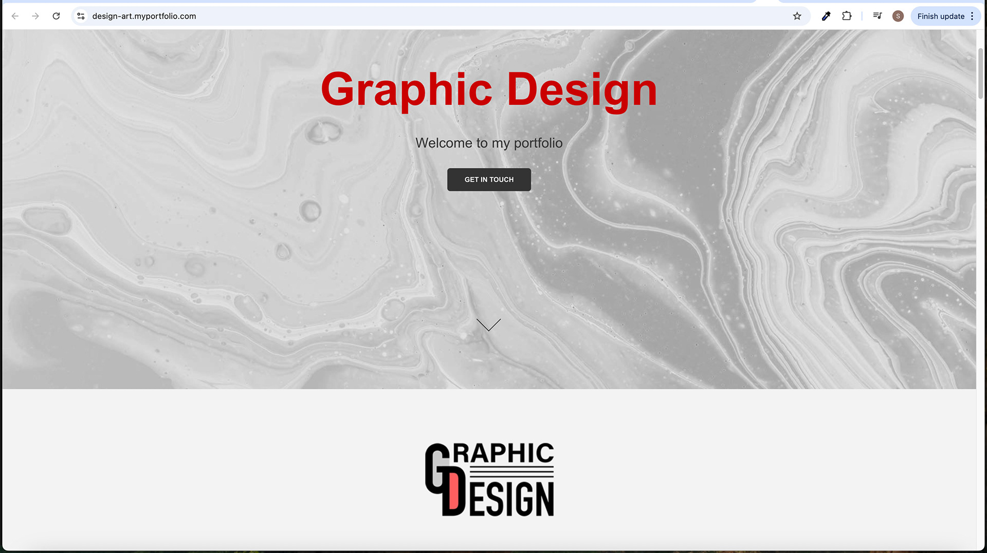
• Masthead Area: The masthead area is the topmost section of the home page. It prominently displays key components that immediately grab the user's attention. These components include a sizable grey texture image as the background. This bold red heading reads "Graphic Design," a slogan that welcomes visitors to the portfolio, and an outlined "Get In Touch" button.
• Use of Texture Image and Neutral Background: The texture image used as the background in the masthead area adds visual interest and depth to the overall design. By opting for a neutral background, the designer ensures that the focus remains on the showcased projects and avoids any distractions that may hinder the user's experience.
• Bold Red Heading and Slogan: The bold red heading of "Graphic Design" stands out against the neutral background, immediately conveying the website's purpose. It grabs the user's attention and reinforces the designer's expertise in graphic design. The accompanying slogan, "Welcome to my Portfolio," sets the tone and creates a welcoming atmosphere, encouraging visitors to explore further.
• "Get In Touch" Button and Hover State Effect: The "Get In Touch" button, outlined initially, stands out against the background and serves as a clear call to action for potential clients or collaborators. When hovering over the button, it undergoes a state change, turning from black to red. This hover-state effect provides visual feedback and enhances interactivity, encouraging users to take action and engage with the designer.
• Arrow for Scrolling: The arrow positioned at the bottom of the masthead area serves as a scroll indicator, indicating to users that there is more content to explore below. Users can smoothly scroll down the page by clicking on the arrow, ensuring a seamless transition and enhancing the overall user experience.
The home page design aims to create a visually captivating and user-friendly introduction to the portfolio website. The combination of the masthead components, texture image, bold red heading, "Get In Touch" button, and scroll arrow work together to engage visitors, communicate the designer's expertise, and guide them toward exploring the showcased projects and other sections of the website.
Navigation Menu
The navigation menu of the Graphic Design Portfolio Website provides users with a clear and organized structure to navigate through different sections and pages. It offers a seamless browsing experience and ensures easy access to the desired content. The following elements contribute to the effective design and functionality of the navigation menu:
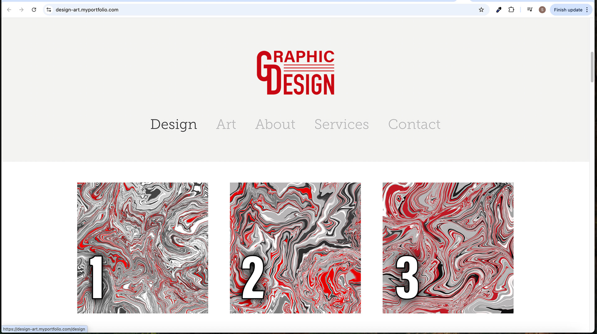
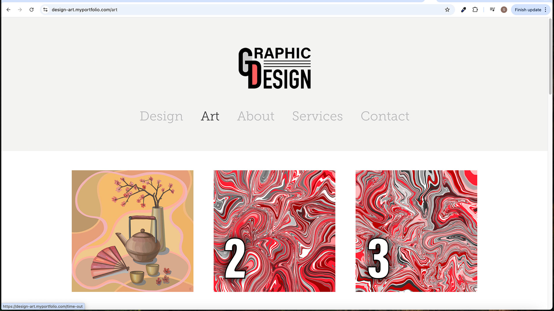
• Menu Structure and Categories: The navigation menu consists of the following categories: Design, Art, About, Services, and Contact. Each type represents a distinct section of the website, allowing users to explore specific aspects of the designer's work and information. "Design" showcases graphic design projects, "Art" focuses on the artist's artworks, "About" provides details about the designer, "Services" outlines the offered design services, and "Contact" offers a means to get in touch.
• Design and Placement: The navigation menu is designed to be visually appealing and easily accessible. It is placed at the top of the page, typically on a grey background, ensuring it stands out against the surrounding content. The menu items are represented as clickable text links, displayed horizontally or vertically, depending on the design aesthetic and layout preferences.
• Hover and Active States: The navigation menu items have hover and active states to enhance interactivity and provide visual feedback. When a user hovers over a menu item, it changes the hover state delivered. For example, the menu item may change colour, such as turning black or red, or display a subtle animation effect. This visual feedback informs users that the menu item is clickable and ready for interaction.
• Active State: The active state of a menu item indicates the user's current location within the website's navigation hierarchy. When a user clicks on a menu item and navigates to a corresponding section or page, that menu item is visually differentiated from the others. It may appear in a different colour or have an underline or background highlight, ensuring that users can quickly identify their current location within the website's structure.
The navigation menu guides users through the Graphic Design Portfolio Website. It provides a clear structure with well-defined categories, allowing users to access different sections effortlessly. The design and placement of the menu, along with the hover and active states of menu items, contribute to an intuitive and user-friendly browsing experience.
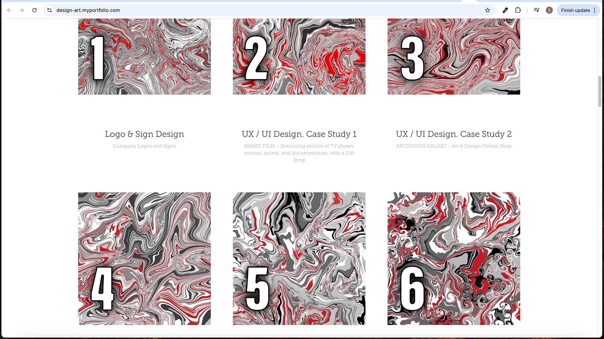
Project Showcase
The project showcase area of the Graphic Design Portfolio Website serves as the central focus, allowing visitors to explore and appreciate the designer's work in a visually appealing and organized manner. The following elements contribute to the effectiveness of the project showcase:
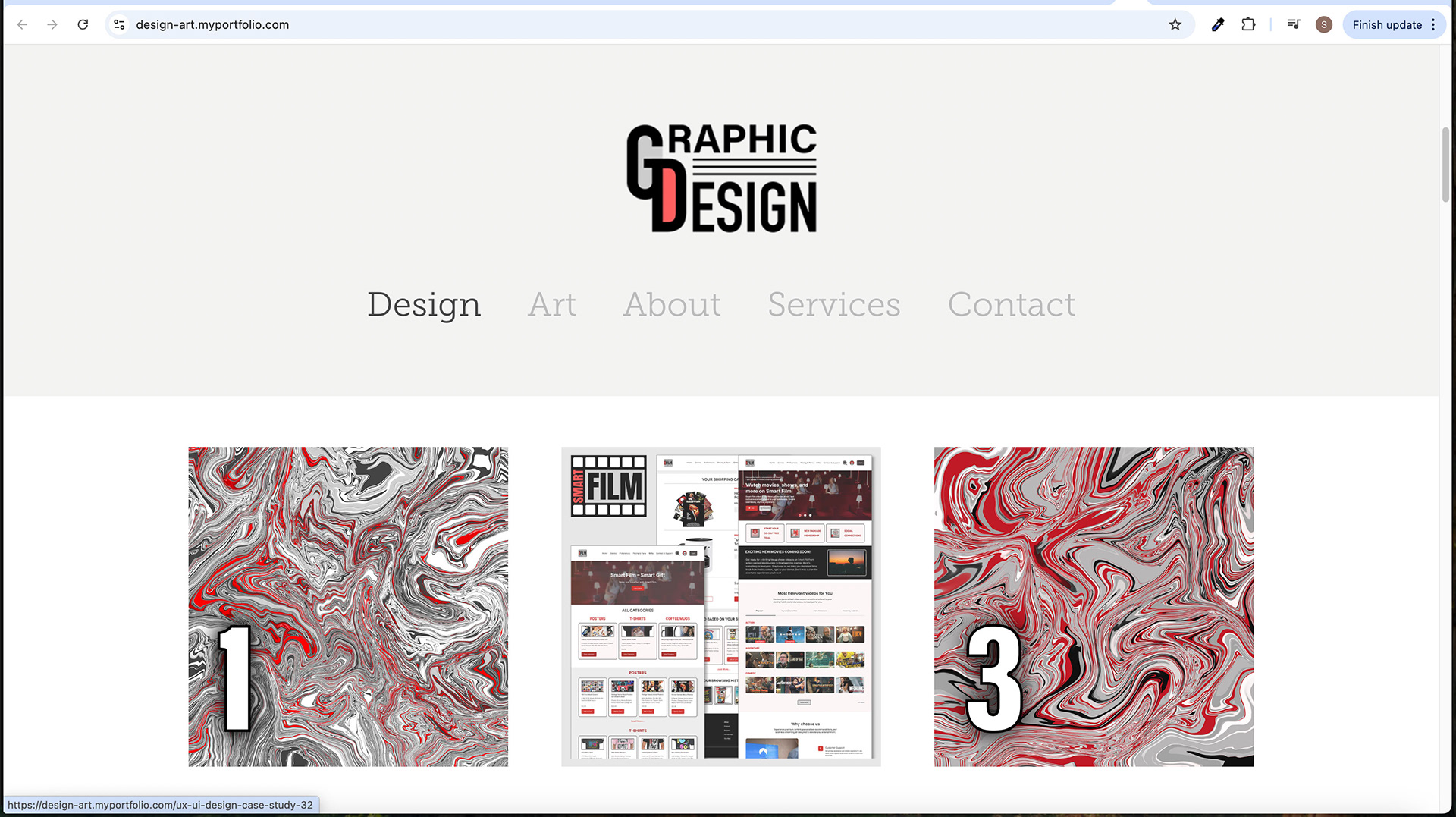
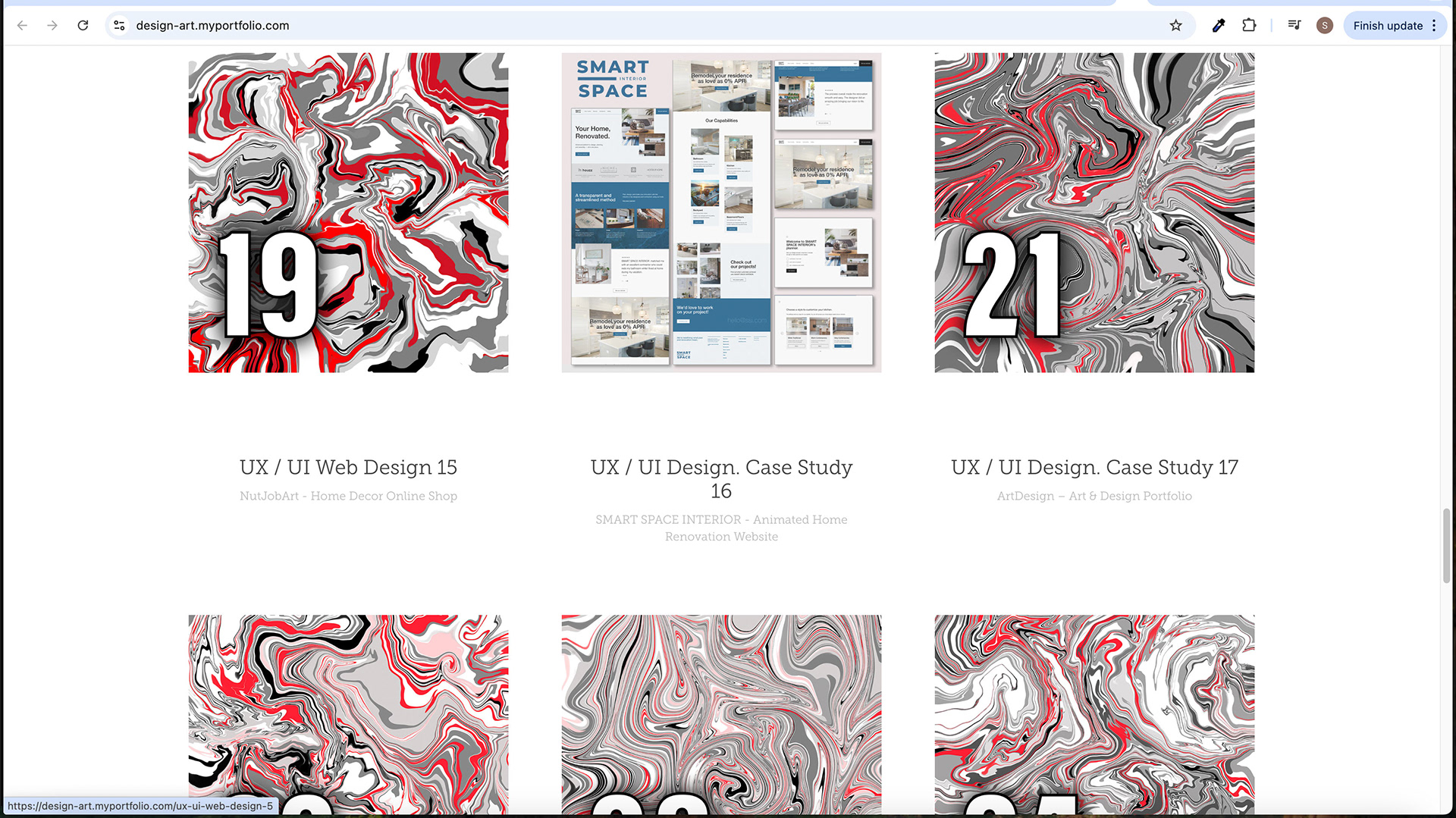
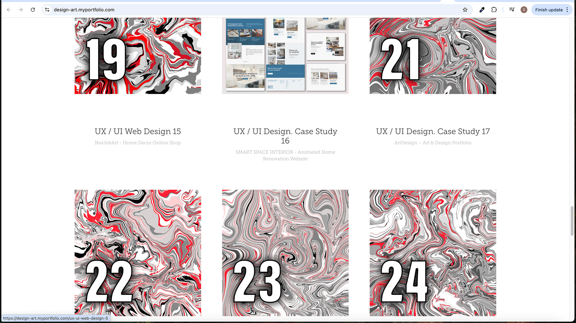
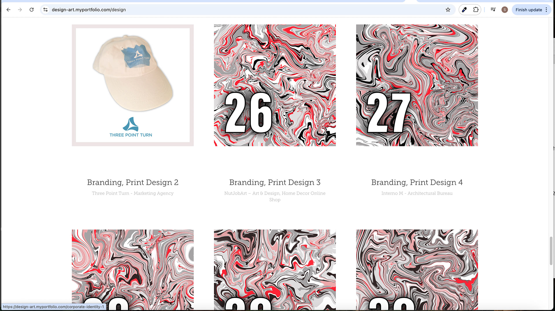
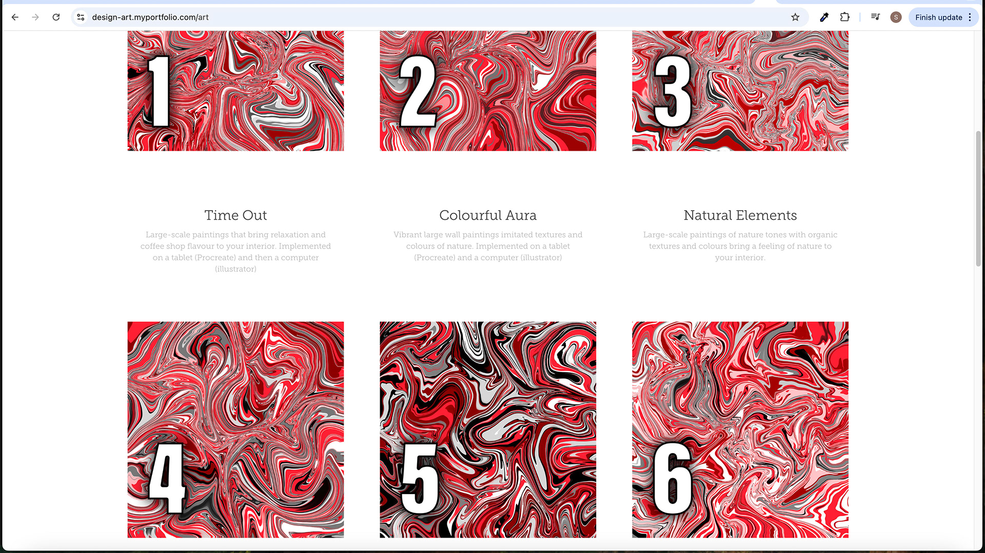
• Squares with Whimsical Textures: Each project is represented by a square with whimsical textures. These textures add a touch of creativity and visual interest to the overall design. The combination of red-grey-white-black colours creates a stylish and cohesive aesthetic, ensuring the projects stand out while maintaining a consistent visual theme throughout the website.
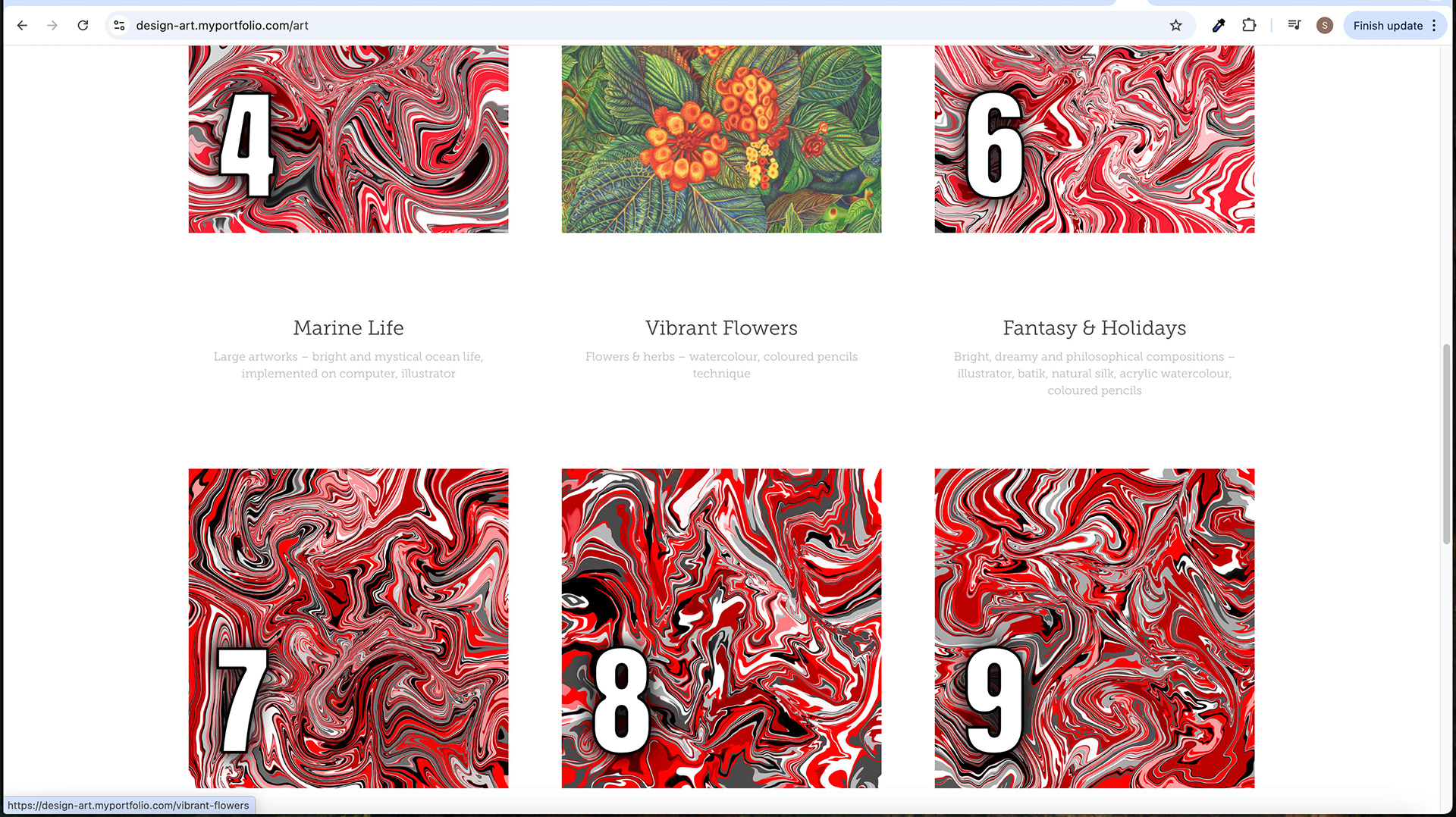
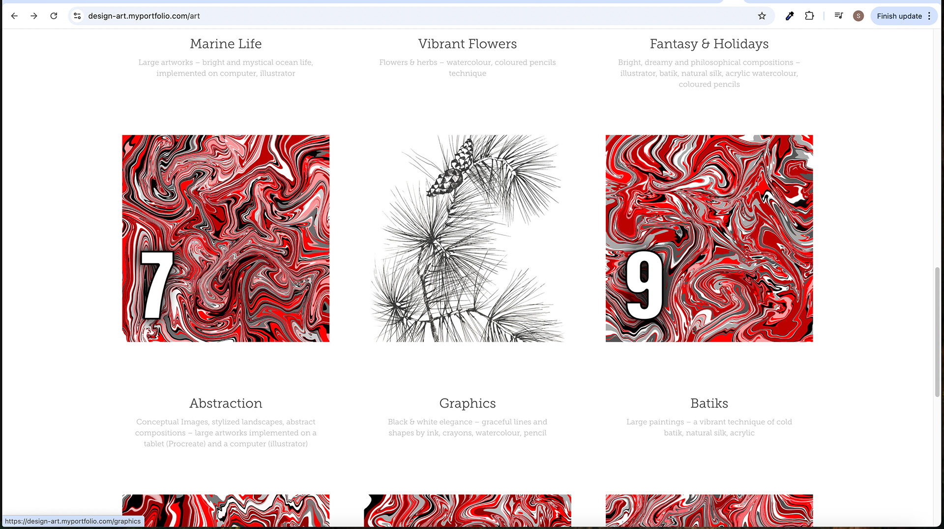
• Hover State Effect and Image Transition: When a user hovers over a square representing a project, it undergoes a hover state effect. This effect can involve a change in colour, texture, or animation, providing visual feedback to the user and indicating interactivity. Additionally, the image within the square transitions from a stylish red-grey-white-black texture to a picture depicting the related project. This transition allows users to glimpse the project's visual representation and encourages them to click for more details.
• Headlines and Descriptions: Each project square is accompanied by a headline and a description. The headline provides a brief and catchy title for the project, capturing the user's attention and conveying its essence. The description offers additional context, highlights key features or objectives, and provides a glimpse into the project's details. These headlines and descriptions play a crucial role in informing and engaging users, helping them understand the designer's creative process, problem-solving skills, and the unique aspects of each project.
The project showcase area is instrumental in showcasing the designer's competency, creativity, and style. Through the use of squares with whimsical textures, hover state effects, image transitions, and informative headlines and descriptions, users are enticed to explore the projects in more detail. This section not only allows visitors to appreciate the visual aspect of the projects but also provides valuable information to help them understand the designer's approach and capabilities.
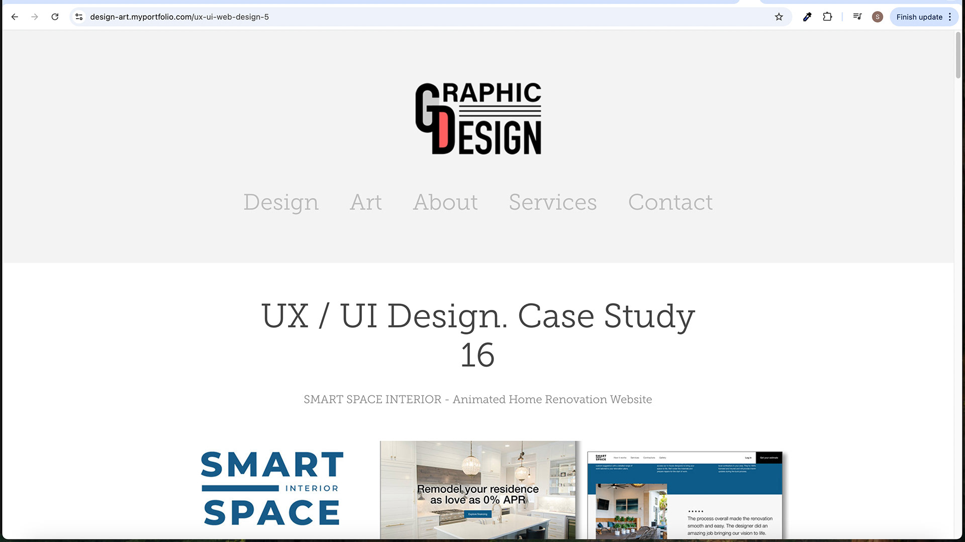
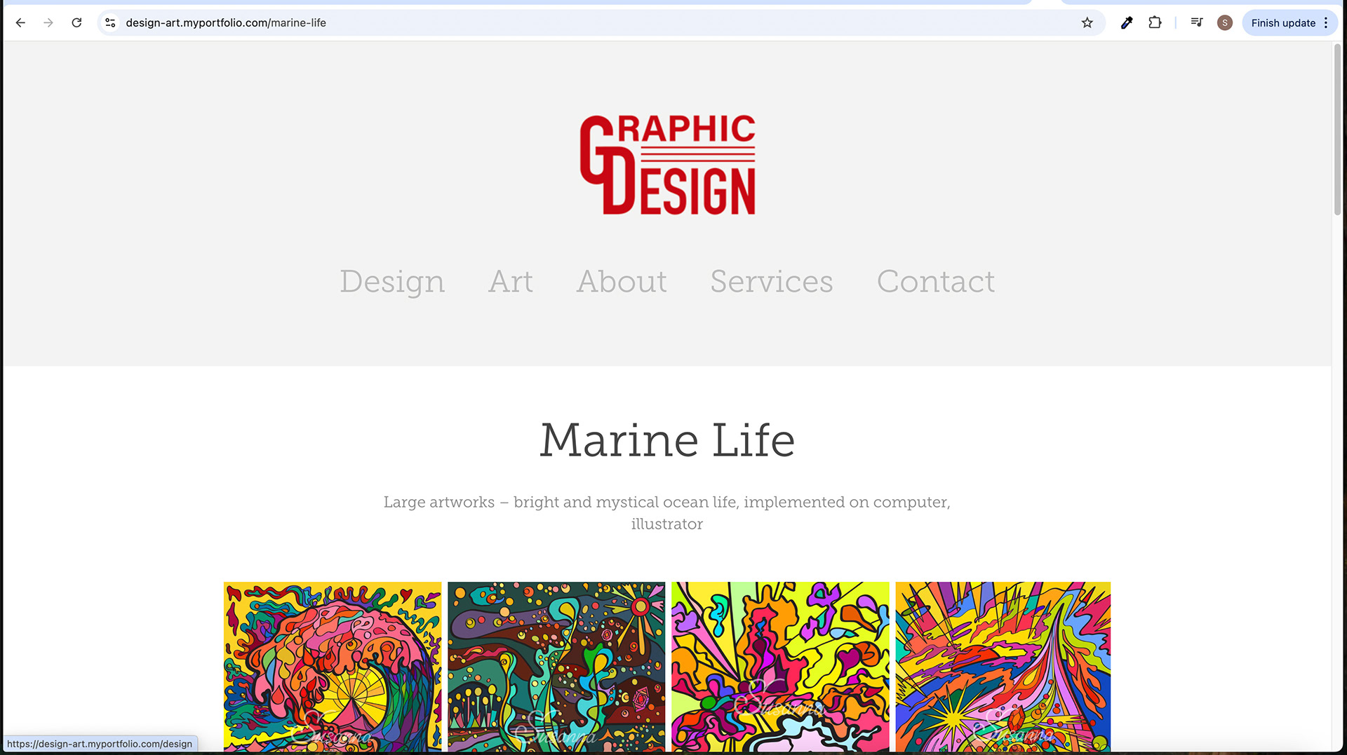
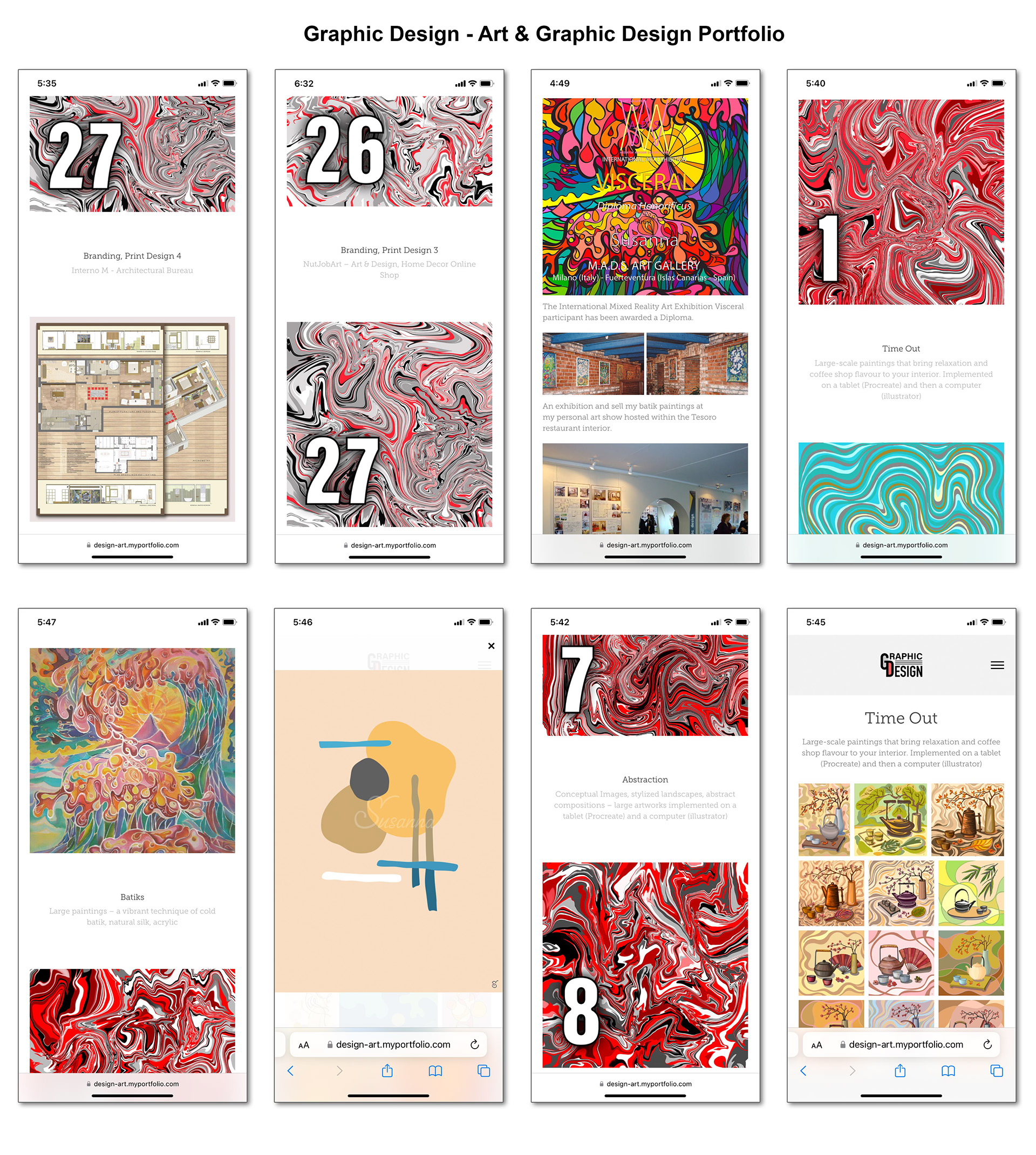
Second-Level Pages
The Graphic Design Portfolio Website includes several second-level pages, namely the Art, About, Services, and Contact pages. Each page has its unique structure and design, catering to specific information and functionalities. The following details outline the characteristics of these pages:
• Art Page: The Art page follows a similar structure to the Home page but without the masthead area. Instead, it focuses directly on showcasing the artist's artworks. The square representations for each art piece incorporate a red texture, combining red-grey-brown-black colours. This choice of blooms creates a visually appealing and cohesive aesthetic for the art section, differentiating it from the graphic design projects on the Home page.
• About Page: The About page provides information about the designer. It typically includes a heading that introduces the designer, a sub-heading that summarizes their background or expertise, and a detailed description elaborating on their skills, experience, and artistic philosophy. The page may also include relevant images, such as the designer's photo or snapshots of their workspace, to create a more personal connection with the audience.
• Services Page: The Services page outlines the design services the designer offers. It presents a comprehensive overview of the services, including their descriptions, benefits, and unique features or approaches. This page helps potential clients understand the range of services available and showcases the designer's expertise in various design domains. It may also incorporate visual elements, such as icons or images, to enhance the presentation.
• Contact Page: The Contact page serves as a means for visitors to contact the designer. It typically includes a contact form where users can input their name, email address, and message. Additionally, the Contact page may provide alternative contact information, such as an email address or phone number, for those who prefer direct communication. Clear instructions and a friendly message can guide users on how to initiate contact effectively.
Differentiation from Home Page Masthead: Unlike the Home page, the second-level pages do not feature a masthead area. The masthead area is exclusive to the Home page, creating a distinctive and impactful introduction. The absence of the masthead on the second-level pages allows for a more focused presentation of the respective content, such as art, information about the designer, services, or contact details.
The second-level pages of the Graphic Design Portfolio Website are vital in providing in-depth information and facilitating user interaction. The Art page showcases the artist's works with red-themed textures, the About page offers insights into the designer's background and expertise, the Services page outlines the available design services, and the Contact page provides a means for users to reach out. These pages enhance the overall user experience and provide a comprehensive understanding of the designer's capabilities and offerings by ensuring a cohesive design and incorporating relevant content and features.
Navigation and Interaction
The Graphic Design Portfolio Website maintains consistent navigation elements across all pages to ensure a seamless browsing experience for users. The following aspects contribute to effective navigation and interaction:
• Consistent Navigation Elements: The navigation menu, comprising the categories Design, Art, About, Services, and Contact, remains constant across all pages. This consistency allows users to easily navigate between different website sections and locate desired information without confusion. Users can access the navigation menu from any page, ensuring quick and convenient browsing.
• "Go Back" Buttons: All pages, including the second and third levels, feature "Go Back" buttons. These buttons serve as a means for users to return to the previous page or section they were viewing. When clicked, the "Go Back" buttons take users back to the previous page, facilitating effortless navigation and maintaining a smooth user experience. These buttons typically appear in black in the active state and turn red when hovered over, ensuring they are easily noticeable and clickable.
• Hover and Active States: The website's navigation and contact form buttons employ hover and active states to enhance interactivity and provide visual feedback to users. When users hover over navigation menu items, such as Design, Art, About, Services, or Contact, they may change colour (e.g., black to red) or exhibit other visual cues (e.g., underline or background highlight). This hover state effect signals users that the menu item is interactive and ready for selection.
• Contact Form Button: Similar to the navigation menu, the contact form button on the Contact page also undergoes a hover state and active state change. In the default state, the contact form button is black but transitions to red when hovering over it. This change in colour draws attention and encourages users to click on the button to access the contact form and initiate communication with the designer.
By maintaining consistent navigation elements, utilizing "Go Back" buttons, and employing hover and active states, the Graphic Design Portfolio Website ensures intuitive navigation and smooth interaction for users. These design choices contribute to a user-friendly experience, enabling visitors to explore different sections, easily return to previous pages, and engage with interactive elements effectively.
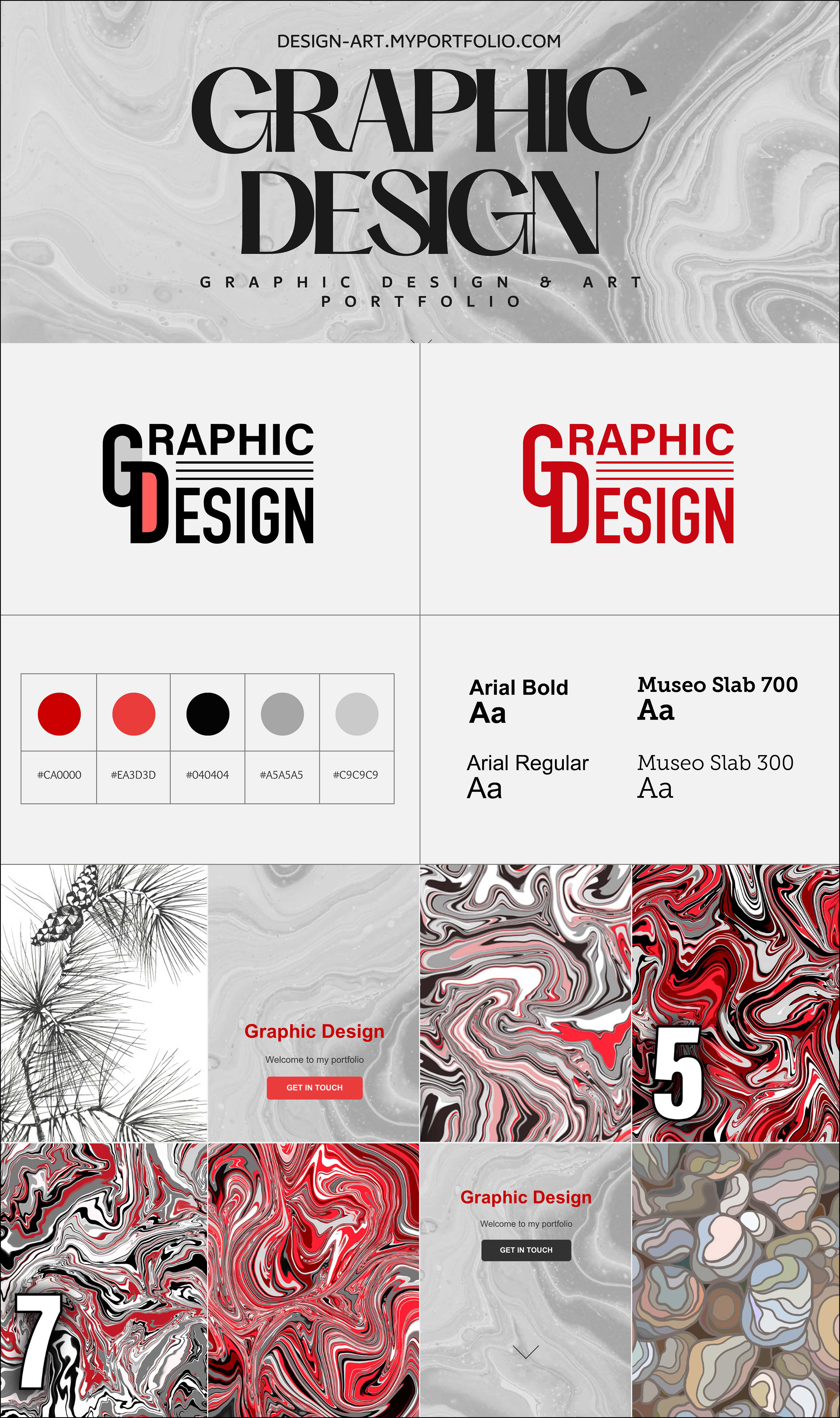
Logo Design
The logo of the Graphic Design Portfolio Website is a crucial visual element that represents the brand and creates a lasting impression on visitors. The following aspects outline the design elements and colours of the logo:
• Logo Elements and Colors: The logo incorporates the Wordmark "Graphic Design" and specific design elements. The Wordmark typically comprises three lines, where the letters "GD" are highlighted. The colours used in the logo design include black for the outlines and red and grey for the fills under the "GD" letters. These colour choices create a visually striking and harmonious combination that aligns with the brand identity.
• Significance of Wordmark: The Wordmark "Graphic Design" with three lines holds importance as it succinctly communicates the core focus of the portfolio website. It indicates that the website showcases graphic design work, instantly conveying the designer's area of expertise to visitors. Using three lines adds visual interest and creates a distinctive aesthetic, capturing attention and making the logo memorable.
• Hover-In State: The logo design incorporates a hover-in state, which means that when users hover their cursor over the logo, it undergoes a visual change typically, during the hover-in state, the logo's colour, particularly the Wordmark's fill colour, transitions to red. This colour change provides an interactive and dynamic effect, capturing users' attention and reinforcing the brand's visual identity. The hover-in state of the logo creates an engaging experience, encouraging users to interact with the logo and explore the website further.
The logo design of the Graphic Design Portfolio Website plays a crucial role in representing the brand and making a memorable impact on visitors. Using the Wordmark "Graphic Design" with three lines and appropriate colour choices, the logo effectively communicates the website's focus. Additionally, the hover-in state adds interactivity and visual appeal, enhancing user engagement and reinforcing the brand identity.
Brand Colors and Typography
The Graphic Design Portfolio Website has carefully selected brand colours and typography to create a cohesive and visually appealing design. The following details outline the significance of the brand colours and the chosen typography:
Brand Colors:
• #c80813: This vibrant red color, represented by the hexadecimal code #c80813, serves as the primary brand color. It is bold, attention-grabbing, and evokes a sense of energy and passion. This colour throughout the website helps establish a strong visual identity and makes key elements, such as headlines and interactive elements, stand out.
• #333333, #000000, #3f3f2, #444444, #bbbbbb: These neutral colours, including various shades of grey and black, are used strategically to provide contrast, balance, and readability. They serve as background colours, outlines, or fills in different website sections. The neutral colour palette creates a clean and modern look while allowing the content and design elements to take center stage.
Typography:
• Museo Slab 300 and Museo Slab 500: The chosen Graphic Design Portfolio Website typography is Museo Slab, specifically the 300 and 500 weights. Museo Slab is a sturdy and elegant typeface with a distinct character. The 300 weight offers a lighter and more delicate appearance, while the 500 gives a bolder and more prominent presence.
Museo Slab typography adds a touch of sophistication and professionalism to the website's overall design. The combination of the 300 and 500 weights allows for versatility in highlighting different sections, headlines, and body text. The clean lines and geometric shapes of Museo Slab enhance readability and create a visual hierarchy, guiding users through the content seamlessly.
By employing the vibrant red colour and a neutral colour palette, along with the Museo Slab typography, the Graphic Design Portfolio Website achieves a harmonious and visually engaging aesthetic. The brand colours and typography work together to convey the designer's style, professionalism, and attention to detail while enhancing the overall user experience.
Third-Level Pages
The Graphic Design Portfolio Website incorporates third-level pages to provide more detailed information and showcase specific aspects of the designer's work. The following points describe the structure and design of these pages, along with the functionality of various elements:
• Structure and Design: The third-level pages follow a consistent structure in layout and design. They typically include a heading that briefly describes the page's content, sub-headings to further categorize or elaborate on the topic, and descriptions that provide comprehensive information about the specific area being explored. This structured approach ensures clarity and ease of navigation for users.
• Headings, Sub-headings, and Descriptions: The titles in the third-level pages act as explicit identifiers for the presented content. They provide a concise section overview and help users quickly understand what they can expect. Subheadings are used to further organize and categorize information within the page, enabling users to navigate through different sections efficiently. Descriptions offer in-depth details about the specific topic or project, providing valuable insights and context for visitors.
• Gallery Images: The third-level pages often feature gallery images to showcase the designer's work visually appealingly. These images represent the projects or artworks being highlighted on the respective pages. Users can view these images in both normal mode and lightbox mode. Usually, the images are displayed within the page's content, allowing users to glimpse the design. In the lightbox mode, users can click on an image to open it in a larger, more detailed view, providing a closer examination of the artwork.
• Buttons: The third-level pages incorporate various controls with specific purposes. These buttons may include a Prototype button, which directs users to interact with a prototype or demo of a project, allowing them to experience the design firsthand. Additionally, the pages often feature a Go Back button, typically in black when in the active state and red when hovered over, enabling users to easily navigate back to the previous page or section they were viewing. These buttons enhance user navigation and provide convenient access to additional content and functionality.
The third-level pages of the Graphic Design Portfolio Website offer a comprehensive exploration of specific projects or areas of focus. Through the strategic use of headings, sub-headings, and descriptions, along with the inclusion of gallery images and functional buttons, these pages provide a rich and engaging experience for users. They allow visitors to delve deeper into the designer's portfolio, gain insights into their creative process, and interact with the showcased work.
Conclusion
In this case study, we explored a Graphic Design Portfolio Website's design and user experience aspects. Let's recap the key points covered throughout the study and evaluate the effectiveness of the design choices, as well as reflect on the achievement of the project goals.
The case study discussed the following points:
1. Introduction: Provided a brief overview of the project and outlined the purpose and goals of the portfolio website.
2. Target Audience: Identified the target audience for the website and gained an understanding of their needs, preferences, and expectations.
3. Design Strategy: Discussed the design approach, methodology, and key considerations for UX and UI design.
4. Home Page Design: Described the masthead area, the use of texture image and neutral background, the significance of the bold red heading and slogan, the functionality of the "Get In Touch" button, and the purpose of the scrolling arrow.
5. Navigation Menu: Provided an overview of the menu structure and categories, described the design and placement of the menu, and explained the hover and active states of the menu items.
6. Project Showcase: Detailed the project showcase area, the squares with whimsical textures for projects, the functionality of the hover state effect and image transition, and the importance of headlines and descriptions for each project.
7. Second-Level Pages: Described the structure and design of Art, About, Services, and Contact pages, differentiated the masthead area on the Home page from other pages, explained the red texture for Art page squares, and provided an overview of the content and features of About, Services, and Contact pages.
8. Navigation and Interaction: Discussed the consistent navigation elements across all pages, the functionality and design of the "Go Back" buttons, and highlighted the hover and active states of navigation and contact form buttons.
9. Logo Design: Described the logo design elements and colours, explained the significance of the Wordmark "Graphic Design" with three lines, and discussed the impact of the hover-in state on the logo.
10. Brand Colors and Typography: Provided an overview of the brand colours and their significance and explained the chosen typography (Museo Slab 300 and Museo Slab 500).
11. Third-Level Pages: Described the structure and design of the pages at the deepest level, explained the headings, sub-headings, and descriptions, discussed the gallery images and their functionality and provided an overview of the buttons and their purposes.
Evaluation: The design choices made for the Graphic Design Portfolio Website appear to be effective in achieving the project goals. Using a visually appealing masthead area, an engaging project showcase with whimsical textures, and consistent navigation elements contribute to a user-friendly and immersive experience. The chosen typography, Museo Slab 300 and Museo Slab 500 adds a touch of sophistication and enhances readability. The brand colours, particularly the vibrant red, create visual impact and help draw attention to essential elements.
The hover and active states of various buttons and menu items provide clear feedback and affordance, enhancing the website's interactivity. Including lightbox functionality for gallery, images allows users to view the designs in detail, adding depth to the visual experience. Overall, the design choices align well with the target audience's needs, showcasing the designer's competency most efficiently and creatively.
Reflection: The Graphic Design Portfolio Website successfully achieved its goals of showcasing the designer's competence in a visually appealing and user-friendly manner. The design strategy, including the attention to UX and UI considerations, resulted in an engaging experience for the target audience. The structure and design of the pages, along with the thoughtful placement of navigation elements, enable easy exploration and navigation through the website.
The brand colours and typography contribute to a cohesive and professional visual identity. At the same time, the functionality of buttons, hover effects, and image transitions add interactivity and enhance the overall user experience. Including detailed descriptions, headlines, and sub-headings provides valuable context and information for the showcased projects.
The project successfully captures the target audience's attention and allows them to navigate through various levels of content seamlessly. Using the masthead area, navigation menu, and consistent design elements across all pages ensures a cohesive and intuitive browsing experience.
Throughout the case study, it is evident that careful consideration was given to the needs and preferences of the target audience. The chosen brand colours, typography, and design elements effectively convey the designer's creativity, professionalism, and attention to detail.
In conclusion, the Graphic Design Portfolio Website showcases the designer's competency most efficiently and creatively. The well-designed structure, visually appealing elements, and thoughtful user experience considerations make it a compelling platform for graphic designers and artists to showcase their work. By combining effective navigation, engaging project showcases, and a visually cohesive design, the website successfully presents the designer's portfolio in a compelling and user-friendly manner.