UI Design, BRANDING

Cover - Project Overview

ARTDESIGN - Project Overview
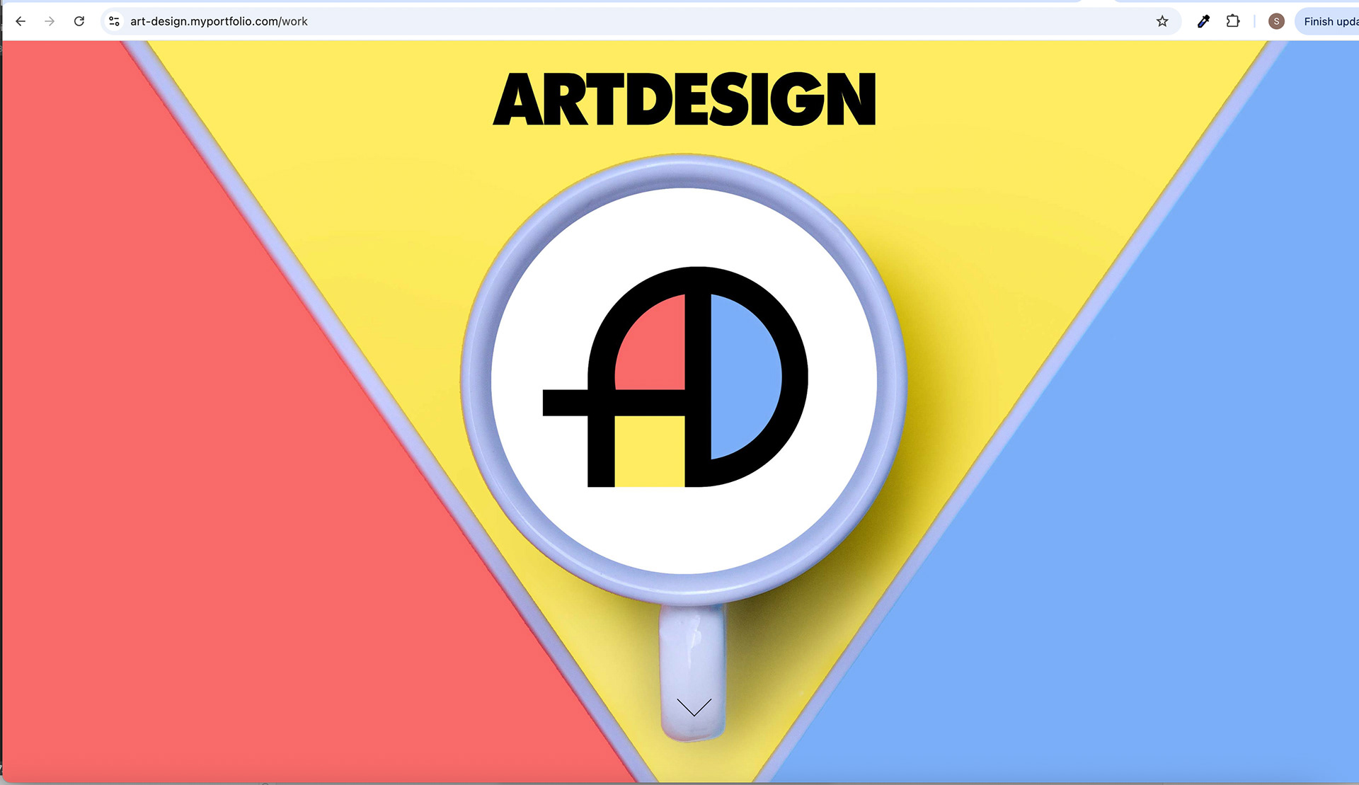
Splash Screen with Down Arrow
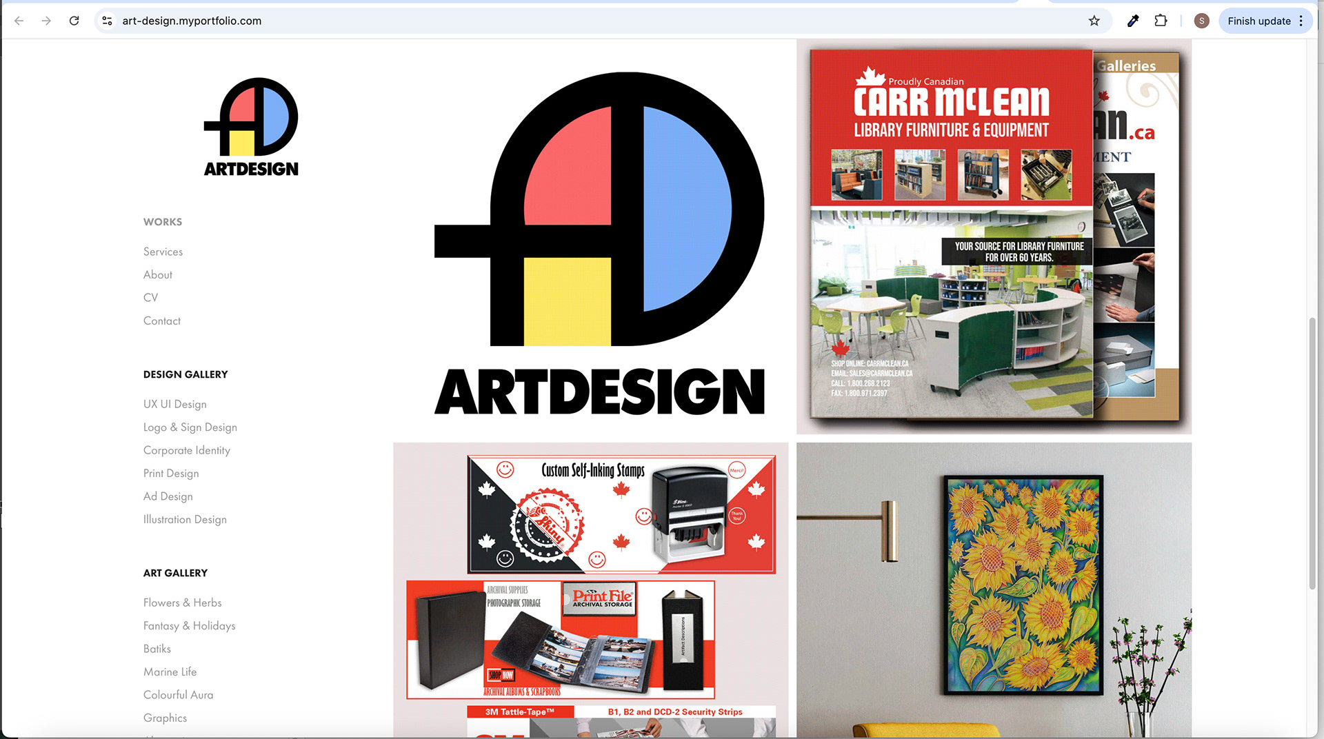
Home Screen with GIF Animation
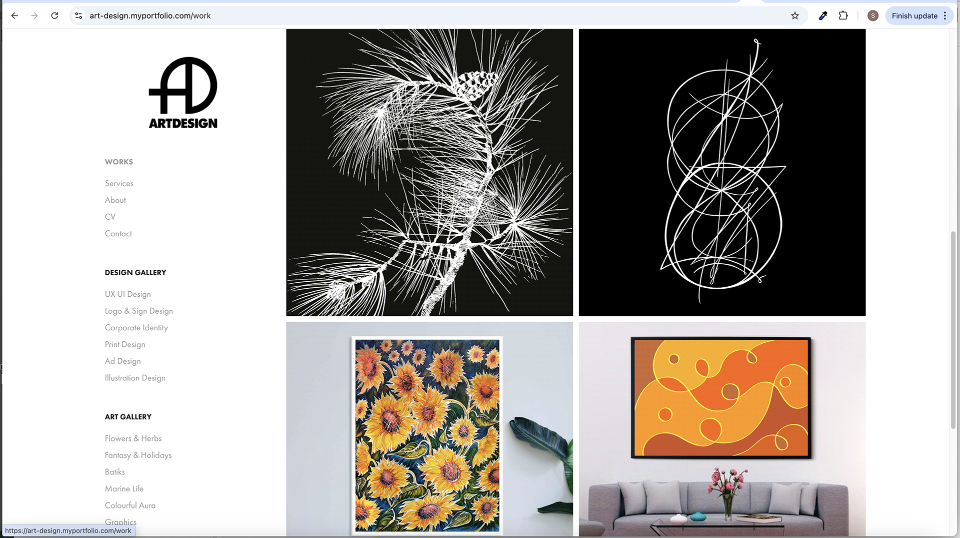
Home Screen Logo with rHover Effect and with GIF Animation.

Home Screen with GIF Animation
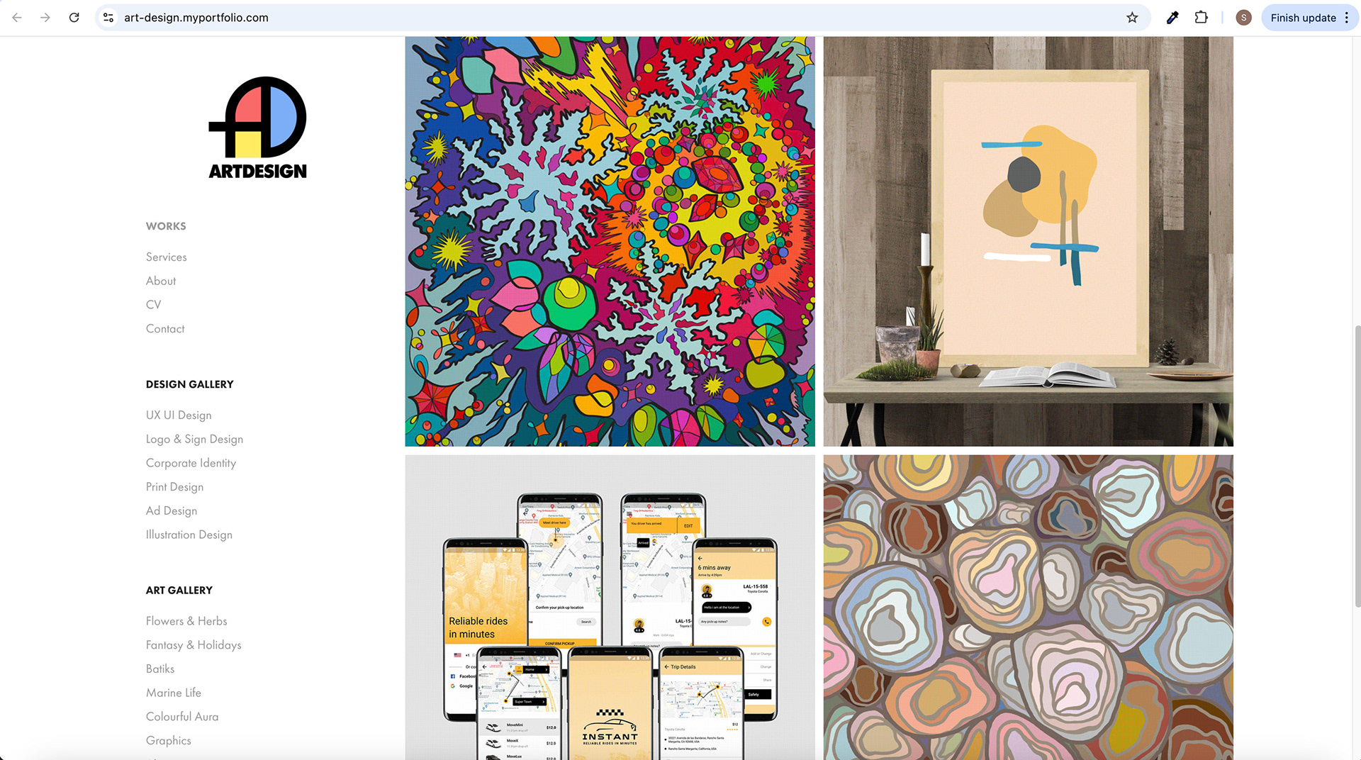
Home Screen with GIF Animation
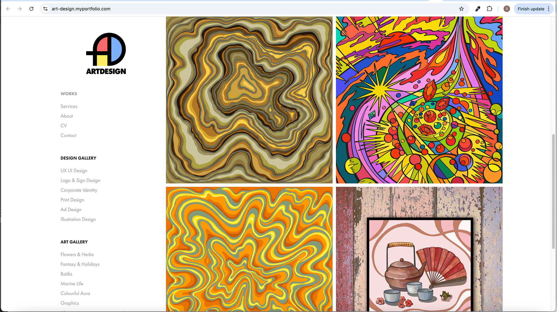
Home Screen with GIF Animation

Home Screen with GIF Animation
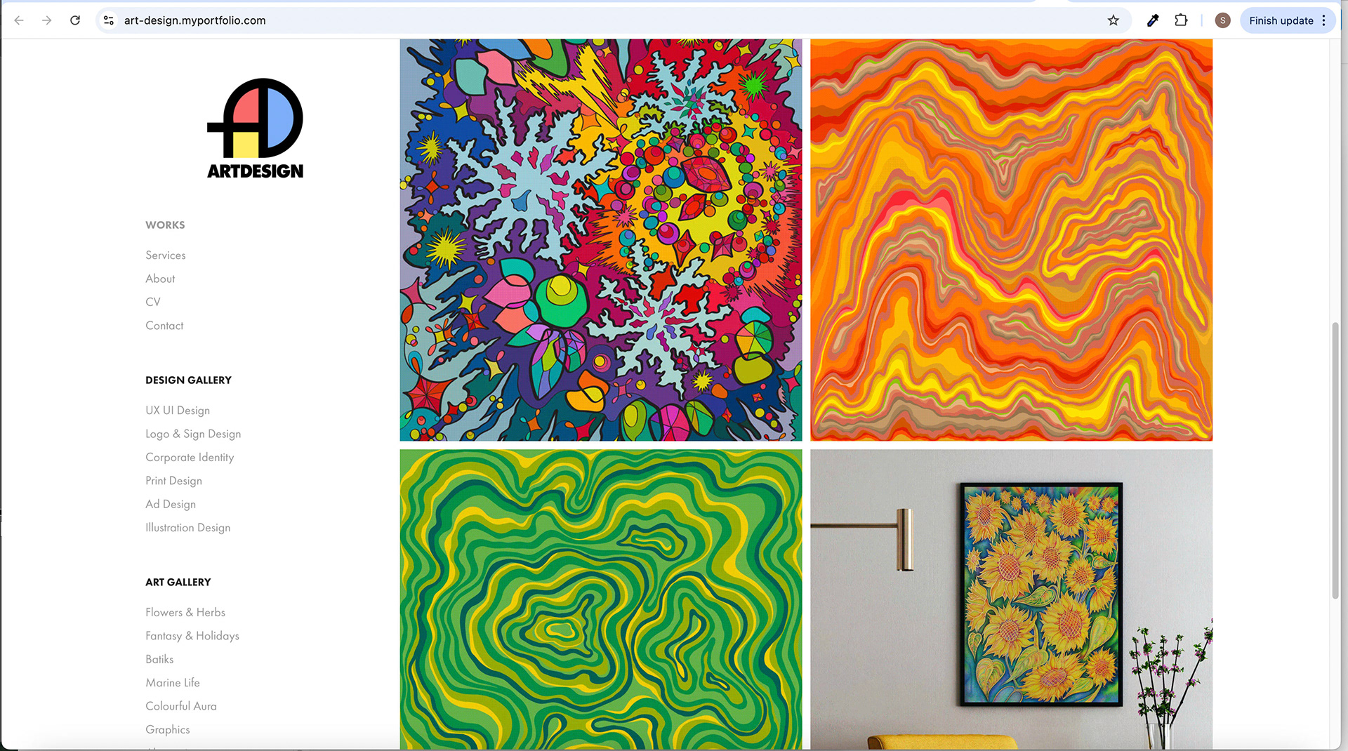
Home Screen with GIF Animation
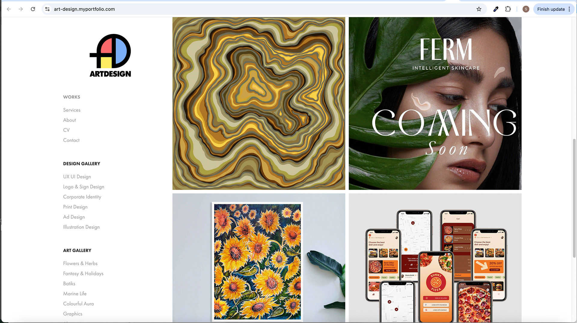
Home Screen with GIF Animation
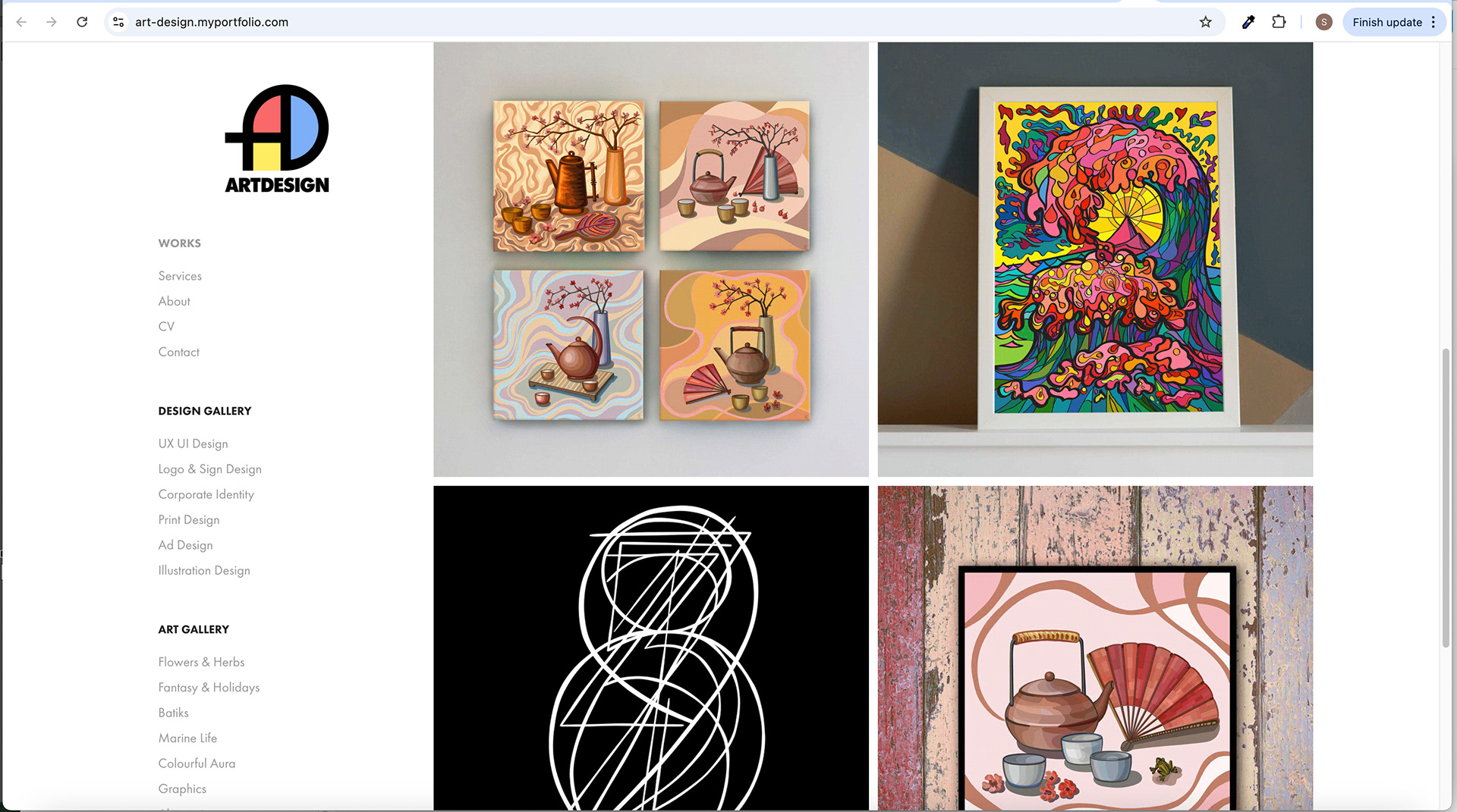
Home Screen with GIF Animation
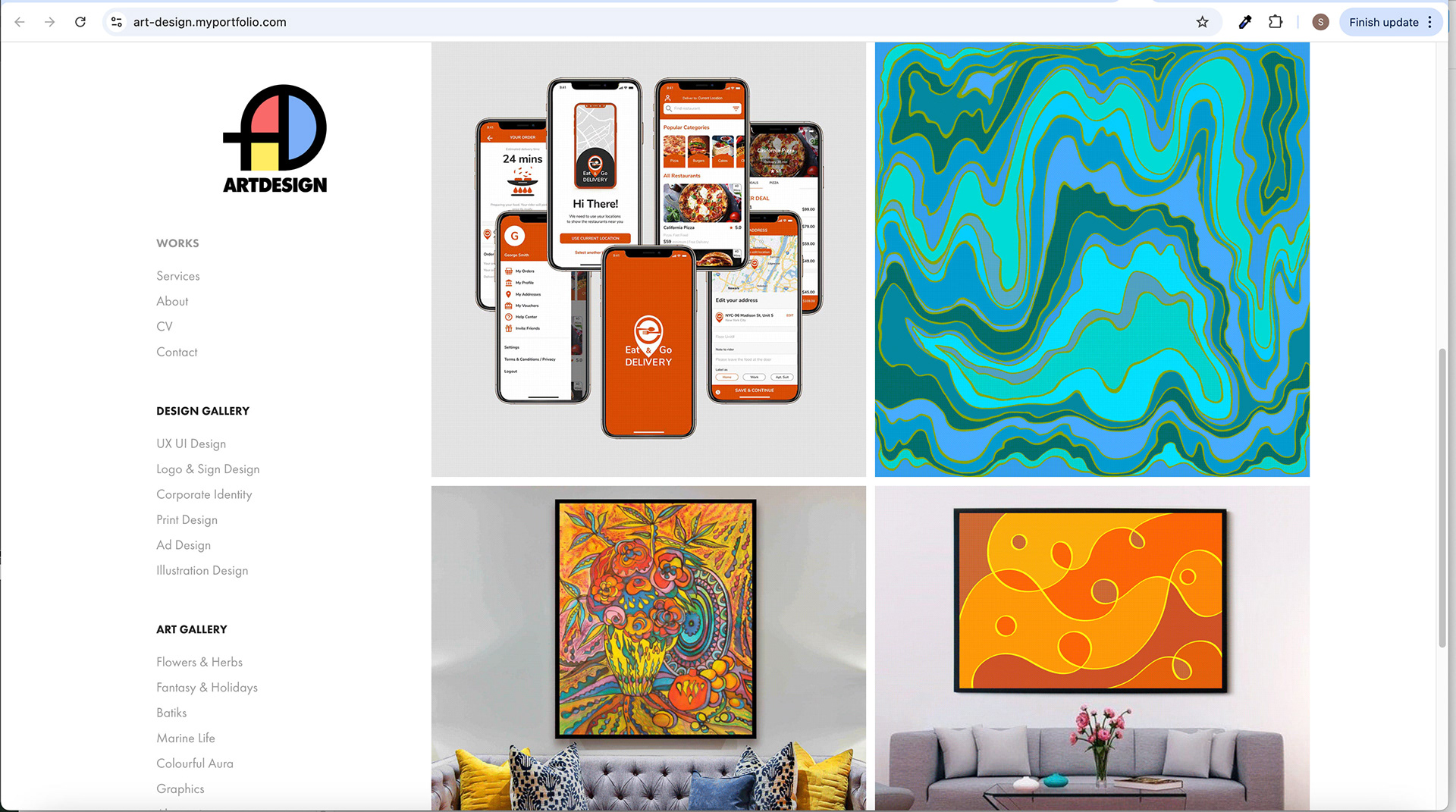
Home Screen with GIF Animation
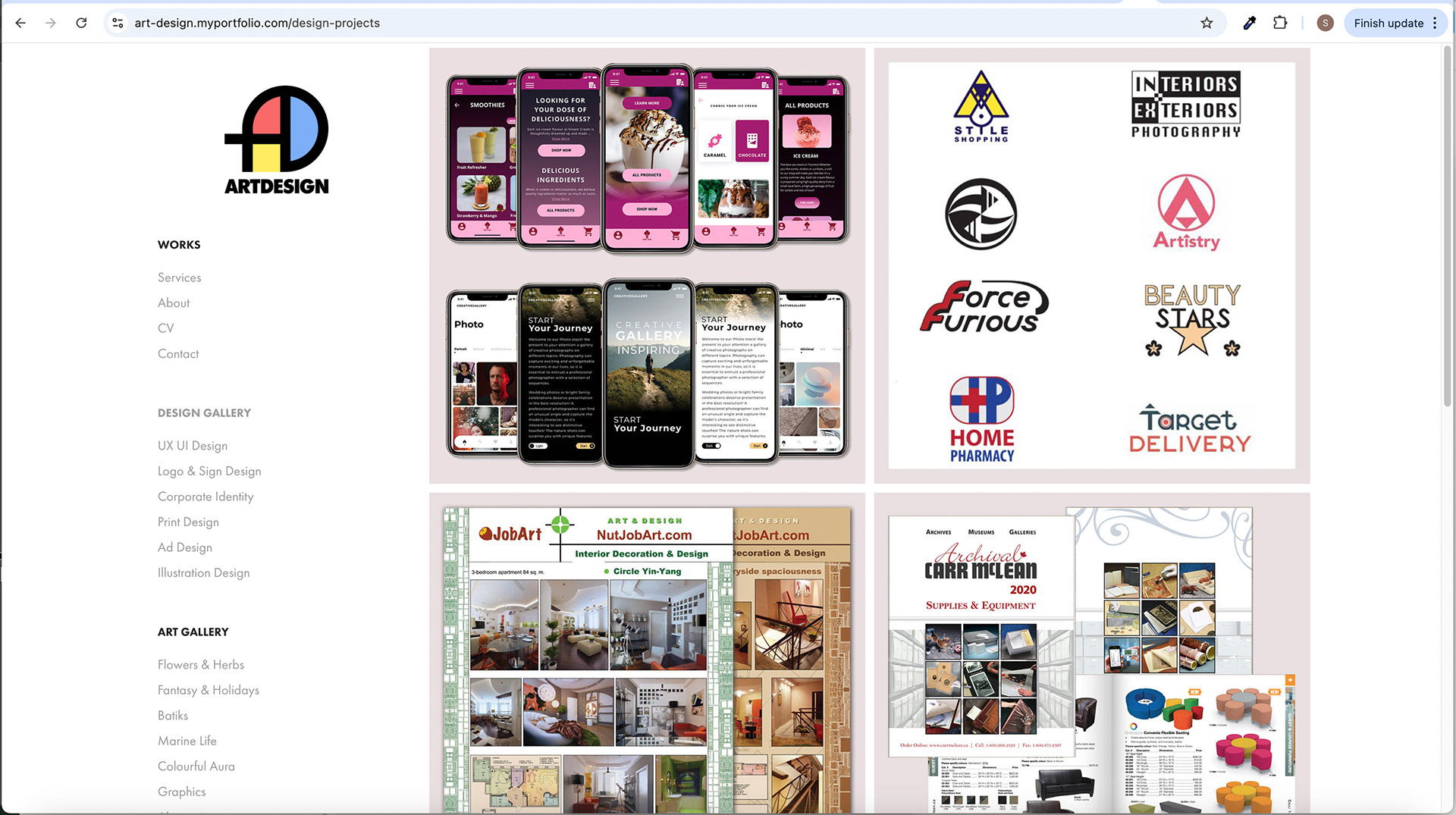
DESIGN GALLERY Screen
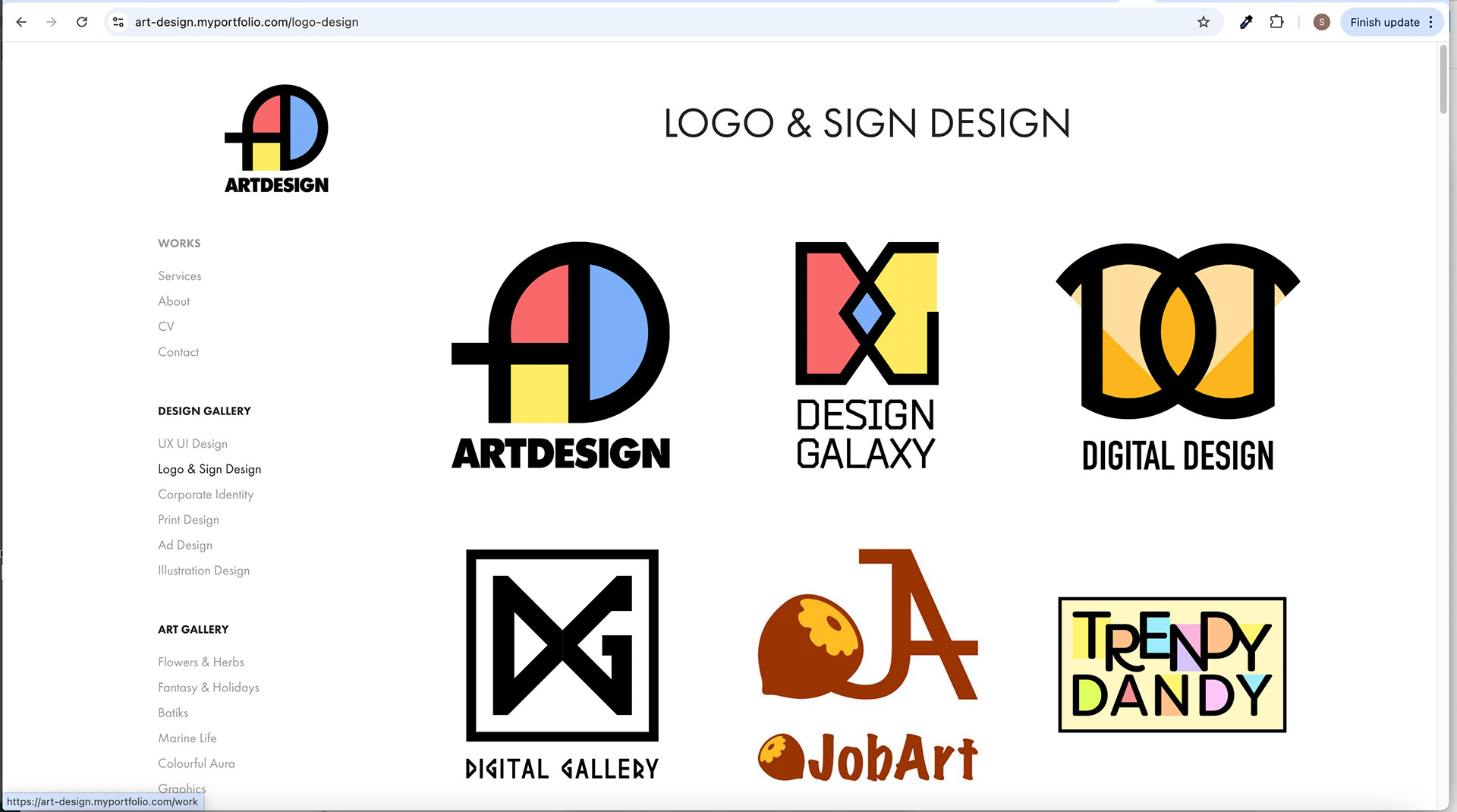
DESIGN GALLERY Subpage
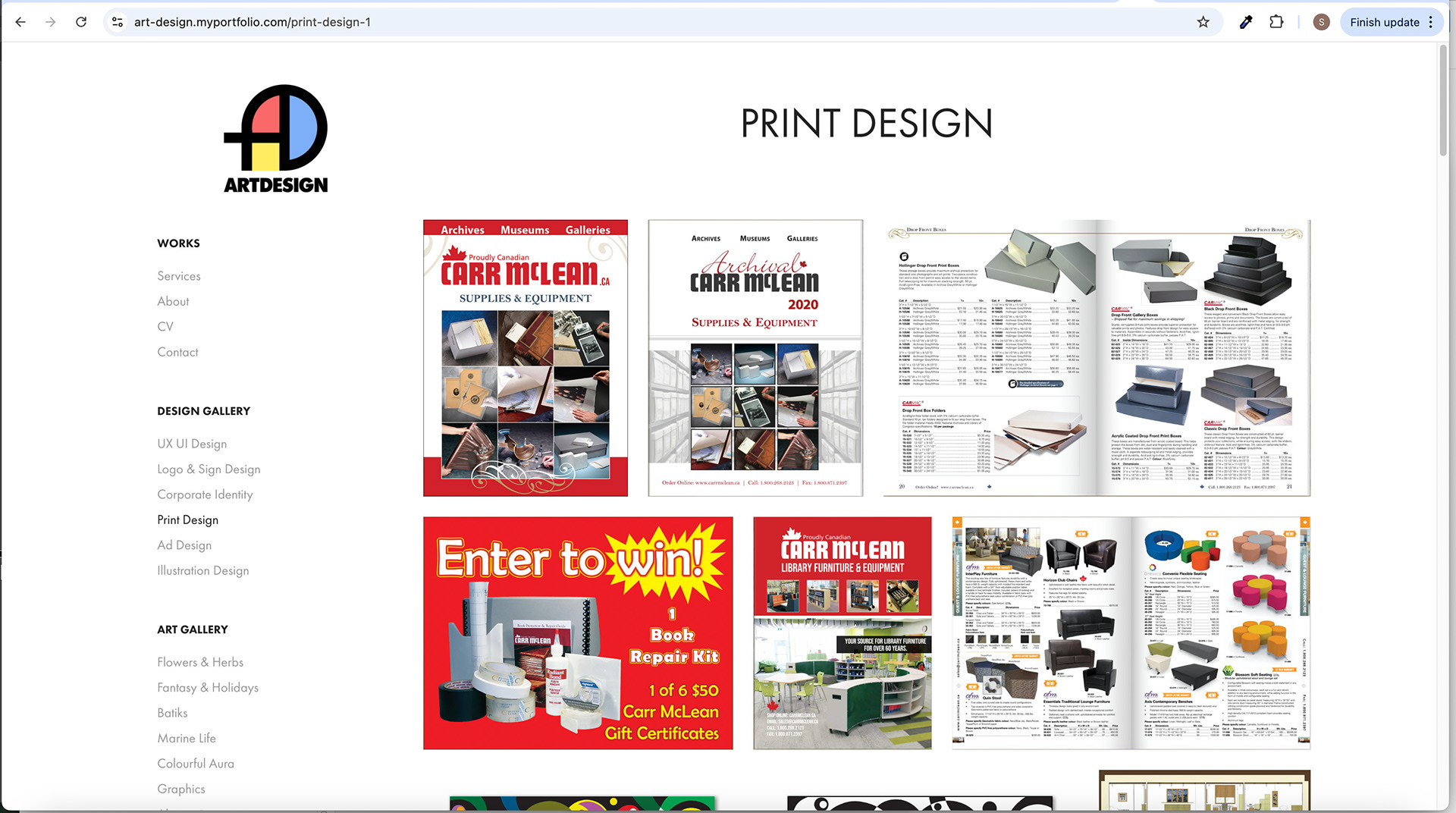
DESIGN GALLERY Subpage
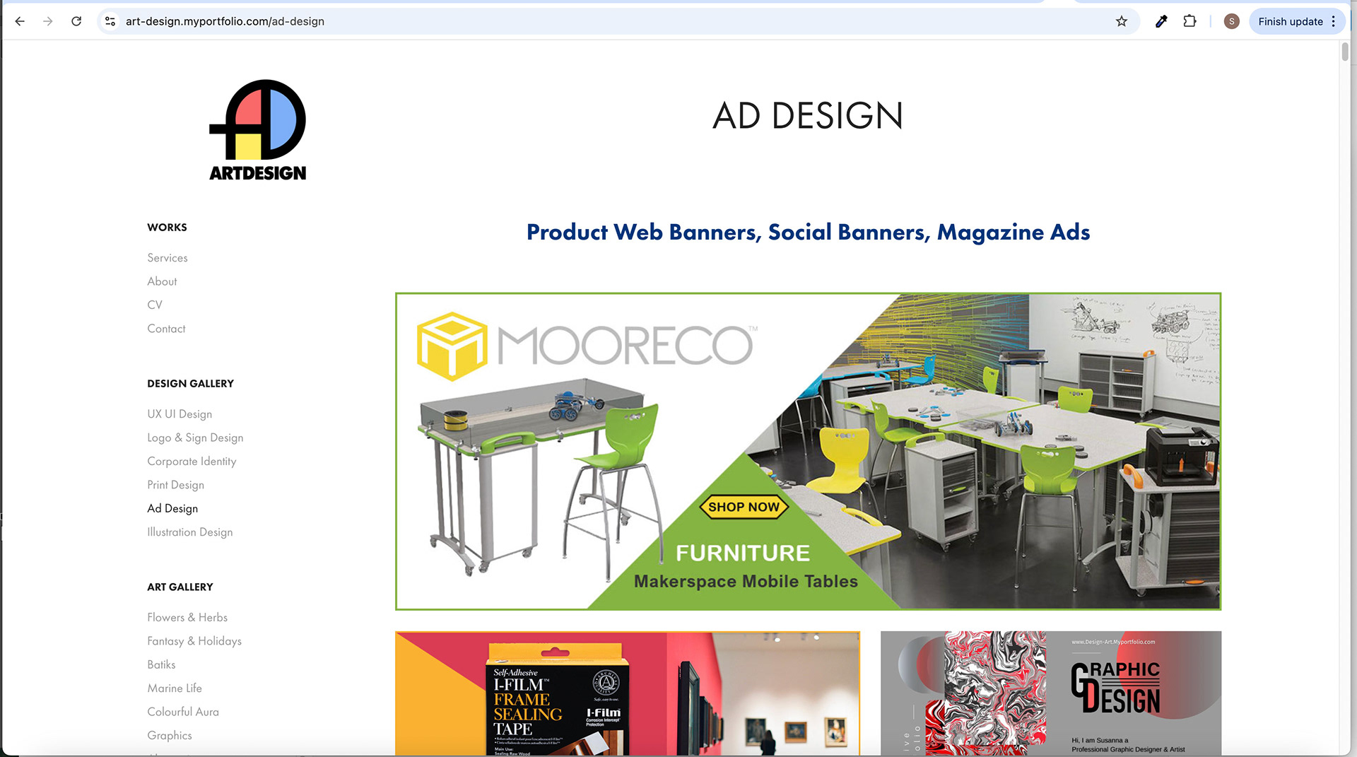
DESIGN GALLERY Subpage
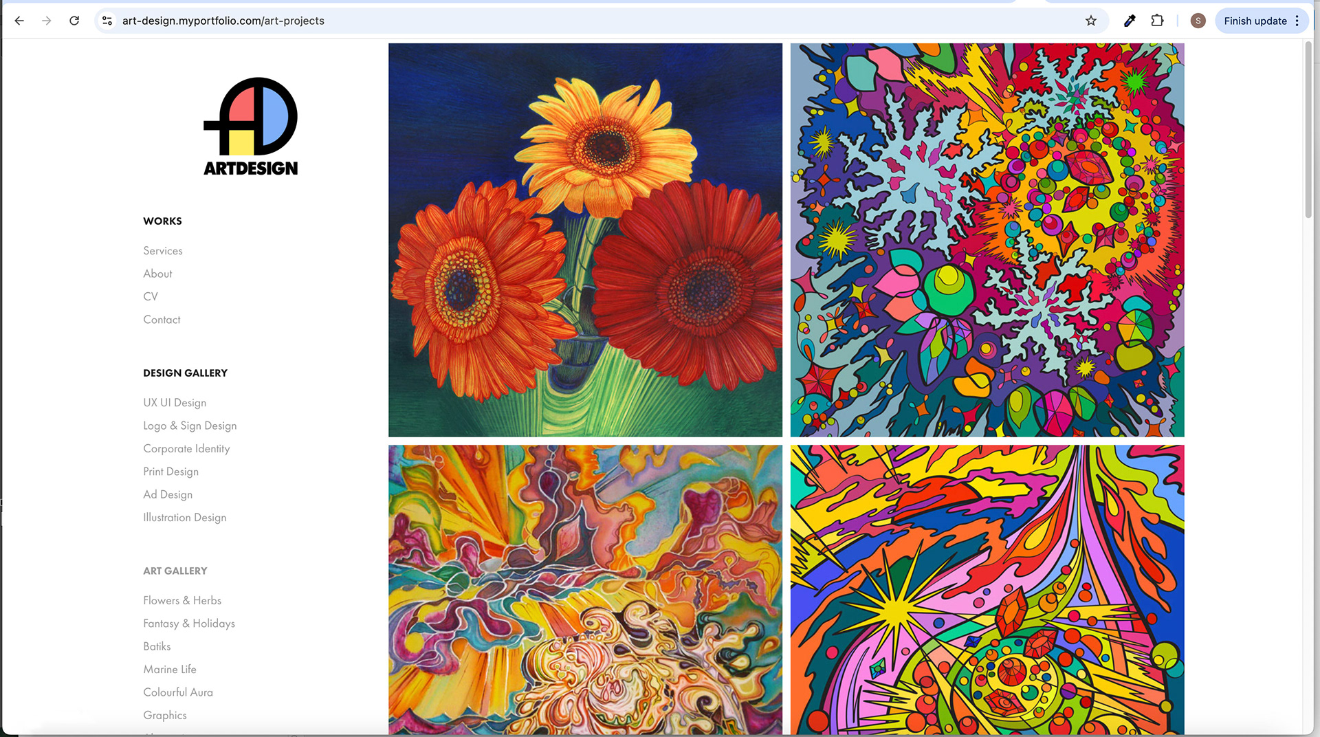
ART GALLERY Screen
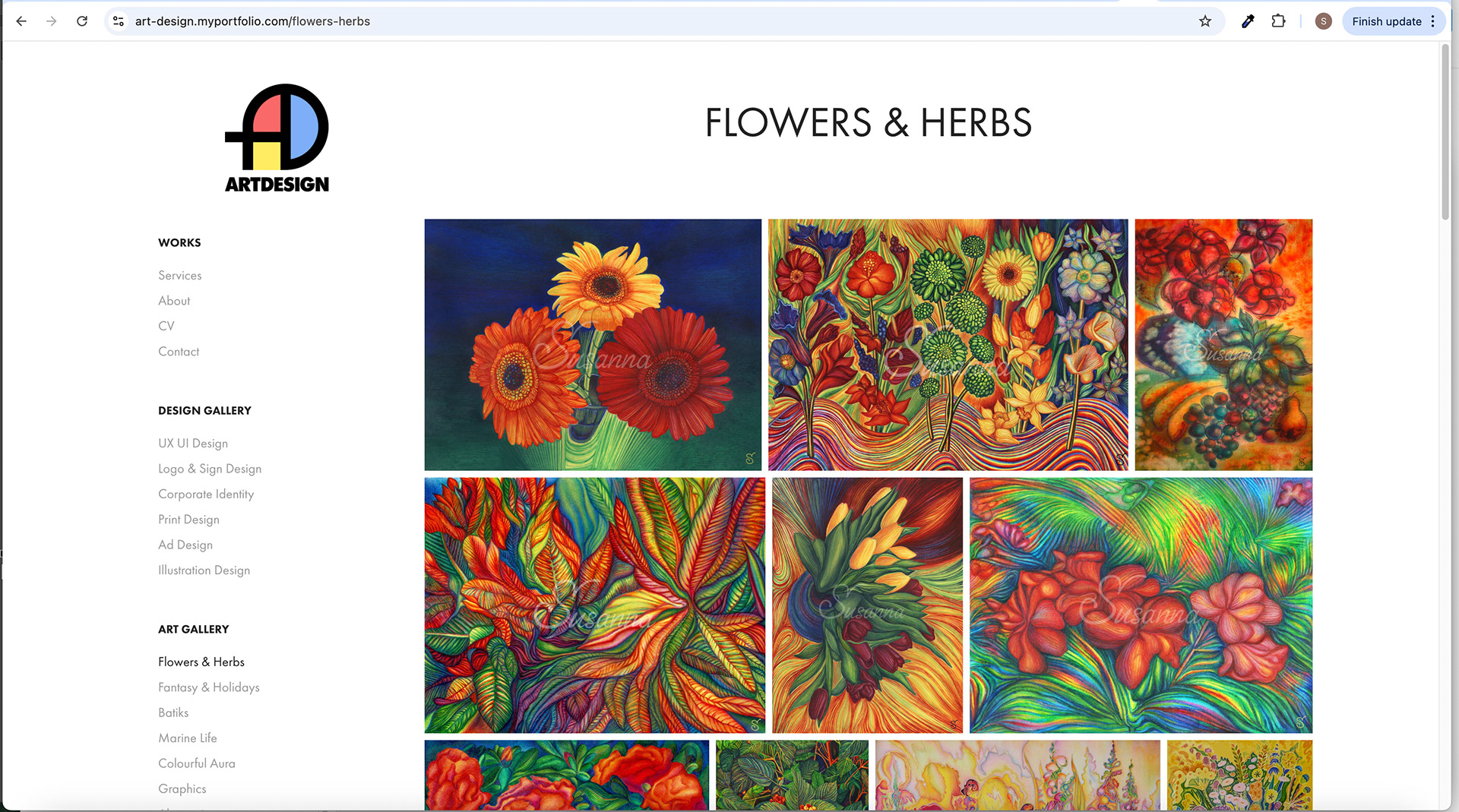
ART GALLERY Subpage
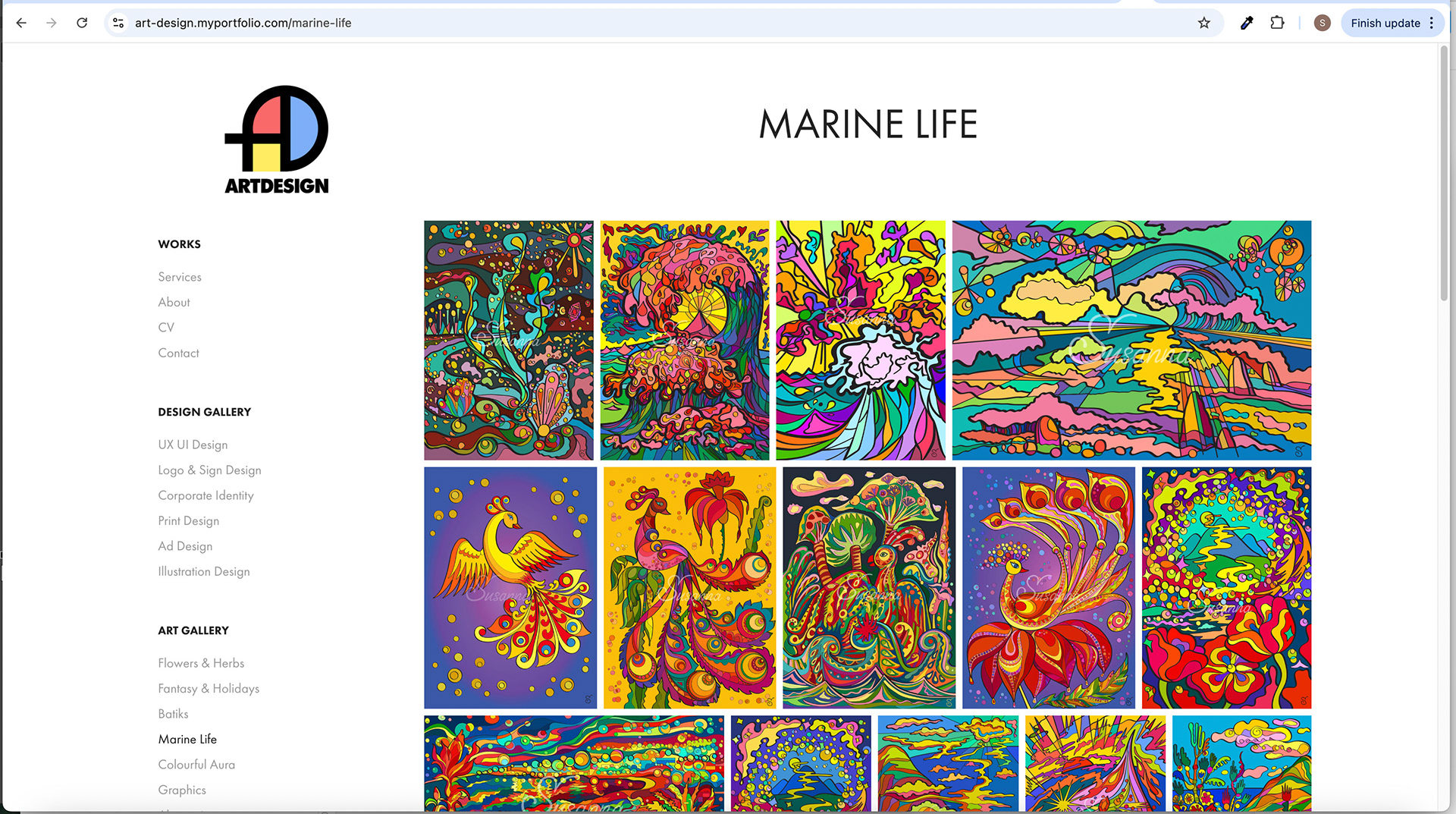
ART GALLERY Subpage

ART GALLERY Subpage
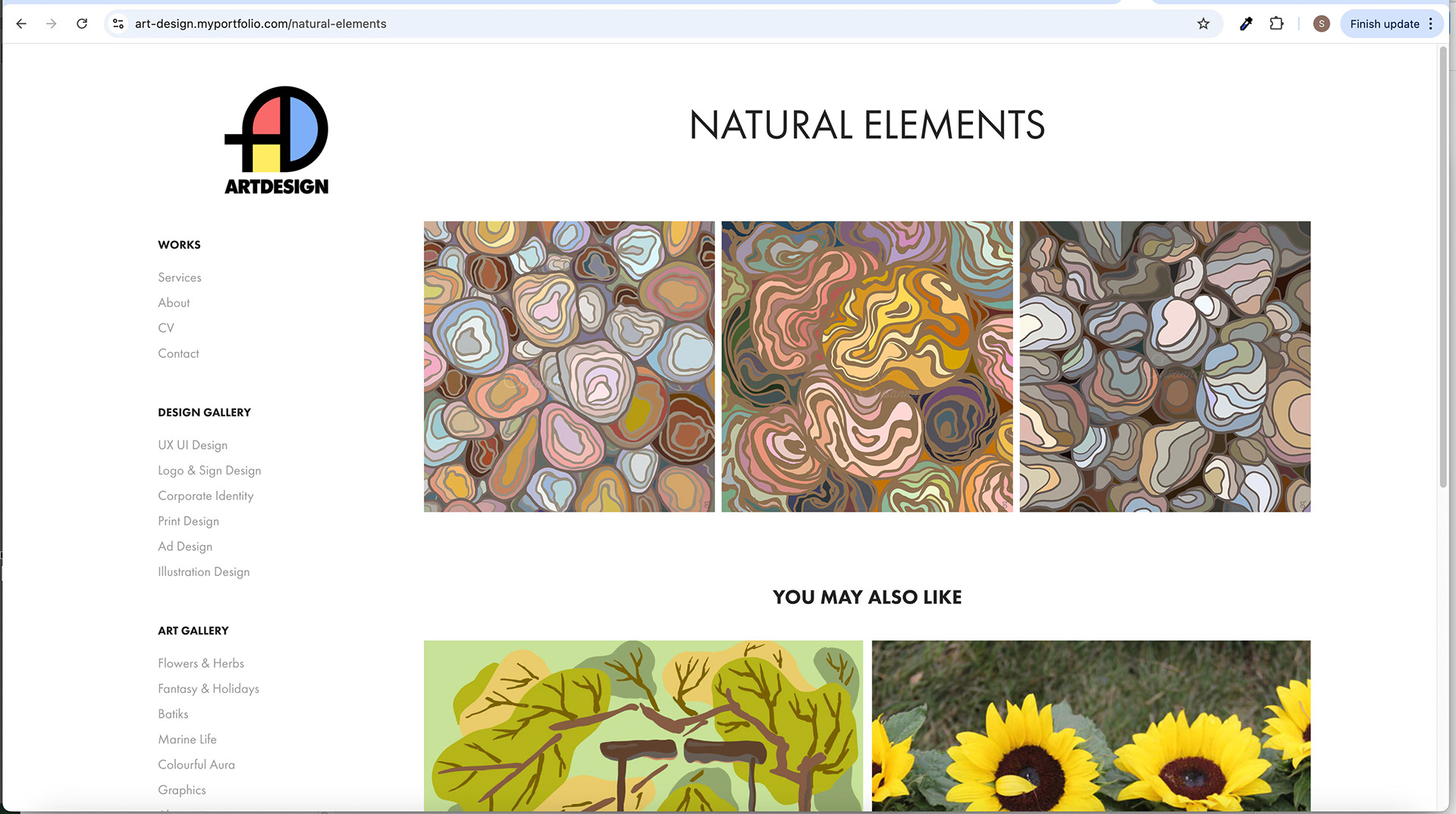
ART GALLERY - Subpage with Related Products at the Bottom
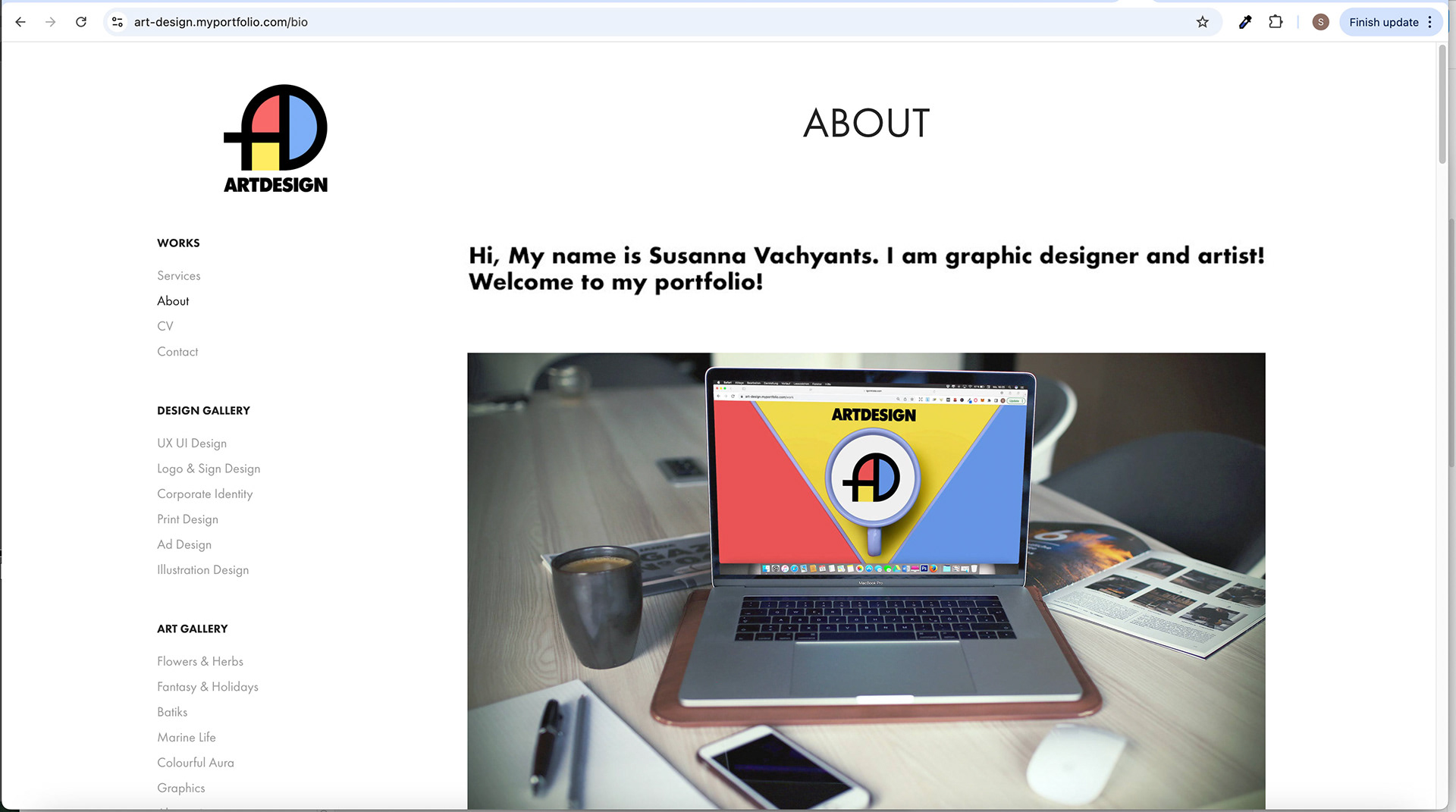
About Us Screen
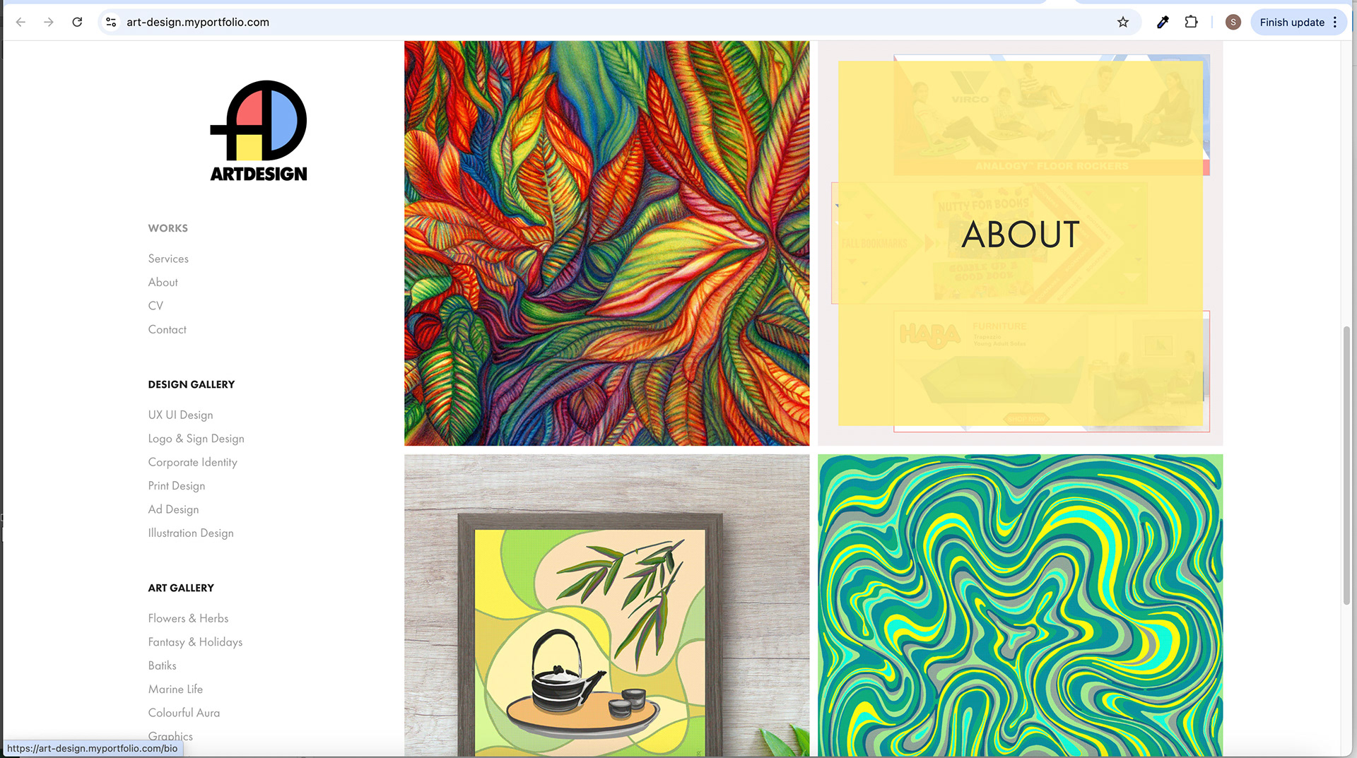
Screens with GIF Animation - Hover Image Effect
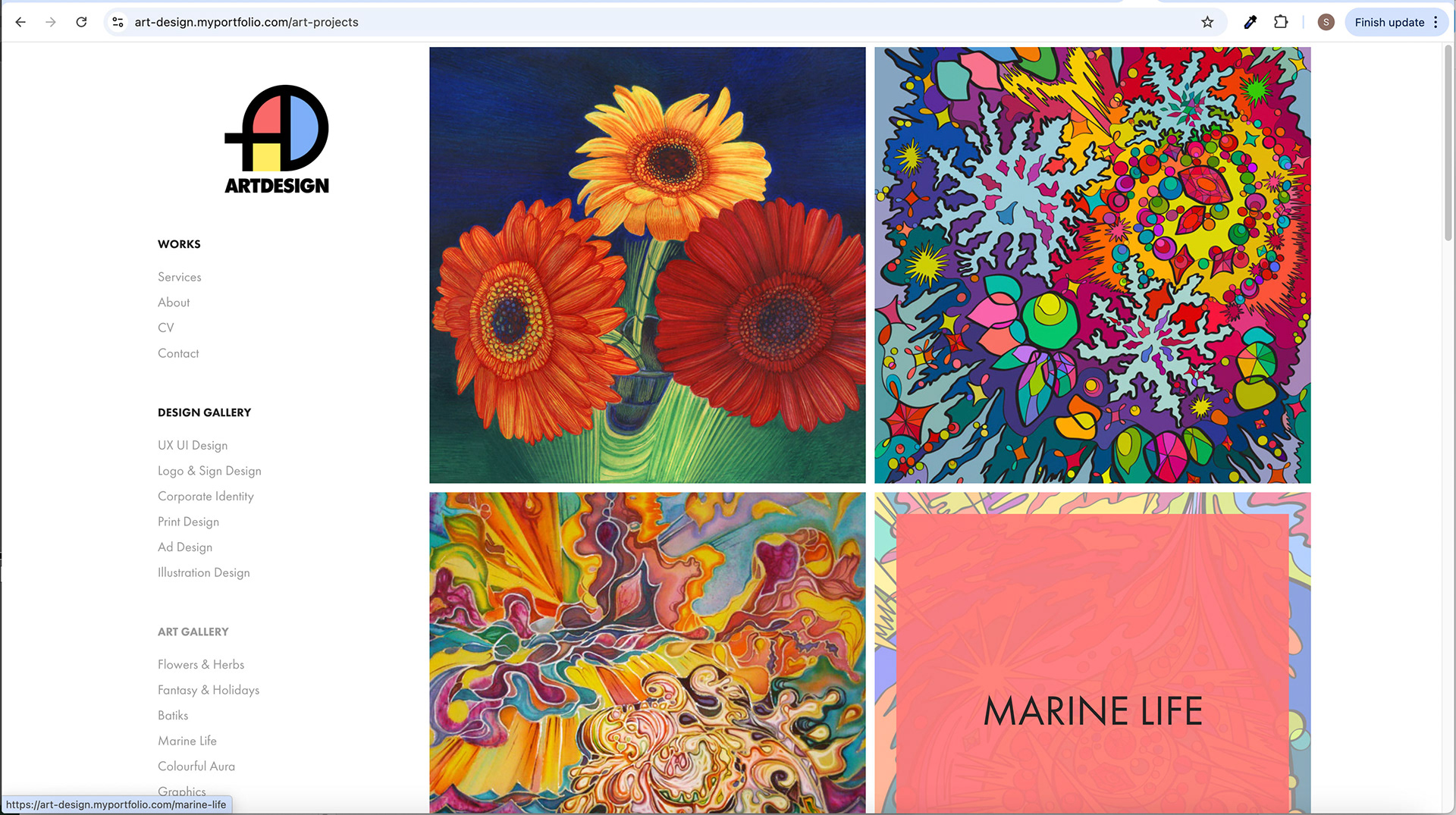
Screen with GIF Animation - Hover Image Effect
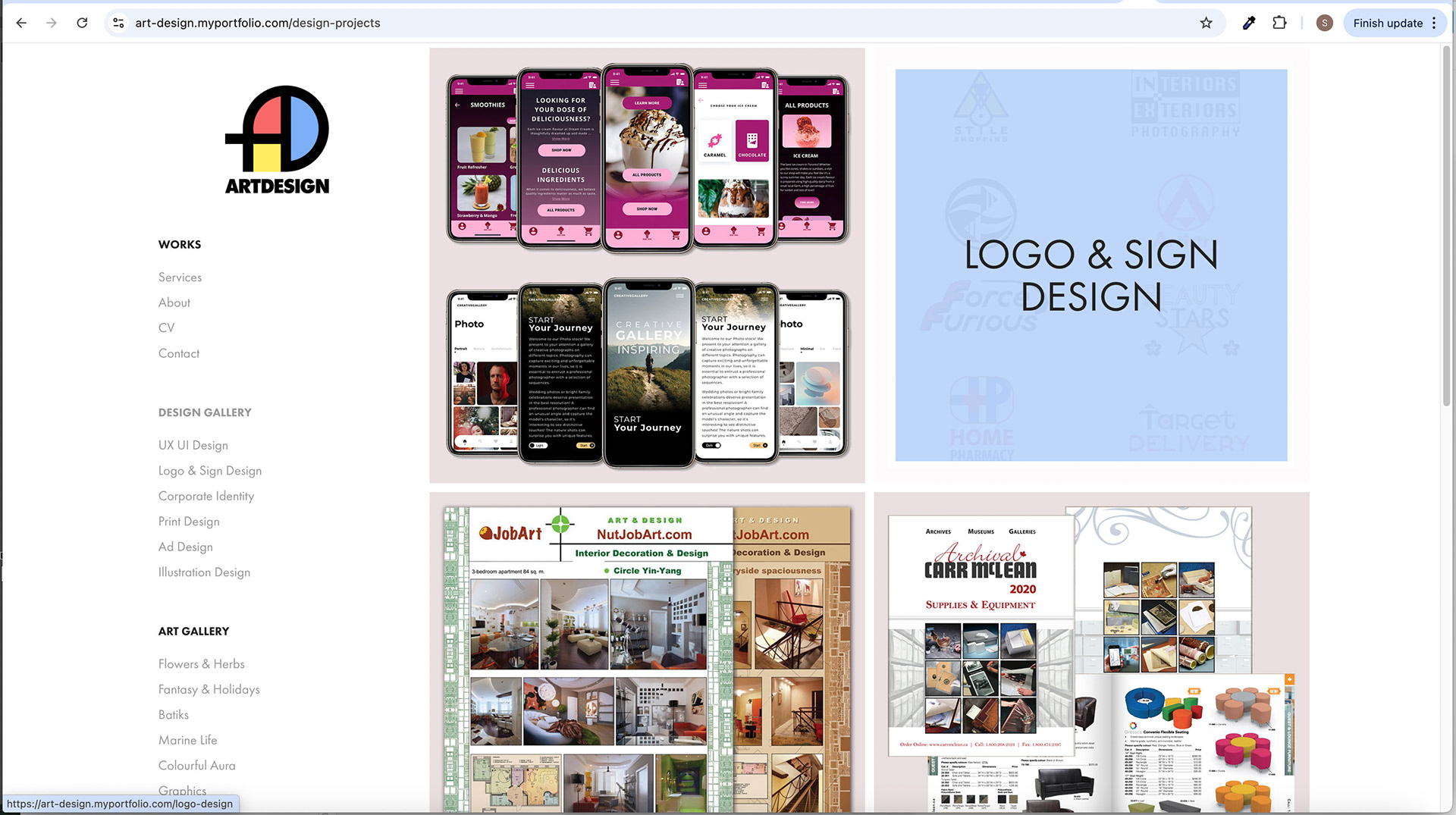
Screen with GIF Animation - Hover Image Effect
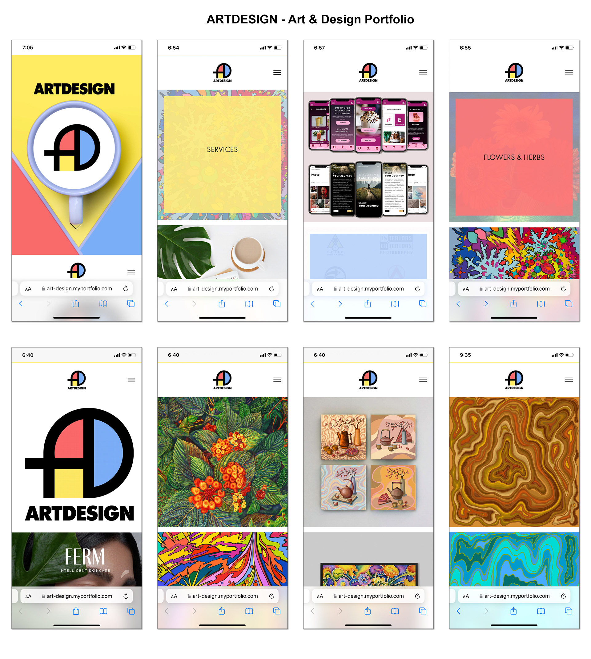
Mobile Screens

Mobile Screens
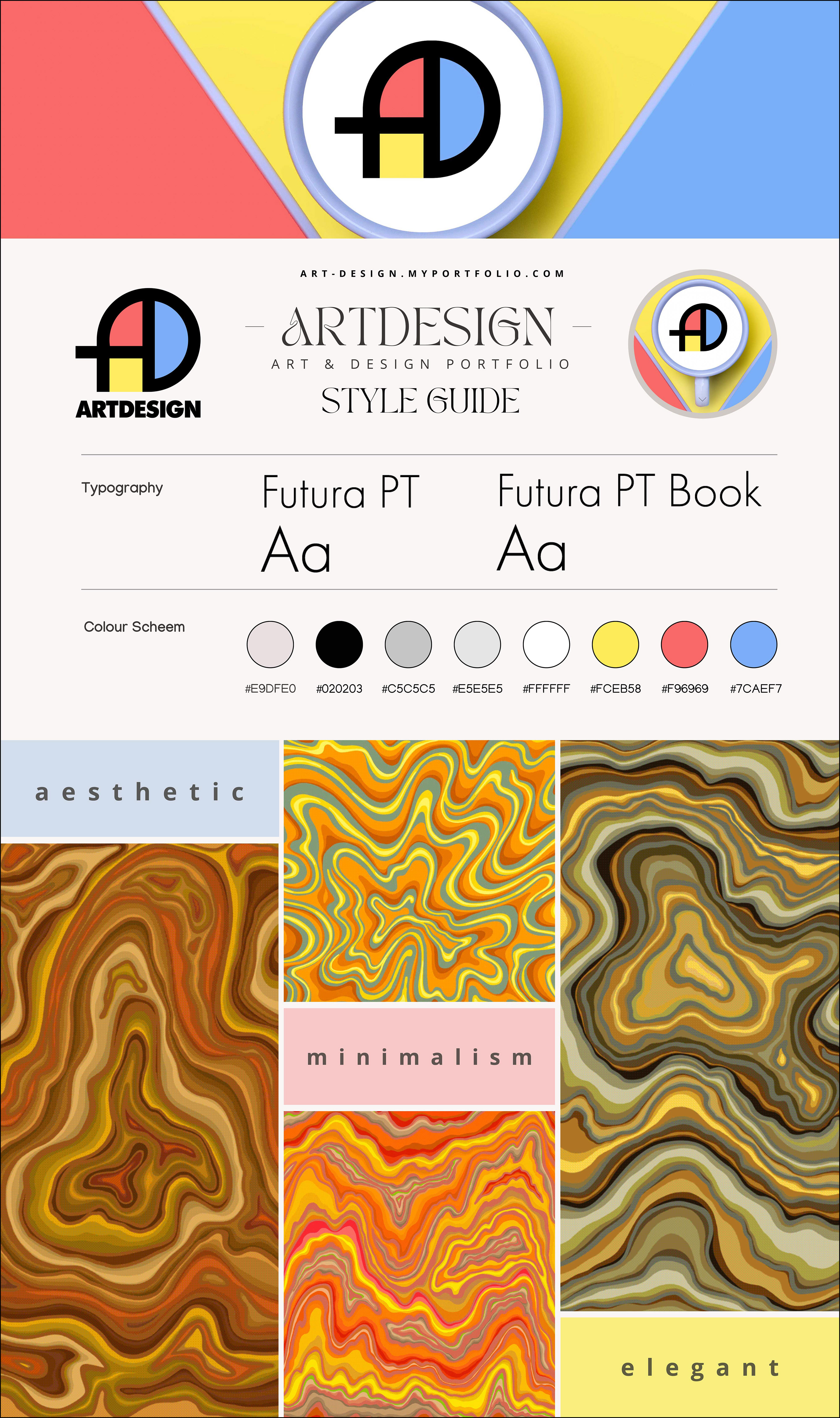
Style Guide
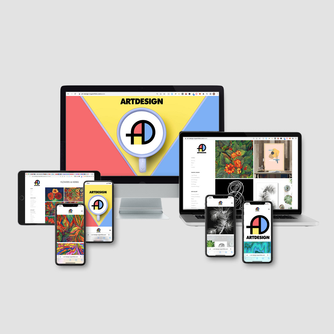
ARTDESIGN Project Overview - Devices
Live Website
ArtDesign – Art & Design Portfolio
"Art & Design" is a conceptual portfolio website have 3 primary colours in its logo and design: red, blue and yellow. The masthead image contains the same idea as the logo and website design. There are also 3 chapters with these 3 primary colours on the text cover. The design is bright up-to-date, and minimalistic. Animated GIFs on a Home page attract attention and evoke interest in browsing.
UX Design
ArtDesign – Art & Design Portfolio
Role and Project Information
Branding, visual, interactive and UX/ UI Design. Web design and development: Adobe Portfolio.
Role: UX/UI Designer. Tools: Figma, Photoshop, Illustrator. Timeline: 1,2 month (2021).
Collaboration: I was a solo UX/UI designer for a small business. I was responsible for branding and determining the overall design direction of the project, creativity and implementation.
ArtDesign Portfolio: A Memorable and Conceptual Showcase of Art and Design
1. Introduction: The ArtDesign Portfolio is a website showcasing the work of digital and graphic designers and artists. With its visually striking design inspired by Mondrian's primary colours, the platform aims to efficiently and creatively highlight the competency of its featured artists. This case study will explore the product design and UX/UI considerations behind the ArtDesign Portfolio.
2. Masthead and Logo Design: The masthead area is the website's first contact point. It features a sizable image with symmetrical red, yellow, and blue stripes divided by a grey border. A grey cup of milk with a white circle is placed on the middle yellow stripe, representing the ArtDesign logo symbol. The wordmark "ARTDESIGN" appears in black on the top of the masthead. Additionally, an arrow slides on and off the masthead, providing a visual cue for navigation.
The ArtDesign logo combines a symbol and a wordmark. The symbol, outlined in black, uses the same three colours - red, blue, and yellow - to create a cohesive visual identity. In the hover-in state, the logo maintains a black outline and the wordmark without colours, ensuring legibility and focus.
3. Home Page Structure: Clicking on the arrow in the masthead takes users to the Home (Works) page, featuring left navigation with the logo and a navigation menu. The navigation menu is divided into three categories: Works (Home page), Graphic Design, and Art Gallery. Social media links are included in the footer for easy access.
The Home page showcases featured projects through four squares with GIF animations. Each square contains 12 changing images, providing a dynamic preview of the Art and Design artwork. The squares align with the website's primary colours, with yellow representing the Works section, blue for Graphic Design, and red for Art. These colourful outlines serve as the base for the headings of each project.
4. Sections and Categories: Each section on the website, such as Works, Graphic Design, and Art, contains categories of products with corresponding names. Clicking on a category leads users to a third-level page with an image gallery of projects. Each project includes descriptions and clickable buttons, allowing users to explore further if desired.
Each section page also includes a "YOU MAY ALSO LIKE" section to encourage exploration and discoverability. This section features two squares showcasing projects from other categories, enticing users to explore beyond their initial selection.
5. Typography and Brand Colors: The ArtDesign Portfolio utilizes the Futura PTBook typography, which offers a clean, modern aesthetic that complements the showcased artworks.
The brand colours consist of primary colours: #f56b6d, #fbe966, #7db0f4, #ffffff, and #000000. These colours are inspired by Mondrian's iconic palette, providing a cohesive and memorable visual identity. Additionally, secondary colors such as #ebdfe2, #8a8a8a, #9d9d9d, #bed7fa, #fb7c7c, and #fae788 may be used to enhance the overall design.
6. Conclusion: The ArtDesign Portfolio's product design and UX/UI case study highlight its commitment to efficiently and creatively showcasing the work of digital and graphic designers and artists. Through its visually striking masthead, dynamic homepage, intuitive navigation, and thoughtful categorization, the platform offers users an engaging and memorable experience. Inspired by Mondrian's primary colours, the website's design creates a solid conceptual presence, reinforcing its commitment to art and design excellence.
Showcasing Art and Design Competency through Creative UX/UI
1. Introduction. The ArtDesign Portfolio is an online platform specifically curated to exhibit the exceptional work of digital and graphic designers and artists. Embracing the artistic legacy of Mondrian's primary colours, the platform endeavours to effectively and creatively showcase the immense competency of its featured artists. This case study delves into the product design and UX/UI considerations that underpin the ArtDesign Portfolio, enabling an engaging and visually captivating experience for its users.
2. Visually Striking Design Drawing inspiration from Mondrian's primary colours, the ArtDesign Portfolio captures attention through its visually striking design. By employing a symmetrical layout of red, yellow, and blue stripes, divided by a contrasting grey border, the website exudes an artistic and conceptual aesthetic. This design choice sets the tone for the entire portfolio, conveying a sense of creativity and visual excellence.
3. Efficient Showcasing of Competency: The ArtDesign Portfolio's primary objective is to showcase its featured artists' exceptional competency efficiently. The platform achieves this by meticulously curating and organizing the content into distinct sections. Users can easily navigate through the Works (Home page), Graphic Design, and Art Gallery sections, enabling them to explore the diverse range of artwork and designs.
4. Intuitive Masthead and Logo Design: The masthead serves as the user's initial point of contact with the website, making it crucial to create a captivating and intuitive design. The ArtDesign Portfolio achieves this by incorporating a sizable image with symmetrical primary-colored stripes accented by a grey border. Positioned on the central yellow stripe is a grey cup of milk with a white circle, representing the ArtDesign logo symbol. The wordmark "ARTDESIGN" is prominently displayed in black on the top part of the masthead. An arrow sliding on and off the masthead provides an intuitive visual cue for navigation, inviting users to explore further.
5. Engaging Home Page: The Home page of the ArtDesign Portfolio is thoughtfully designed to engage and captivate visitors. GIF animations within four squares create a dynamic and visually appealing preview of the featured projects. With each square containing 12 changing images, users are given a glimpse into the breadth and depth of the artists' capabilities. The squares' colour scheme, aligned with the website's primary colours, enhances visual coherence and creates a cohesive user experience.
6. Categorized Sections and Project Galleries: To facilitate easy exploration and discovery, the ArtDesign Portfolio organizes its content into classified sections, such as Works, Graphic Design, and Art. Each section comprises subcategories, allowing users to navigate directly to their areas of interest. Clicking on a specific category leads users to a dedicated project gallery page, where they can explore detailed descriptions and interact with image galleries. This hierarchical structure ensures a seamless and focused browsing experience.
7. Typography and Brand Colors: The ArtDesign Portfolio adopts the Futura PTBook typography, which exudes a clean and modern aesthetic, enhancing the presentation of the showcased artworks and designs.
The brand colours of the portfolio reflect Mondrian's primary colours, including #f56b6d, #fbe966, #7db0f4, #ffffff, and #000000. These colours establish a solid visual identity, evoking a sense of creativity while providing a consistent and harmonious visual experience.
8. Conclusion: The ArtDesign Portfolio showcases the work of digital and graphic designers and artists through a visually striking design inspired by Mondrian's primary colours. By embracing efficient organization, intuitive navigation cues, engaging home page features, and accurate categorization of content, the portfolio successfully highlights the extraordinary competency of its featured artists. Through
Masthead and Logo Design
The masthead area of the ArtDesign Portfolio plays a crucial role as the first point of contact for visitors. It is designed to make a strong visual impact and set the tone for the website. Here are the key elements of the masthead and logo design:
The masthead features a sizable image that immediately captures attention. It is composed of symmetrical red, yellow, and blue stripes divided by a sleek grey border. This design element draws inspiration from Mondrian's iconic use of primary colours, infusing the website with an artistic and vibrant atmosphere.
Placed strategically on the middle yellow stripe is the ArtDesign logo symbol. The symbol depicts a grey cup of milk with a white circle inside. This simple yet evocative image represents the essence of the ArtDesign brand and signifies creativity, inspiration, and the fusion of art and design.
The wordmark "ARTDESIGN" is prominently displayed in black on the top part of the masthead. The choice of black colour ensures high contrast and legibility against the colourful background, making the brand name instantly recognizable.
An arrow slides on and off the masthead to enhance user navigation and provide a seamless browsing experience. This subtle animation serves as a visual cue, inviting users to explore the website further. It guides their attention and encourages them to interact with the different sections and content available.
Combining the symmetrical stripes, the cup of milk logo symbol, the bold wordmark, and the sliding arrow create a visually compelling and cohesive masthead design. It captures the visitors' attention, conveys the artistic essence of the portfolio, and guides them toward further exploration.
Overall, the masthead and logo design of the ArtDesign Portfolio effectively communicates the platform's focus on art and design. It creates a visually engaging and memorable first impression, setting the stage for an immersive and inspiring user experience throughout the website.
The ArtDesign logo
The ArtDesign logo is a harmonious fusion of a symbol and a wordmark, designed to represent the essence of the brand visually. Here are the details of the logo design:
The symbol of the ArtDesign logo is outlined in black, creating a defined and distinct shape. It incorporates the three primary colours - red, blue, and yellow - inspired by Mondrian's iconic palette. This colour combination adds vibrancy and creativity to the logo while establishing a cohesive visual identity with the website design.
The logo maintains its black outline in the hover-in state, providing a consistent visual element. However, the wordmark within the logo is displayed without colours. This design choice ensures optimal legibility and focus, allowing the brand name "ARTDESIGN" to stand out clearly and make a strong impression.
By combining the symbolic representation of art and design through the coloured shapes and the bold wordmark, the ArtDesign logo encapsulates the essence of the portfolio. It represents the fusion of creativity and expertise while maintaining a balanced and visually appealing composition.
The consistent black outline of the logo in both normal and hover-in states helps maintain brand recognition and coherence across different interactions and contexts within the website. It ensures that the logo remains easily identifiable and reinforces the visual identity of the ArtDesign brand.
Overall, the ArtDesign logo effectively combines the symbolic representation of art and design with a clean and legible wordmark. It communicates the portfolio's commitment to creative excellence and establishes a solid and memorable brand identity.
Home Page Structure
Upon clicking the arrow in the masthead, users are directed to the Home (Works) page of the ArtDesign Portfolio. The Home page is thoughtfully designed to provide easy navigation and access to the website's different sections. Here are the key components of the Home page structure:
1. Left Navigation: The Home page features a left-side navigation panel that remains accessible throughout the browsing experience. This navigation panel includes the ArtDesign logo, serving as a visual anchor, reinforcing brand identity, and offering a link to the Home page.
2. Navigation Menu: The navigation menu, located within the left navigation panel, is divided into three primary categories: Works (Home page), Graphic Design, and Art Gallery. This categorization allows users to quickly and intuitively navigate to their desired interest section. Clicking on each category will lead users to the respective pages to explore specific works and projects related to that category.
3. Footer with Social Media Links: A footer section is included at the bottom of the Home page. This footer houses social media links, providing users convenient access to ArtDesign's social media profiles. These links allow visitors to further engage with the portfolio and stay connected through various social platforms.
By incorporating a consistent left navigation panel and a straightforward navigation menu, the ArtDesign Portfolio ensures that users can easily navigate between different website sections. This user-friendly structure enhances the overall user experience, enabling seamless exploration of the featured works and projects.
Including social media links in the footer promotes social engagement and allows users to connect with the portfolio and its artists beyond the website. This integration of social media further expands the reach of the ArtDesign brand and fosters a sense of community and connection.
Overall, the Home page structure of the ArtDesign Portfolio offers efficient navigation, keeping users engaged and allowing them to explore the diverse range of works and projects showcased within the Graphic Design, Art Gallery, and Works (Home page) sections.
Home page
The Home page of the ArtDesign Portfolio utilizes visually engaging elements to showcase featured projects and provide users with a dynamic preview of the diverse artwork and designs. Here are the key features of the Home page:
Four Squares with GIF Animations: The centrepiece of the Home page consists of four squares, each featuring a GIF animation. These squares are strategically positioned to capture attention and create a visually captivating user experience. The GIF animations within each square provide a dynamic and interactive preview of the featured projects, offering a glimpse into the artistic and design prowess of the showcased works.
Changing Images: Within each square, there are 12 changing images. This continuous rotation of images adds an element of surprise and intrigue, ensuring that users are constantly engaged and exposed to various artwork and designs. The changing pictures offer a dynamic viewing experience, providing users with a sense of the breadth and depth of the artists' creations.
Colourful Outlines and Section Representations: The squares on the Home page align with the website's primary colours to visually represent different sections. Yellow means the Works section, blue signifies Graphic Design, and red represents Art. This colour-coded approach adds vibrancy to the page and helps users quickly identify and associate each square with its respective section.
Colourful Outlines for Project Headings: The colourful outlines used for each square serve as the base for the headings of the projects within those sections. For example, projects within the Works section would have yellow outlines as the background for their titles. This consistent use of colour throughout the website creates a cohesive visual identity and reinforces the categorization of projects based on their respective sections.
By incorporating GIF animations, changing images, and colour-coded squares, the Home page of the ArtDesign Portfolio offers an engaging and visually dynamic experience. Users are enticed to explore the various sections, and using colour outlines provides a clear visual hierarchy, making it easy to navigate and discover projects within specific categories. This design approach effectively captures visitors' attention and showcases the artistry and design expertise of the featured artists.
Sections and Categories
The ArtDesign Portfolio website is organized into different sections: Works, Graphic Design, and Art. Each section contains categories of products that users can explore. Here's how the sections and categories are structured:
1. Works, Graphic Design, and Art Sections: The website's sections showcase different types of artwork and designs. The Works section represents a broad category that encompasses various creative works. The Graphic Design section focuses on projects related to graphic design, while the Art section highlights fine art and artistic creations.
2. Categories of Products: Within each section are categories of products with corresponding names. These categories help organize the artwork and designs based on their themes or styles. For example, the Works section might include categories such as Illustration, Photography, Web Design, and Motion Graphics. Similarly, the Graphic Design and Art sections would have distinct categories relevant to their respective fields.
4. Third-Level Page: Clicking on a category within a section leads users to a third-level page. Users will find an image gallery of projects related to the selected category on this page. The image gallery showcases visually appealing representations of the artwork and designs, giving users a glimpse into the projects.
5. Project Descriptions and Clickable Buttons: Each project within the image gallery is accompanied by descriptions that provide additional context and information about the work. These descriptions give users insights into the creative process, concept, and techniques used in the projects. Additionally, clickable buttons enable users to explore further if they wish to delve deeper into a specific project or learn more about the artist behind it.
6. "YOU MAY ALSO LIKE" Section: Each section page features a "YOU MAY ALSO LIKE" section to encourage exploration and discoverability. This section showcases two squares, each highlighting projects from other categories that may be of interest to users. By presenting projects from different categories, this section entices users to explore beyond their initial selection, fostering a sense of curiosity and discovery.
Including categories, third-level pages with image galleries, project descriptions, and the "YOU MAY ALSO LIKE" section enhances the user experience on the ArtDesign Portfolio website. It enables users to navigate through different areas, discover relevant projects and encourages them to explore a diverse range of artwork and designs.
Typography and Brand Colors
The ArtDesign Portfolio pays careful attention to typography and brand colours to create a cohesive and visually appealing aesthetic. Here's how typography and brand colours are incorporated:
Typography: The ArtDesign Portfolio uses the Futura PTBook typography. Futura PTBook is known for its clean and modern look, making it suitable for showcasing artwork and designs. The typography complements the website's visual elements and contributes to an overall sleek and professional appearance. The clean lines and balanced letterforms of Futura PTBook enhance readability and ensure that the focus remains on the showcased artworks.
Brand Colors: The brand colours of the ArtDesign Portfolio consist of a selection of primary and secondary colours. The primary colours are #f56b6d (red), #fbe966 (yellow), #7db0f4 (blue), #ffffff (white), and #000000 (black). These primary colours are inspired by Mondrian's iconic palette, which adds a sense of artistic flair and conceptual design to the portfolio. Using these primary colours throughout the website helps establish a consistent and recognizable visual identity.
In addition to the primary colours, the ArtDesign Portfolio may also incorporate secondary colours to enhance the overall design. These secondary colors include #ebdfe2, #8a8a8a, #9d9d9d, #bed7fa, #fb7c7c, and #fae788. These colours can add depth, contrast, and visual interest to various website elements, such as buttons, backgrounds, or accents.
By utilizing the Futura PTBook typography and a carefully selected palette of primary and secondary colours, the ArtDesign Portfolio maintains a consistent and visually appealing design. This combination of typography and brand colours contributes to the overall aesthetic and helps create a memorable and engaging experience for users exploring the showcased artworks and designs.
Conclusion
The ArtDesign Portfolio's product design and UX/UI case study demonstrate its dedication to presenting the work of digital and graphic designers, as well as artists, efficiently and creatively. By incorporating visually striking elements, intuitive navigation, and thoughtful categorization, the platform provides users with an engaging and memorable experience. Inspired by Mondrian's primary colours, the website's design establishes a solid conceptual presence that reinforces its commitment to artistic excellence and design innovation.
From the masthead with its symmetrical stripes and captivating logo to the dynamic homepage showcasing animated squares and changing images, every element is designed to capture users' attention and showcase diverse artwork and designs. The intuitive navigation, with its precise categorization of works, graphic design, and art, ensures that users can easily explore and discover projects that align with their interests.
Futura PTBook typography adds a clean and modern touch to the website, complementing the showcased artworks and designs without distracting them. Inspired by Mondrian's iconic palette, the carefully chosen primary and secondary colours create a cohesive and visually appealing visual identity for the ArtDesign Portfolio.
In conclusion, the ArtDesign Portfolio's product design and UX/UI considerations successfully create an immersive and memorable experience for users. The platform's commitment to showcasing art and design excellence shines through its visually striking design, intuitive navigation, and attention to detail. By combining aesthetics with functionality, the ArtDesign Portfolio establishes itself as a premier destination for digital and graphic designers and artists to showcase their work and engage with a wider audience.
