

UI Design, BRANDING
Project Overview - Branding & Desktop Screens

Cover - Project Overview

Project Overview - Desktop Screens
Project Overview - Desktop Screens

Style Guide
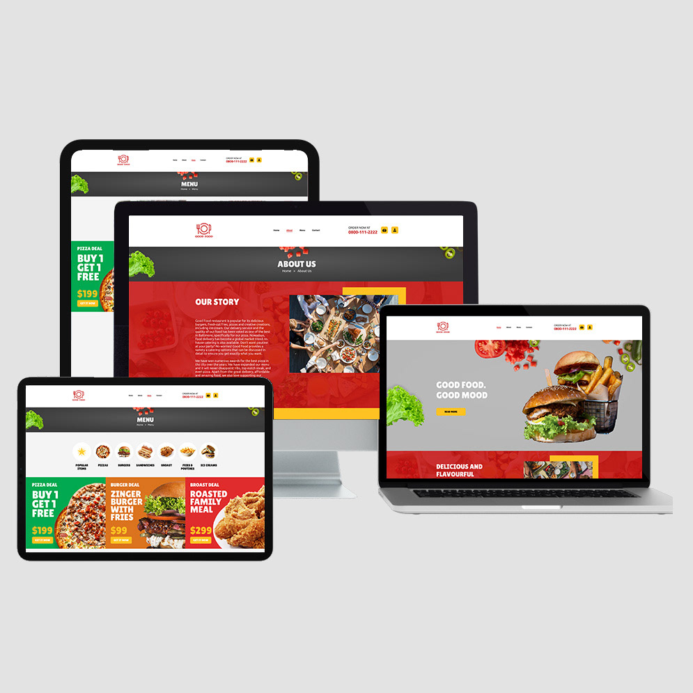
Project Overview - Devices
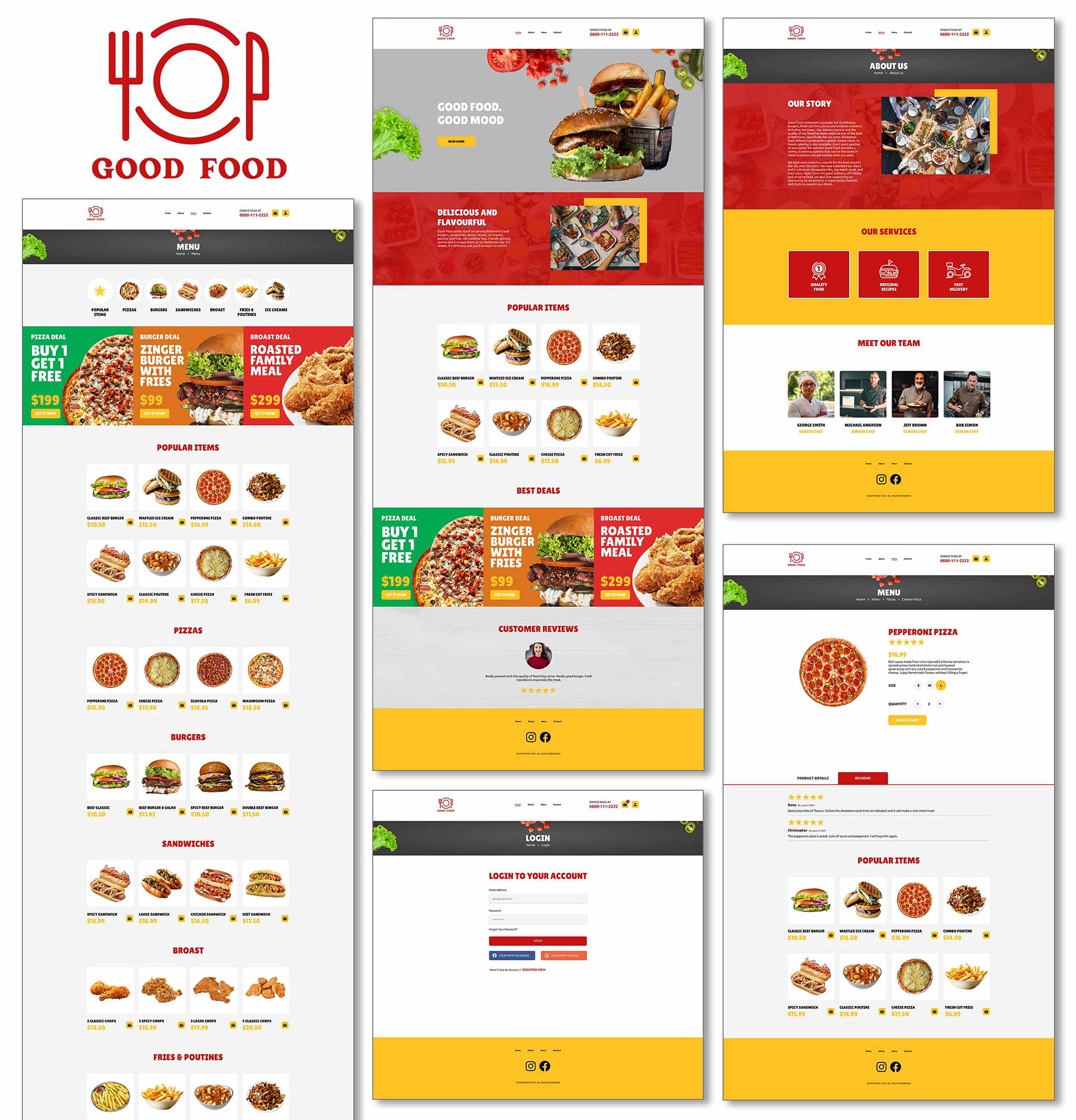
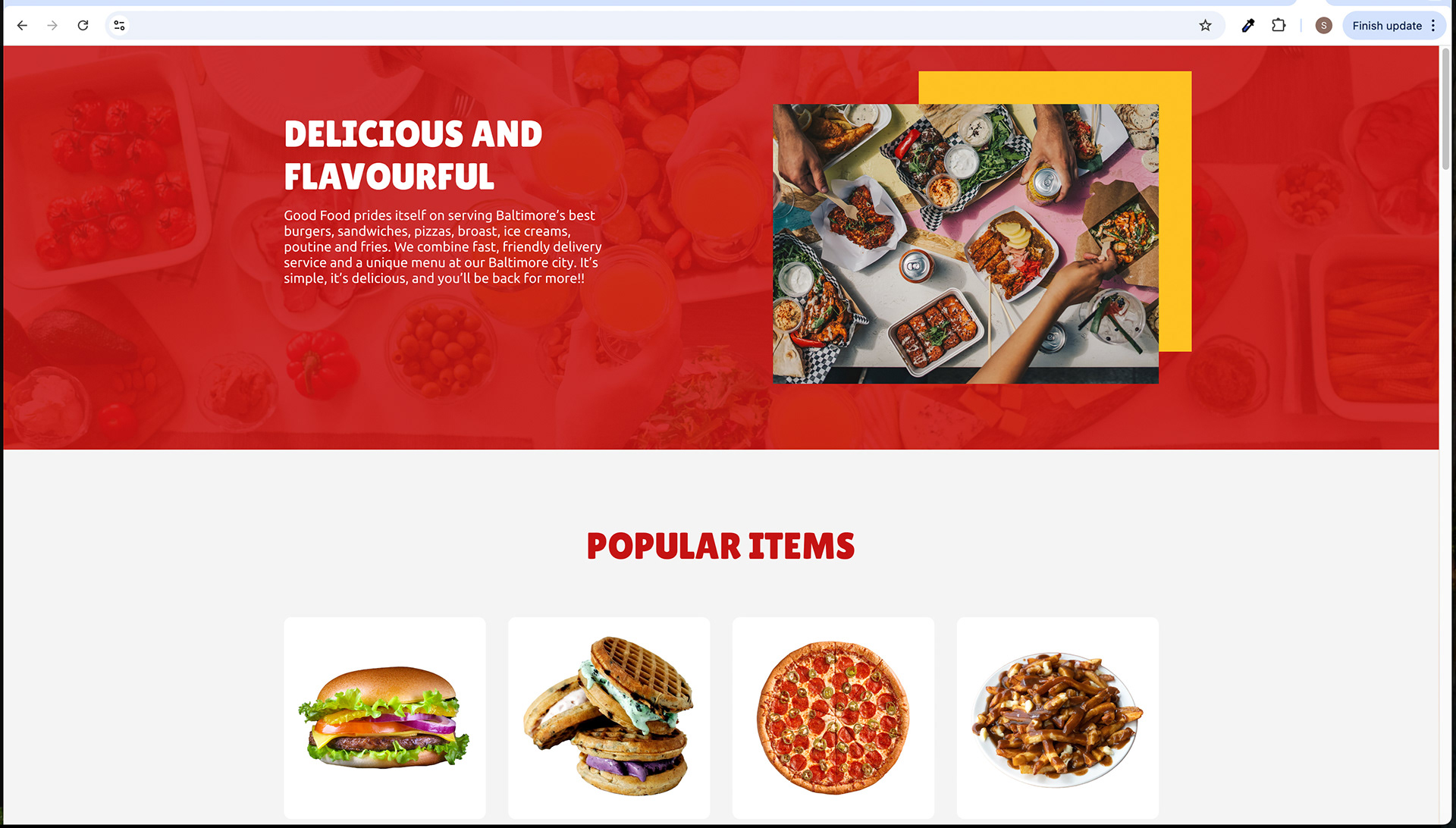
Desktop Screen
Desktop Screen

Desktop Screen
Desktop Screen

Desktop Screen
Desktop Screen

Desktop Screen
Desktop Screen
Desktop Screen
Desktop Screen
Desktop Screen
Desktop Screen
Desktop Screen
Desktop Screen
Desktop Screen

Desktop Screen

Desktop Screen
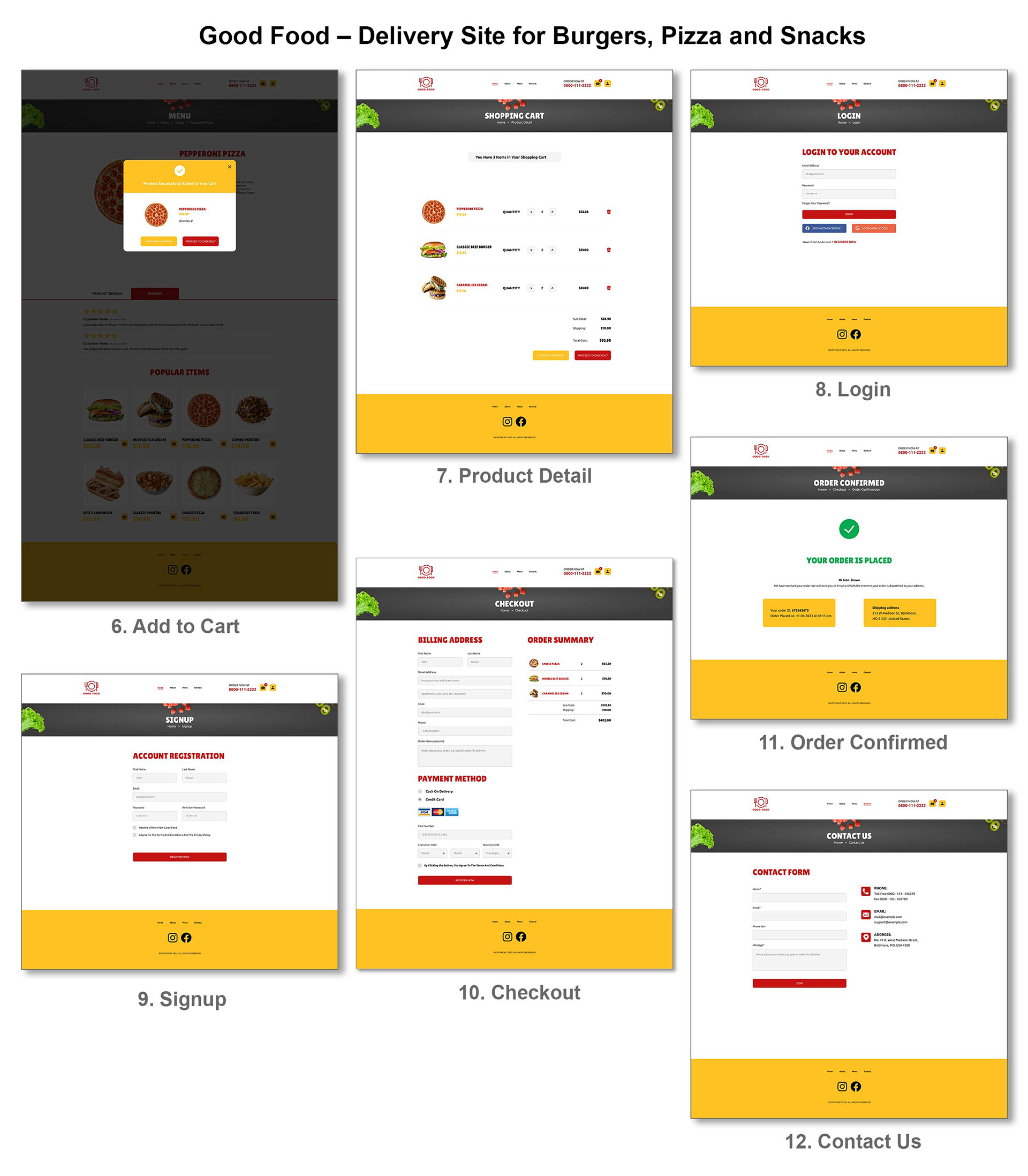
Good Food - Delivery Site for Burgers, Pizza and Snacks
Clickable Prototype
Copy Link & View Clickable Figma Prototype - Good Food - Delivery Site for Burgers, Pizza and Snacks:
https://www.figma.com/proto/gmQPdRI86vE2FKOS26BOXs/Good-Food---Delivery-Site-for-Burgers%2C-Pizza-and-Snacks?page-id=0%3A1&type=design&node-id=5-236&viewport=69%2C325%2C0.03&t=tM02ylM3IkEaQIhu-1&scaling=scale-down-width&starting-point-node-id=5%3A236&mode=design &hide-ui=1
UX Design
Good Food - - Delivery Site for Burgers, Pizza and Snacks

Role and Project Information
Branding, UX/ UI Design. Interactive design and prototyping using Figma. Website design.
Role: UX/UI Designer. Tools: Figma, Photoshop, Illustrator. Timeline: 2,5 months (2024).
Collaboration: As a UX/UI designer, I collaborated with a small team of developers and a product manager. I was responsible for branding and determining the overall design direction of the project while collaborating with the rest of the team on the creativity and implementation.
Introduction
Intro
Welcome to the world of "Good Food" Delivery, a digital haven for food enthusiasts in Baltimore City, MD, USA. This case study illuminates the meticulous design and user experience behind the website. "Good Food" offers a delectable array of Pizzas, Burgers, Sandwiches, Broast, Fries and Poutines, and Ice Cream, and we'll explore how its website enhances user interaction. From structure to aesthetics, we'll delve into the art of creating a seamless and visually appealing culinary journey.
Project Overview
The "Good Food" delivery website is a comprehensive online platform designed to cater to the culinary cravings of Baltimore City, MD, USA. It is a convenient digital gateway for individuals seeking a diverse range of delectable food options, including burgers, pizzas, snacks, sandwiches, broast, fries, poutines, and ice cream.
Here's a concise Project Overview:
Project Name: "Good Food" Delivery Website Development
Project Description: The "Good Food" website is a newly built platform specializing in the delivery of a variety of delicious food items, including pizzas, burgers, sandwiches, broast, fries, poutines, and ice cream. It serves the Baltimore City, MD, USA area.
Project Goals: The primary goal is to establish an online presence for "Good Food," enhancing its accessibility and reach within the Baltimore City area. The project aims to provide a user-friendly interface for customers to conveniently order their favourite food items for delivery.
Target Audience: "Good Food" primarily targets residents and food enthusiasts in Baltimore City who seek a diverse range of food options with the convenience of online ordering and delivery.
Purpose: The primary purpose of the "Good Food" website is to provide an effortless and enjoyable online ordering experience for its customers. By offering an extensive menu of delicious food items, it aims to satisfy the gastronomic desires of residents, delivering restaurant-quality meals directly to their doorstep.
Geographic Location: The "Good Food" delivery service is exclusively available in Baltimore, Maryland's vibrant city, ensuring prompt and efficient delivery to local residents and businesses. It embraces the local community and aims to become the go-to destination for savoury burgers, pizzas, snacks, and more within this geographical area.
Project Vision: To become the go-to food delivery service in Baltimore City, known for its diverse menu, prompt deliveries, and user-friendly online platform.
Website Principles: The website is designed around principles of simplicity, ease of use, and exceptional customer service, prioritizing user experience.
Type of Product: "Good Food" offers a food delivery service with an extensive menu to cater to diverse tastes and preferences.
Strengths and Opportunities: The project leverages local suppliers and focuses on a user-centric approach, aligning with the demand for contactless, local, and customizable food delivery services.
Market Trends and Customer Expectations: The project aligns with market trends, such as contactless delivery, healthy options, customization, sustainability, tech-savviness, local sourcing, and transparency.
Competitive Landscape: "Good Food" faces competition from local restaurants and national food delivery platforms, offering opportunities for differentiation.
This Project Overview encapsulates the core essence and goals of the "Good Food" website development project.
Problem Statement
Problem Statement: The "Good Food" website project aimed to address several key issues prevalent in the food delivery industry, hindering user satisfaction and seamless online ordering. These challenges included slow website performance, unclear product information, and filtering options, which collectively contributed to a less-than-optimal user experience. By identifying and rectifying these issues, the project sought to create a website that stands out by providing a faster, more informative, and user-centric platform for ordering burgers, pizzas, and snacks in Baltimore City, MD, USA.
The "Good Food" website faces several user experience challenges:
1. Navigational Complexity: Users, such as Emily, often encounter difficulties when websites become excessively complex and challenging to navigate. This affects their overall experience while trying to order burgers, pizzas, and snacks.
2. Product Details Ambiguity: Ambiguous or unclear product descriptions on the website can lead to frustration for users like Emily, making it challenging for them to make informed choices.
3. Cumbersome Checkout: The website's checkout process can be unnecessarily lengthy and complicated, which is a source of annoyance for Emily and other users. Simplifying this experience is crucial.
4. Website Responsiveness: Alex, and others like him, have a low tolerance for slow and unresponsive websites. The website's speed and performance can lead to user frustration.
5. Customization Constraints: The absence of options to customize menu items based on dietary preferences is a disappointment for users like Alex. Personalization is highly valued and should be improved.
6. Complex Website Navigation: Users like Sarah are averse to websites with overly complex navigation structures, which negatively impact their experience when exploring food options.
7. Product Information Clarity: Sarah and others find it frustrating when product information is insufficient or lacks transparency, hindering their ability to make informed choices.
8. Personalization Shortcomings: Sarah wishes for more personalized recommendations based on her past orders and dietary preferences to enhance her experience. Addressing this would greatly benefit user satisfaction.
9. Slow Website Performance: John and similar users experience frustration when websites are slow to load or unresponsive, impacting their ability to browse and order food online.
10. Unclear Product Information: John also faces difficulty when product descriptions and pricing are not clear or informative. Clarity in product information is essential for user decision-making.
Recognizing and addressing these pain points is integral to enhancing the user experience of the "Good Food" website, aligning it more closely with the specific needs and concerns of each user persona.
The purpose of the "Good Food" website
The purpose of the "Good Food" website is to provide a user-friendly and visually engaging platform for online food delivery services. This website aims to offer a seamless and enjoyable experience for customers in Baltimore City, MD, USA, who seek to order a variety of food items, including pizzas, burgers, sandwiches, broast, fries and poutines, and ice cream. The primary objectives of the website are as follows:
1. Convenient Ordering: To enable customers to easily browse the menu, select their preferred food items, and place orders with minimal effort.
2. Information Accessibility: To provide clear and organized information about the available products, their details, and customer reviews.
3. Engaging Visuals: To create an enticing and appealing visual experience through high-quality images, colour schemes, and typography.
4. Efficient Checkout: To facilitate a straightforward and secure checkout process, allowing users to review their orders and select their preferred payment methods.
5. Contact and Support: To offer multiple channels of communication, including a contact form and contact information, for users to get in touch with the business.
6. Brand Identity: To establish and reinforce the "Good Food" brand identity through the website's design, including the logo, colour schemes, and font choices.
The "Good Food" website seeks to meet the needs of a diverse audience in Baltimore City by providing an intuitive and visually appealing platform that enhances the overall user experience, ultimately driving customer engagement and loyalty. Through this case study, we will explore how the website's design elements and strategies contribute to achieving these objectives.
Primary product offerings
The "Good Food" website primarily offers the following product categories for online delivery:
1. Pizzas: A selection of delicious pizzas with various toppings, sizes, and crust options to cater to different tastes.
2. Burgers: A range of mouthwatering burgers with different ingredients and flavours, including classic and specialty options.
3. Sandwiches: Various sandwich choices, each prepared with quality ingredients and unique recipes.
4. Broast: An assortment of broasted chicken dishes, including wings, tenders, and more, known for their crispiness and flavour.
5. Fries and Poutines: Crispy and seasoned French fries and poutines, served with a variety of toppings and sauces.
6. Ice Cream: A selection of delectable ice cream flavours and desserts to satisfy sweet cravings.
These primary product offerings are designed to cater to a wide range of preferences, making "Good Food" a one-stop destination for individuals and families in Baltimore City looking to order quality food items for delivery. The website's design and user experience aim to showcase these products effectively and simplify the ordering process for users.
Location
"Good Food" operates in Baltimore City, Maryland, USA. This location is the primary area of service for the website, ensuring that residents and visitors in Baltimore City have easy access to the diverse menu of pizzas, burgers, sandwiches, broast, fries, poutines, and ice cream. The website's design and functionality are tailored to meet the specific needs and preferences of this geographic area, enhancing the user experience for customers in this region.
Project Brief
Competitors
In the fiercely competitive online food delivery market, "Good Food" faces several well-established competitors in Baltimore City, Maryland. Understanding the strengths and weaknesses of these competitors is essential for positioning the website effectively. Key competitors include:
1. Uber Eats: Uber Eats is a global food delivery giant known for its extensive network of restaurants and swift delivery services. Its brand recognition and user base pose a significant challenge to "Good Food."
2. DoorDash: DoorDash is another major player in the food delivery industry, offering a wide selection of restaurants and cuisines. It's known for its user-friendly app and comprehensive restaurant choices.
3. Grubhub: Grubhub is a well-established food delivery platform with a strong presence in Baltimore. It provides users with a vast array of dining options and loyalty programs.
4. Postmates: Acquired by Uber Eats, Postmates continues to operate independently in some regions. It is popular for delivering not only restaurant meals but also groceries and various retail items.
5. Local Restaurants: In addition to these major players, "Good Food" competes with local restaurants that offer their own delivery services. These include beloved neighbourhood eateries, pizzerias, family-owned diners, and specialty food joints, each with its unique and loyal customer base. These restaurants often have loyal customer bases and unique, niche menus.
here are some examples of local restaurants in Baltimore City that "Good Food" competes with:
Jimmy's Famous Seafood: Known for its seafood specialties, Jimmy's is a Baltimore institution that offers a range of crab dishes and seafood platters.
Matthew's Pizza: A local pizzeria famous for its square-shaped, thick-crust pizzas and a variety of toppings.
Chaps Pit Beef: Renowned for its pit beef sandwiches, Chaps is a favourite spot for lovers of smoked and seasoned beef.
Sip & Bite Restaurant: A classic diner serving a variety of comfort foods, including breakfast dishes, sandwiches, and Greek specialties.
Woodberry Kitchen: A farm-to-table restaurant offering seasonal, locally sourced dishes in a rustic setting.
Nacho Mama's: A Tex-Mex restaurant known for its hubcap margaritas and cheesy nachos.
These local restaurants represent the diversity and unique flavours of Baltimore's culinary scene, and "Good Food" aims to provide customers with a convenient way to enjoy these local favourites in the comfort of their own homes.
To stand out and thrive in this competitive landscape, "Good Food" must offer a distinct value proposition, exceptional user experience, a diverse range of food products, efficient delivery, and effective marketing strategies. By addressing these aspects, it can carve a niche for itself in the market and build a loyal customer base.
Competitors, their Strengths, Opportunities and Weaknesses and Market Analysis
Competitors:
1. Jimmy's Famous Seafood:
• Strengths: Known for its traditional and well-established presence in the seafood industry. Strong local customer base.
• Opportunities: Expanding its menu to include more non-seafood options to attract a wider audience.
• Weaknesses: Limited menu diversity may not cater to all tastes. May not have a strong online presence for delivery.
2. Matthew's Pizza:
• Strengths: Renowned for its unique square-shaped pizza, which has a dedicated following.
• Opportunities: Can expand its menu to include more types of pizzas and sides. Investing in a user-friendly online ordering system.
• Weaknesses: Limited menu options outside of pizza.
3. Chaps Pit Beef:
• Strengths: Specializes in pit beef sandwiches, which is a unique offering. Strong brand recognition.
• Opportunities: Diversifying the menu to include more sides and healthier options. Improving the online ordering experience.
• Weaknesses: Limited menu options beyond pit beef.
4. Sip & Bite Restaurant:
• Strengths: Offers a diverse menu, including breakfast, Greek specialties, and comfort food.
• Opportunities: Enhancing its online presence and marketing for delivery services.
• Weaknesses: May face competition in each food category it serves.
5. Woodberry Kitchen:
• Strengths: Emphasizes farm-to-table dining, which appeals to health-conscious consumers.
• Opportunities: Offering ready-to-eat meals for delivery and takeout. Expanding its reach to a broader audience.
• Weaknesses: Higher prices and limited fast-food options.
6. Nacho Mama's:
• Strengths: Known for its unique margaritas and Tex-Mex offerings.
• Opportunities: Expanding its menu with more Tex-Mex and Mexican cuisine. Increasing marketing efforts for delivery and takeout.
• Weaknesses: Potential competition with other Tex-Mex and Mexican restaurants.
Market Analysis:
The food delivery market in Baltimore is competitive, with a mix of established restaurants and newer entrants. Customers are increasingly looking for convenient, online food ordering options, especially due to the global shift towards online services. "Good Food" aims to tap into this growing market by offering a wide range of popular food items for delivery.
Strengths of "Good Food":
• Diverse menu offerings, including pizzas, burgers, sandwiches, broast, fries, poutines, and ice cream.
• Emphasis on an easy-to-navigate website with user-friendly features.
• Delivery services targeting a specific geographic area in Baltimore City.
Opportunities:
• Collaborations with local restaurants to expand the variety of offerings.
• Marketing efforts to increase brand recognition and customer base.
• Integrating user reviews and ratings for transparency and improved decision-making for customers.
Weaknesses:
• Competition with local restaurants and food delivery services.
• Ensuring consistent quality and on-time deliveries.
• Gaining initial customer trust and loyalty.
In this competitive landscape, "Good Food" seeks to stand out by offering a wide array of food items, an easy ordering process, and efficient delivery services. Through strategic marketing and collaborations, "Good Food" aims to become a trusted choice for food delivery in Baltimore City.
Competitive Landscape Analysis: Identifying Existing Solutions and Opportunities for Differentiation
Competitive Landscape Analysis
In a bustling food delivery market in Baltimore City, "Good Food" faces both local restaurants and established food delivery services. To succeed, it's essential to identify existing solutions and opportunities for differentiation.
Existing Solutions:
1. Local Restaurants:
• Strengths: Offer unique and familiar dishes. Strong local customer base.
• Opportunities: Expanding menu options, embracing online ordering, and improving delivery services.
2. Established Food Delivery Services:
• Strengths: Convenience, a wide range of restaurant options, and established delivery infrastructure.
• Opportunities: Partnering with local restaurants to provide a more diverse menu and enhance the local experience.
Opportunities for Differentiation:
1. Diverse Menu Selection:
• Opportunity: "Good Food" can differentiate by offering an extensive menu including popular items like pizzas, burgers, sandwiches, broast, fries, poutines, and ice cream, all in one place.
2. Easy Online Ordering:
• Opportunity: Implementing a user-friendly website and mobile app for convenient and efficient ordering. Ensuring a seamless and quick checkout process can set "Good Food" apart.
3. Collaborations with Local Restaurants:
• Opportunity: Partnering with local restaurants to expand the menu and provide customers with a broad choice of cuisines, thereby catering to diverse tastes.
4. Quality and Consistency:
• Opportunity: Ensuring that all products meet high-quality standards and are consistently delivered in a timely manner. Building a reputation for reliability.
5. Customer Reviews and Ratings:
• Opportunity: Allowing customers to leave reviews and ratings for products and services can instill trust and transparency.
6. Marketing Efforts:
• Opportunity: Investing in marketing to increase brand recognition and reach in Baltimore City, attracting new customers.
7. Local Emphasis:
• Opportunity: Highlighting the local aspect and the community connection can be appealing to customers who prefer supporting local businesses.
"Good Food" aims to stand out in this competitive landscape by capitalizing on these opportunities, emphasizing quality, diversity, and convenience. Through strategic partnerships with local restaurants, a focus on customer experience, and effective marketing, "Good Food" can establish itself as a top choice for food delivery in Baltimore City.
Project Description: "Good Food" Website Development
The "Good Food" Delivery Website is a comprehensive online platform designed to provide the residents of Baltimore City, MD, USA, with a convenient and diverse food delivery service. This newly established website addresses the need for quick and efficient access to a wide range of delectable products, including pizzas, burgers, sandwiches, broast, fries, poutines, and ice cream.
Key Features and Objectives:
1. Diverse Menu: "Good Food" takes pride in its extensive menu that encompasses popular items, ensuring that customers can satisfy their cravings for a variety of cuisines, all in one place.
2. User-Friendly Ordering: The website is built with a focus on user experience, offering easy and efficient online ordering. The user journey from product selection to checkout is designed to be smooth and convenient.
3. Local Partnerships: Collaborations with local restaurants strengthen the platform's offerings. Customers can enjoy both the comfort of their favourite local dishes and the convenience of centralized ordering and delivery.
4. Quality Assurance: "Good Food" prioritizes quality and consistency. The products are held to high standards, ensuring that customers receive their orders promptly and in excellent condition.
5. Customer Feedback: The website allows customers to leave reviews and ratings for products and services, promoting transparency and trust.
6. Community Connection: The platform emphasizes its local roots and community engagement, appealing to customers who wish to support local businesses.
7. Marketing Efforts: Investment in marketing initiatives fosters brand recognition and wider reach in Baltimore City, attracting new clientele.
"Good Food" aims to be the top choice for food delivery in Baltimore City by capitalizing on its diverse menu, commitment to quality, and convenient user experience. The project endeavours to redefine food delivery by offering a one-stop shop for a wide range of culinary delights, contributing to the local food industry, and becoming an integral part of the community's dining experience.
Services Provided by "Good Food"
"Good Food" offers the following services:
1. Online Food Ordering: Order a variety of dishes, including pizzas, burgers, and more.
2. Local Restaurant Collaborations: Partnered with local restaurants for diverse cuisine.
3. Quality Assurance: Ensures prompt, high-quality food delivery.
4. Customer Reviews and Ratings: Encourages feedback for transparency.
5. Community Engagement: Supports local businesses and community growth.
6. Marketing and Promotions: Promotes the brand with special deals.
7. Easy Online Payments: Provides secure payment options.
8. Contact and Support: Offers various contact channels for customer inquiries.
Objectives of the "Good Food" Website
The primary objectives of the "Good Food" website are as follows:
1. Streamlined Food Ordering: Provide an intuitive platform for customers to easily browse, select, and order their favourite dishes.
2. Local Restaurant Collaboration: Collaborate with local restaurants to offer a wide range of cuisine options, enhancing customer choice.
3. Quality and Reliability: Ensure timely and reliable food delivery while maintaining high-quality standards.
4. User Engagement: Foster user engagement through customer reviews, ratings, and feedback.
5. Community Support: Contribute to the growth of local businesses and communities by supporting nearby eateries.
6. Effective Marketing: Implement effective marketing and promotion strategies to expand the customer base.
7. Convenient Payment Options: Offer secure and hassle-free online payment methods.
8. Customer Support: Provide accessible contact and support channels for addressing customer inquiries and concerns.
9. User-Friendly Experience: Create a user-friendly website with clear navigation and attractive visuals.
10. Mobile Responsiveness: Ensure the website is responsive and accessible on mobile devices for convenience.
11. Competitive Edge: Stand out in the competitive food delivery industry by providing a unique and engaging user experience.
12. Business Growth: Drive increased revenue and business growth by expanding the customer base and retaining loyal users.
These objectives collectively aim to make "Good Food" a go-to platform for online food delivery in Baltimore City, enhancing the local culinary scene and ensuring customer satisfaction.
How "Good Food" Website Stands Out
The "Good Food" website distinguishes itself in the competitive food delivery industry through the following key differentiators:
1. Local Restaurant Collaboration: "Good Food" collaborates with a wide range of local restaurants, offering an extensive and diverse menu that showcases the city's culinary richness. This sets it apart from competitors that may focus on chain restaurants.
2. Community Support: By supporting local businesses, "Good Food" actively contributes to the growth and vitality of Baltimore City's neighbourhoods. This community-oriented approach resonates with customers who prefer to support local establishments.
3. Quality and Reliability: The website maintains a strong commitment to the quality and reliability of its services. Timely deliveries and consistent food quality enhance the customer experience, setting it apart from competitors with inconsistent performance.
4. User Engagement: "Good Food" encourages user engagement through customer reviews, ratings, and feedback, fostering a sense of community and trust among customers. This interactive approach enhances the overall user experience.
5. Effective Marketing: The website employs effective marketing and promotional strategies to create brand awareness and attract a broad customer base, staying competitive in a crowded market.
6. User-Friendly Experience: "Good Food" offers a user-friendly website with clear navigation and visually appealing design. The easy-to-use interface ensures that customers can quickly find and order their preferred dishes.
7. Mobile Responsiveness: Recognizing the importance of mobile access, the website is designed to be responsive and accessible on various devices, catering to the on-the-go needs of modern consumers.
8. Convenient Payment Options: It provides secure and hassle-free online payment methods, offering customers flexibility and convenience in how they pay for their orders.
9. Unique Visual Identity: The website's striking visual elements, including a memorable red and yellow color scheme and a visually appealing logo, create a strong and recognizable brand identity.
10. Local Focus: "Good Food" is deeply rooted in Baltimore City, catering specifically to this geographic area. This local focus allows it to understand and cater to the unique tastes and preferences of its target audience.
These differentiating factors collectively position the "Good Food" website as a local, community-driven, and user-focused platform for food delivery, offering a compelling alternative to larger, less personalized competitors.
Project Goals
1. Website Launch: Successfully launch the "Good Food" website, making it accessible to users in Baltimore City.
2. Local Business Collaboration: Establish partnerships with local restaurants to expand the menu offerings.
3. User Acquisition: Attract and retain a substantial user base within the first year.
4. Order Efficiency: Ensure efficient order processing, delivery, and tracking.
5. Positive User Experience: Prioritize a user-friendly interface and smooth navigation.
6. Community Impact: Contribute to the local economy by promoting and supporting small businesses.
7. Customer Feedback: Encourage user reviews and implement improvements based on feedback.
8. Brand Visibility: Create brand recognition within Baltimore City through effective marketing.
9. Mobile Optimization: Optimize the website for mobile devices, ensuring a seamless experience.
10. Safety and Reliability: Guarantee secure and reliable payment methods and food deliveries.
11. Sustainability: Explore sustainable practices for packaging and delivery.
Business Goals
1. Local Market Leader: Establish "Good Food" as the go-to online food delivery platform in Baltimore City, capturing a significant market share within the first year of operation.
2. Revenue Growth: Achieve a 30% revenue growth quarter-over-quarter, reaching a six-figure monthly revenue within the first year.
3. Customer Retention: Maintain a customer retention rate of at least 70% by delivering exceptional service, quality food, and enticing promotions.
4. Local Restaurant Network: Partner with at least 50 local restaurants in Baltimore City to provide a diverse and appealing menu for customers.
5. Brand Recognition: Make "Good Food" a household name in Baltimore City, with 80% of residents recognizing the brand within six months.
6. Job Creation: Generate 50 employment opportunities within the city, with a focus on hiring locally.
7. Community Involvement: Actively participate in community events and sponsor local initiatives, demonstrating a commitment to the well-being of Baltimore City.
8. Technology Integration: Stay up-to-date with the latest technological trends, incorporating features like AI-driven recommendations and efficient order tracking.
9. Sustainable Practices: Implement eco-friendly packaging, reduce food wastage, and promote sustainable practices to enhance the community and environment.
10. User Satisfaction: Maintain a user satisfaction rating of 4.5/5 stars or higher based on customer reviews and feedback.
11. Regional Expansion: Explore expansion opportunities in neighbouring regions, such as Baltimore County, once established as a market leader in Baltimore City.
These goals reflect the specific objectives and aspirations of the "Good Food" website in the context of its industry and location.
Project Vision
To create a thriving online platform that revolutionizes the way Baltimore City experiences food delivery, elevating convenience, choice, and culinary delight while fostering a sense of community and supporting local businesses. The "Good Food" website envisions becoming an integral part of Baltimore residents' daily lives, embodying excellence in service, innovation, and sustainability. It aims to stand out as the definitive local choice for food delivery and a steadfast contributor to the welfare of the city and its residents.
Target Audience
The "Good Food" website primarily caters to Baltimore City, MD, USA residents and visitors who seek convenient and diverse food delivery options. Our target audience includes:
1. Busy Professionals: Individuals with demanding work schedules looking for quick and hassle-free meal solutions.
2. Families: Parents and caregivers seeking family-friendly meal choices, including comfort foods and kid-friendly options.
3. Students: College students, both on and off-campus, in need of affordable and satisfying meals.
4. Food Enthusiasts: People passionate about exploring a variety of cuisines and flavours from the comfort of their homes.
5. Tourists: Visitors to Baltimore City who want to experience local flavours without leaving their accommodations.
6. Local Businesses: Small to medium-sized enterprises in need of catering services for corporate events and meetings.
By understanding and meeting the diverse needs of our target audience, "Good Food" aims to become the go-to choice for food delivery in Baltimore City.
User Experience (UX) Considerations
The design of the "Good Food" website is carefully crafted to enhance the user experience (UX) in several ways, prioritizing easy navigation and clear calls to action:
1. Intuitive Navigation:
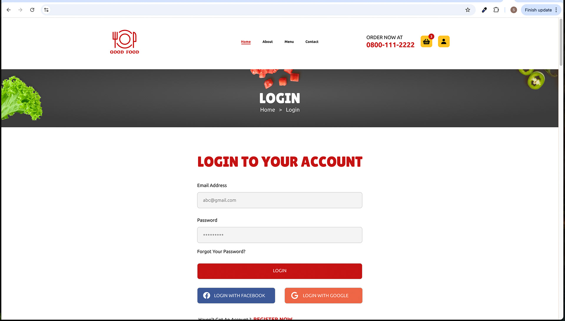
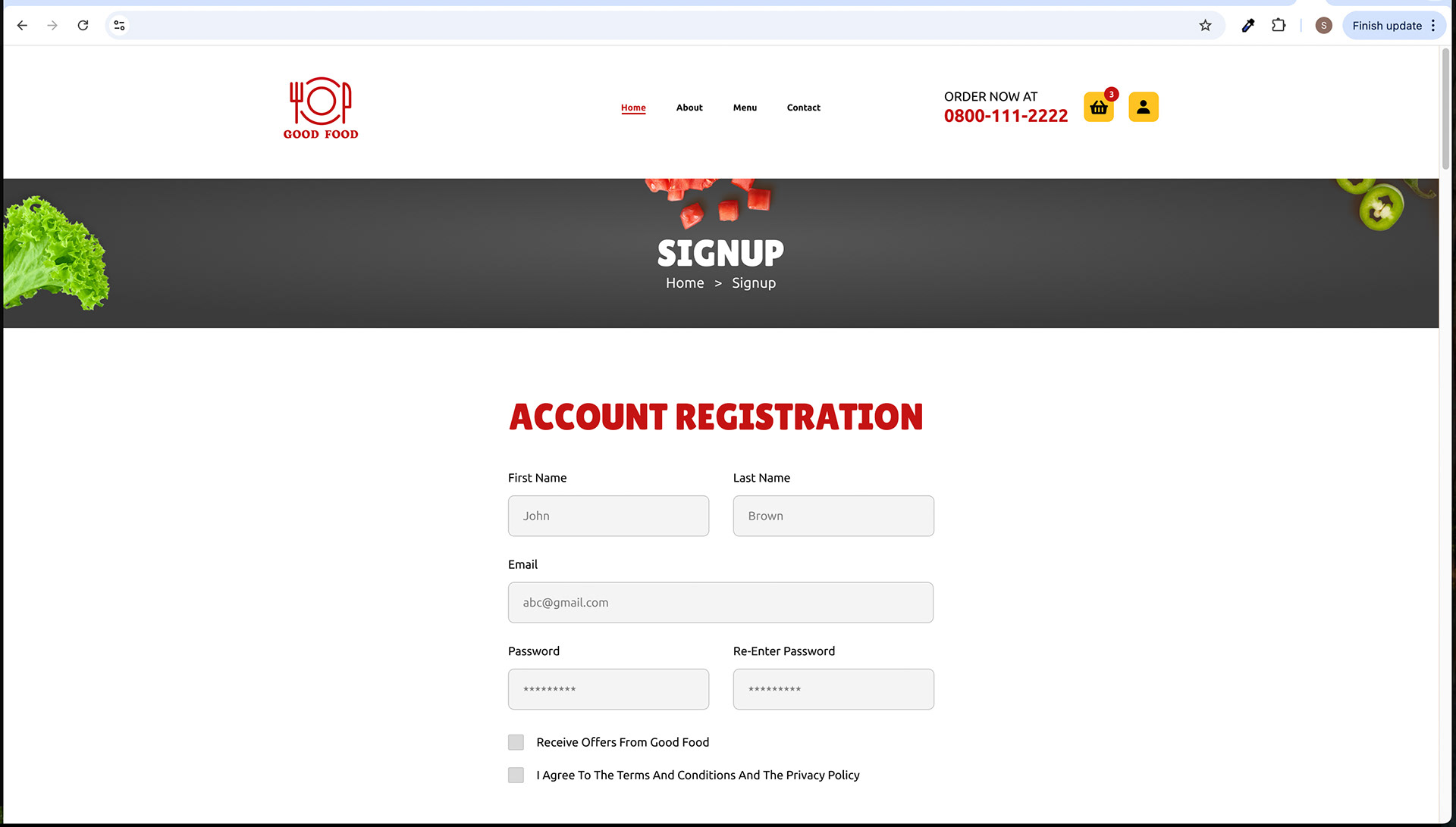
• Clear Menu Structure: The website's information architecture is straightforward, with a well-organized menu structure comprising Home, About, Menu, and Contact. Users can easily find what they're looking for without confusion.
2. Consistent Design Language:
• Uniform Layout: The consistent layout across all pages ensures that users always know where to find key elements like the navigation menu, header, and footer.
• Breadcrumbs: Breadcrumbs provide clear navigation paths, allowing users to backtrack or explore related pages effortlessly.
3. Visual Hierarchy:
• Contrasting Colors: Using contrasting colours, such as red for essential elements and yellow for calls to action, guides users' attention to critical areas like menu items and buttons.• Font Hierarchy: The variation in font sizes and styles (Lilita One and Ubuntu) helps establish a clear information hierarchy, making it easy for users to identify headings, subheadings, and body text.
4. Clear Calls to Action (CTAs):
• Prominent Buttons: CTAs, such as "ORDER NOW," "SEND," and "REGISTER NOW," are designed with distinctive colours (red or yellow) and bold typography to stand out, encouraging user interaction.
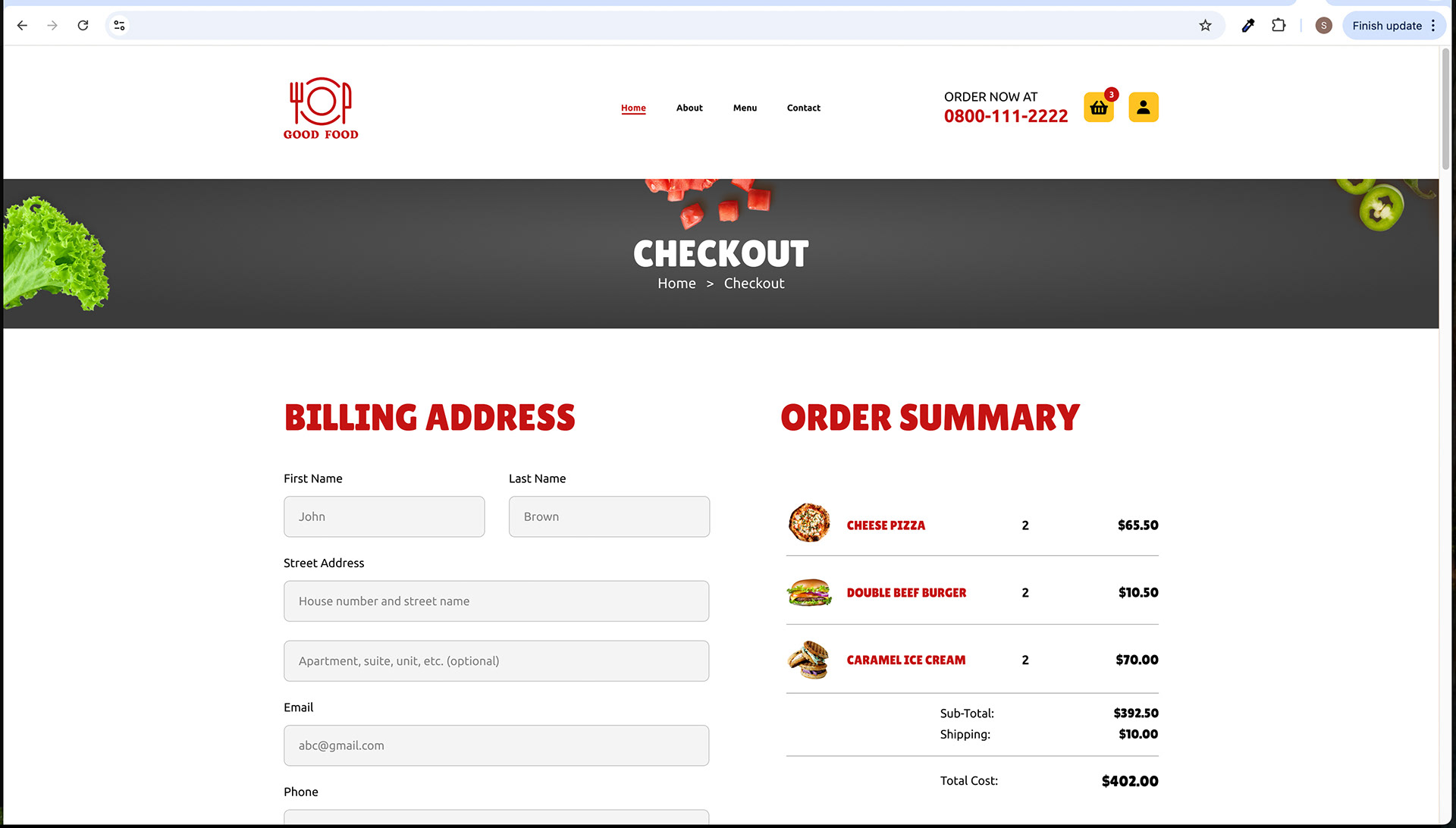
• Logical Progression: The checkout process is well-structured, guiding users through each step with clear buttons like "PROCEED TO CHECKOUT" and "CONTINUE SHOPPING."
5. Informative Content:
• Detailed Product Information: Product pages provide detailed descriptions, pricing, and user reviews, helping users make informed choices.
• Transparent Checkout: The page displays a comprehensive order summary, ensuring users understand their purchases and costs clearly.
6. Accessibility Considerations:
• Readable Fonts: The choice of fonts and font sizes ensures readability for users of all ages and abilities.
• Contrast: The colour palette considers contrast ratios to meet accessibility standards, ensuring that text and interactive elements are easily discernible.
7. Mobile Responsiveness:
• The website is designed to be responsive, adapting to various screen sizes and devices, ensuring a seamless experience for users on smartphones and tablets.
8. Contact Options:
• The "Contact Us" page provides multiple contact options, including a contact form and direct contact information, catering to users' preferences.
9. Feedback and Confirmation:
• The "Order Confirmation" page provides immediate feedback on successful orders, reassuring users about their purchases.
Overall, the "Good Food" website's design is user-centric, focusing on providing a seamless and enjoyable experience. It leverages design elements, typography, and layout to ensure easy navigation, clear communication, and compelling calls to action, ultimately enhancing the overall user experience.
Mobile Responsiveness
Yes, the "Good Food" website is designed to be responsive and accessible on mobile devices. This means that the website's layout and content adapt to different screen sizes and orientations, ensuring a seamless and user-friendly experience for visitors accessing the site on smartphones and tablets.
Mobile responsiveness is crucial for catering to the diverse range of devices users may use to access the website. It allows content to be displayed in an optimized manner, ensuring that text, images, and interactive elements remain readable and usable on smaller screens. Additionally, mobile responsiveness helps maintain the website's visual appeal and functionality across various devices, enhancing the overall user experience.
Principles of the "Good Food" Website
1. Accessibility: Ensuring all users can easily navigate and order.
2. User-Centered Design: Prioritizing user needs and feedback.
3. Efficiency: Streamlining the ordering process.
4. Transparency: Providing accurate pricing and delivery info.
5. Quality Assurance: Collaborating with trusted local restaurants.
6. Security: Protecting customer data and payments.
7. Inclusivity: Offering diverse food options.
8. Sustainability: Minimizing environmental impact.
9. Community Engagement: Supporting local businesses and initiatives.
10. Continuous Improvement: Regular updates and enhancements.
Type of Product
"Good Food" offers a variety of food items including:
• Pizzas
• Burgers
• Sandwiches
• Broast
• Fries and Poutines
• Ice Cream
These items cater to a wide range of tastes and preferences.
Strengths and Opportunities
Strengths:
1. Diverse Menu: "Good Food" boasts a diverse menu offering a wide range of food items, ensuring there's something for every customer.
2. Local Ingredients: A commitment to sourcing local and fresh ingredients ensures high-quality and flavorful dishes.
3. Efficient Delivery: Fast and reliable delivery services guarantee that customers receive their orders promptly.
4. User-Friendly Website: The website's intuitive design makes it easy for customers to browse the menu, place orders, and track deliveries.
Opportunities:
1. Expansion: There's an opportunity to expand to neighbouring areas and potentially other cities, broadening the customer base.
2. Catering Services: "Good Food" can explore offering catering services for events, parties, and gatherings.
3. Loyalty Programs: Implementing customer loyalty programs can encourage repeat business and enhance customer retention.
4. Special Promotions: Offering regular promotions, discounts, or daily specials can attract more customers.
Feedback and Improvement: By actively seeking and acting on customer feedback, "Good Food" can continually enhance its offerings and services.
Challenges and Solutions
During the design process of the "Good Food" website, several challenges were encountered, and innovative solutions were implemented to address them:
1. Complex Information Architecture: The website had multiple sections, subpages, and a detailed checkout process. To simplify navigation, breadcrumbs were introduced to provide users with a clear path and help them understand their location within the site.
2. Colour Consistency: Consistent colour usage was crucial for branding and user experience. A predefined colour palette and guidelines were established to ensure that the correct colours were applied consistently across the website.
3. Mobile Responsiveness: Adapting the design for mobile devices presented challenges due to varying screen sizes. The solution was to implement responsive design techniques, including flexible grids and media queries, to ensure the website functioned and looked appealing on desktop and mobile screens.
4. Accessibility: Ensuring the website met accessibility standards, including contrast ratios for text and interactive elements, was a priority. The design team carefully selected colours and font sizes to meet these requirements, ensuring that individuals with disabilities could use the website.
5. User Engagement: Prominent call-to-action buttons were placed throughout the website to encourage engagement and conversions. Using contrasting colours and bold typography helped draw attention to these essential elements.
6. Checkout Process Clarity: A straightforward and user-friendly checkout process was critical to reducing cart abandonment. The solution involved a step-by-step approach with detailed order summaries, ensuring users understood the process and costs.
7. Visual Appeal: Balancing visual appeal with usability was an ongoing challenge. The design team focused on maintaining a clean and elegant design while ensuring that functionality and ease of use were not compromised.
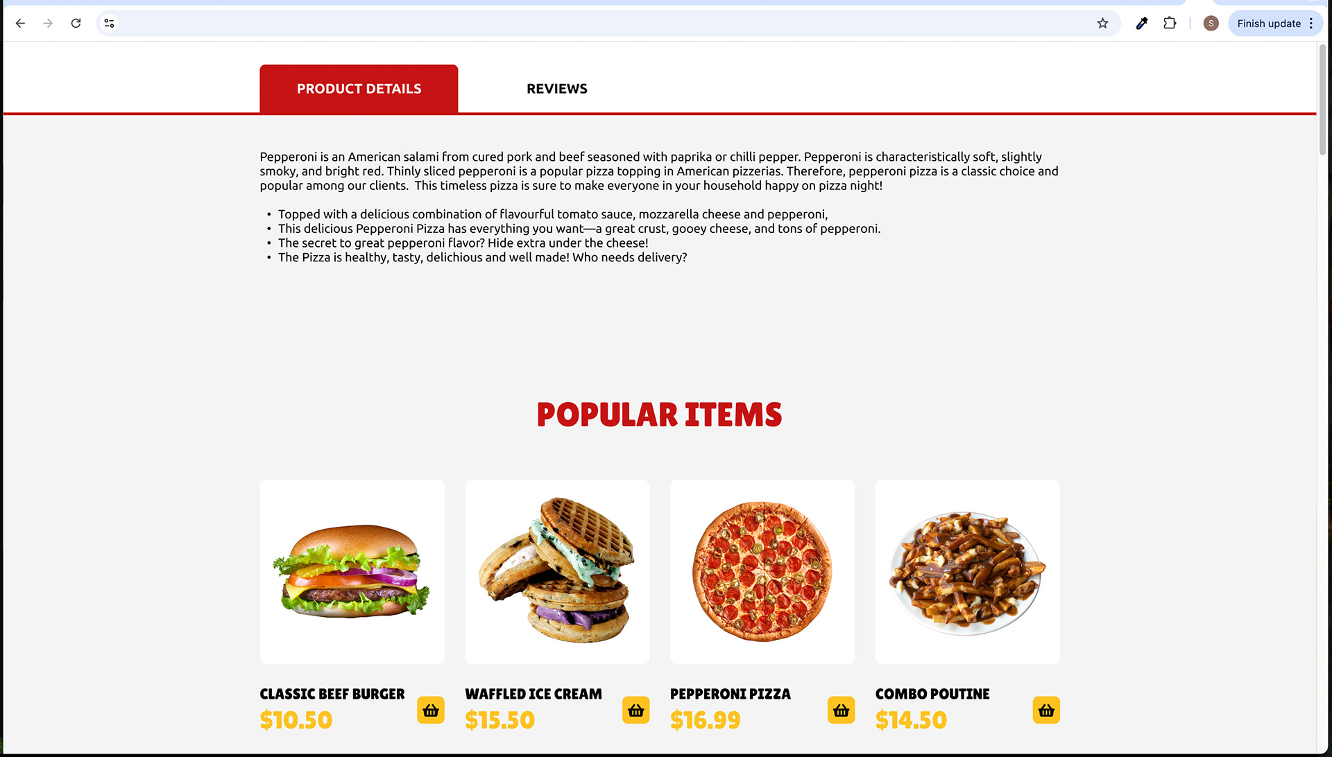
8. Content Presentation: Presenting detailed product information and user reviews in an organized and easily digestible manner was challenging. The solution was to create separate product details and review pages with tabbed navigation, allowing users to access the information they needed without overwhelming them.
By addressing these challenges through thoughtful design decisions and incorporating user-centric solutions, the "Good Food" website was successfully developed to provide an enjoyable and efficient user experience while meeting business goals and branding requirements.
Conducted User Research
User research by "Good Food" informs menu diversity, fast deliveries, intuitive website design, local ingredient sourcing, promotions, and feedback mechanisms for a user-centric experience.
User Preferences:
Menu Variety: Users prefer a wide range of menu options, including items like pizzas, burgers, sandwiches, broast, fries, poutines, and ice cream. The availability of diverse choices, including vegetarian and gluten-free options, is highly valued.
Timely Delivery: Customers prioritize fast and punctual deliveries. The website needs to ensure efficient and quick delivery services to meet this preference.
User-Friendly Interface: A user-friendly website with easy navigation and a straightforward ordering process is favoured. Users appreciate intuitive design and functionality.
Local Sourcing: Users show a preference for locally sourced ingredients, highlighting a desire for fresh and quality food items. Emphasizing local suppliers is important.
Promotions and Discounts: Special promotions, loyalty programs, and discounts are welcomed by users as they seek cost-effective and rewarding options for their food orders.
Feedback Mechanisms: Users want the ability to leave reviews and feedback. Providing a platform for them to share their experiences and suggestions is valuable.
User Pain Points:
Limited Menu Selection: Users may be dissatisfied if the menu lacks variety, potentially leading to lost business.
Late Deliveries: Delayed or late deliveries can result in negative customer experiences and impact retention.
Complex Ordering Process: A complicated or confusing website interface can frustrate users and deter them from completing orders.
Low-Quality Ingredients: If the food quality or freshness does not meet expectations, it can lead to dissatisfaction and negative reviews.
Lack of Incentives: Insufficient promotions or rewards may result in reduced customer loyalty and engagement.
Inadequate Feedback Channels: Without proper mechanisms for leaving feedback or addressing issues, users may feel unheard and unsatisfied.
Understanding these user preferences and pain points is essential for "Good Food" to tailor its website and services effectively, providing an exceptional user experience while mitigating potential issues.
Market Trends and Customer Expectations in the Restaurant Food Delivery Industry
Understanding the evolving landscape of the restaurant food delivery industry is vital for "Good Food." Key market trends and customer expectations in this industry include:
1. Contactless Delivery: The COVID-19 pandemic accelerated the demand for contactless delivery options. Customers expect safe, no-contact deliveries.
2. Healthy Options: Increasing health consciousness among consumers means a rising demand for healthier menu items, such as salads, lean proteins, and low-sodium dishes.
3. Customization: Many customers appreciate the ability to customize their orders, choosing ingredients and portion sizes to suit their preferences.
4. Sustainability: Environmentally conscious consumers expect restaurants to reduce packaging waste and adopt sustainable practices, like using eco-friendly packaging.
5. Tech-Savviness: With the proliferation of food delivery apps, customers expect user-friendly, mobile-responsive websites and apps for convenient ordering.
6. Local Sourcing: Supporting local businesses is a growing trend. Customers prefer restaurants that source ingredients locally and are involved in the community.
7. Transparency: Consumers value transparent pricing, including delivery fees and taxes, to avoid surprises during checkout.
"Good Food" aims to align with these trends to meet customer expectations and stand out in the competitive food delivery landscape.
User Discovery
User Testing
In the "Good Food" project, user testing is a pivotal phase for ensuring a user-centric website. It involves:
1. Usability Testing: Participants from the target audience perform tasks like ordering, menu navigation, and providing feedback to enhance the user experience.
2. A/B Testing: Comparing versions of webpages to optimize elements like button placement and menu layouts.
3. Mobile Responsiveness Testing: Ensuring smooth performance on various devices.
4. Performance Testing: Assessing loading speed and responsiveness.
5. User Feedback Gathering: Actively seeking user feedback for continuous improvement.
Iterative design is guided by user insights to enhance the website's usability and overall user experience.
User Testing Interview Questions
The 8 questions for user interviews were asked to 4 interviewees for user testing specifically. during user testing for the "Good Food" website:
1). How did you find the overall experience of using the website for ordering food?
2). Were you able to easily find your preferred food items on the menu?
3). Did you encounter any difficulties during the checkout process?
4). What are your thoughts on the website's speed and responsiveness?
5). Were the product descriptions and pricing clear and informative?
6). How do you feel about the website's design and visual appeal?
7). Did you face any challenges when adding items to your cart or proceeding to checkout?
8). Can you provide any suggestions or improvements that could enhance your experience when using the website for future orders?
These questions helped gather valuable user feedback and insights to refine the website and improve the user experience.
4 interview scripts
INTERVIEWEE 1: EMILY ANDERSON
A) Name: Emily Anderson
B) Occupation: Teacher
C) Place of Residence: Baltimore
D) Neighborhood: Hampden
A) Name: Emily Anderson
B) Occupation: Teacher
C) Place of Residence: Baltimore
D) Neighborhood: Hampden
Answers from Interviewee 1 - Emily:
1). The overall experience was great. The website is user-friendly and intuitive.
2). Yes, I could easily find the food items I wanted. The menu is well-organized.
3). No, the checkout process was smooth and hassle-free.
4). The website loaded quickly, and I didn't encounter any lag. It's quite responsive.
5). Yes, the product descriptions and pricing were clear, and I could make informed choices.
6). I found the design visually appealing. It's modern and clean.
7). No, adding items to the cart and proceeding to checkout was straightforward.
8). It would be helpful to have the option to save favourite orders for quicker reordering
INTERVIEWEE 2: ALEX JOHNSON
A) Name: Alex Johnson
B) Occupation: Graphic Designer
C) Place of Residence: Baltimore
D) Neighborhood: Federal Hill
A) Name: Alex Johnson
B) Occupation: Graphic Designer
C) Place of Residence: Baltimore
D) Neighborhood: Federal Hill
Answers from Interviewee 2 - Alex:
1). Overall, it was a positive experience. The website is user-friendly.
2). Yes, I could easily find what I wanted on the menu. It's well-organized.
3). The checkout process was smooth, and I didn't face any difficulties.
4). The website was quite fast and responsive.
5). Yes, the descriptions and pricing were clear, which helped me make decisions.
6). I found the design appealing. It's neat and modern.
7). No, adding items to the cart and proceeding to checkout was straightforward.
8). It would be convenient to have an option to customize menu items to accommodate dietary preferences.
INTERVIEWEE 3: SARAH WILSON
A) Name: Sarah Wilson
B) Occupation: Teacher
C) Place of Residence: Baltimore
D) Neighborhood: Mount Vernon
A) Name: Sarah Wilson
B) Occupation: Teacher
C) Place of Residence: Baltimore
D) Neighborhood: Mount Vernon
Answers from Interviewee 3 - Sarah:
1). My experience was pleasant. The website is quite intuitive.
2). Yes, I could quickly find the items I wanted on the menu.
3). The checkout process was straightforward, and I didn't face any issues.
4). The website was responsive and didn't lag, which I appreciate.
5). Yes, the descriptions and pricing were clear and informative, making it easy to choose.
6). I found the design visually appealing. It's well-designed and engaging.
7). Adding items to the cart and proceeding to checkout was a breeze. No issues there.
8). It would be nice to see more personalized recommendations based on past orders and dietary preferences.
INTERVIEWEE 4: JOHN ANDERSON
A) Name: John Anderson
B) Occupation: Software Engineer
C) Place of Residence: Baltimore
D) Neighborhood: Federal Hill
A) Name: John Anderson
B) Occupation: Software Engineer
C) Place of Residence: Baltimore
D) Neighborhood: Federal Hill
Answers from Interviewee 4 - John:
1). The overall experience was smooth and efficient.
2). Yes, I had no trouble finding the items I wanted on the menu.
3). The checkout process was straightforward, and I didn't face any difficulties.
4). The website was fast and responsive, which is essential for a seamless experience.
5). Yes, the descriptions and pricing were clear and informative, helping me make informed choices.
6). The website's design and visual appeal are impressive. It's visually appealing and user-friendly.
7). I didn't face any issues when adding items to the cart or proceeding to checkout.
8). It might be useful to have more filtering options, like dietary preferences or sorting by price.
Summary of User Interviews
The user interviews conducted with James Martinez, Alex Johnson, Sarah Wilson, and John Anderson provided valuable insights into the "Good Food" website's usability and overall user experience. Here are the key takeaways:
• Positive Overall Experience: All interviewees expressed positive feedback regarding their experience using the website for food ordering. They found it to be efficient and user-friendly.
• Easy Menu Navigation: Users were able to easily locate their preferred food items on the menu. This indicates a well-structured menu layout.
• Smooth Checkout Process: There were no reports of difficulties during the checkout process. Users found it straightforward and hassle-free.
• Speed and Responsiveness: The website's speed and responsiveness received positive feedback, emphasizing the importance of a fast-loading website.
• Clear Product Information: Users commended the clarity and informativeness of product descriptions and pricing, helping them make well-informed choices.
• Impressive Design: The website's design and visual appeal were appreciated by the interviewees, highlighting its user-friendliness.
• No Cart or Checkout Challenges: None of the interviewees faced challenges when adding items to their cart or proceeding to checkout, indicating a smooth shopping process.
• Suggested Enhancements: While all users had a positive experience, John Anderson suggested adding more filtering options, such as dietary preferences and sorting by price, to further enhance the website's usability.
User Interview Insights
Emily Anderson:
• Positive overall experience with a user-friendly website.
• Easy menu navigation and straightforward checkout.
• Fast and responsive website with clear product descriptions.
• Visually appealing design.
• Suggested adding an option to save favourite orders.
Alex Johnson:
• Positive experience with a user-friendly and well-organized menu.
• Smooth checkout process.
• Responsive website with clear descriptions.
• Appealing design.
• Suggested adding customization options for dietary preferences.
Sarah Wilson:
• Pleasant experience with an intuitive website.
• Easy menu navigation and smooth checkout.
• Appreciated responsiveness and clear descriptions.
• Engaging and visually appealing design.
• Suggested more personalized recommendations.
John Anderson:
• Smooth and efficient overall experience.
• Easy menu navigation and straightforward checkout.
• Impressed by the responsive website and clear descriptions.
• Visually appealing and user-friendly design.
• Suggested more filtering options, like dietary preferences.
Summary of User Interviews
The user interviews conducted with James Martinez, Alex Johnson, Sarah Wilson, and John Anderson provided valuable insights into the "Good Food" website's usability and overall user experience. Here are the key takeaways:
Positive Overall Experience: All interviewees expressed positive feedback regarding their experience using the website for food ordering. They found it to be efficient and user-friendly.
Easy Menu Navigation: Users were able to easily locate their preferred food items on the menu. This indicates a well-structured menu layout.
Smooth Checkout Process: There were no reports of difficulties during the checkout process. Users found it straightforward and hassle-free.
Speed and Responsiveness: The website's speed and responsiveness received positive feedback, emphasizing the importance of a fast-loading website.
Clear Product Information: Users commended the clarity and informativeness of product descriptions and pricing, helping them make well-informed choices.
Impressive Design: The website's design and visual appeal were appreciated by the interviewees, highlighting its user-friendliness.
No Cart or Checkout Challenges: None of the interviewees faced challenges when adding items to their cart or proceeding to checkout, indicating a smooth shopping process.
Suggested Enhancements: While all users had a positive experience, John Anderson suggested adding more filtering options, such as dietary preferences and sorting by price, to further enhance the website's usability.
These insights will play a pivotal role in refining and optimizing the "Good Food" website to align more closely with user preferences and expectations.
Affinity Map
CATEGORIES In the context of the "Good Food" website project, the relevant categories for the affinity map include:
1. User Experience: Understanding the overall satisfaction and experience of users with the website.
2. Menu Navigation: Exploring how users interact with and navigate the menu to find their preferred food items.
3. Checkout Process: Assessing the ease and efficiency of the checkout process as perceived by users.
4. Website Performance: Analyzing the speed and responsiveness of the website from the user's perspective.
5. Product Information: Evaluating the clarity and informativeness of product descriptions and pricing.
6. Visual Design: Examining the visual appeal and layout of the website and its impact on user experience.
7. Cart Management: Investigating the process of adding items to the cart and proceeding to checkout.
8. User Suggestions: Collecting feedback and recommendations from users for potential improvements.
These categories help in organizing insights and identifying trends from the user interviews to enhance the "Good Food" website's user experience.
Affinity Map - User Feedback on "Good Food" Website
Creating an Affinity Map for User Feedback on the "Good Food" website involves organizing insights and comments from user interviews into categories and subcategories. Here's how it could be structured:
MAIN CATEGORY 1: WEBSITE USAGE
• Subcategory 1: Frequency of Website Use
• User A: "I order food online every week."
• User B: "I use the website at least once a month."
• Subcategory 2: Ease of Navigation
• User C: "Finding food items is straightforward."
• User D: "The website's layout is intuitive."
MAIN CATEGORY 2: MENU AND FOOD SELECTION
• Subcategory 1: Menu Browsing
• User E: "I enjoy exploring various menu options."
• User F: "I usually stick to my favourite dishes."
• Subcategory 2: Dietary Preferences
• User G: "I appreciate having vegetarian choices."
• User H: "It's essential for me to find gluten-free options."
MAIN CATEGORY 3: ORDERING PROCESS
• Subcategory 1: Checkout Experience
• User I: "The checkout process is hassle-free."
• User J: "I had some issues with payment confirmation."
• Subcategory 2: Website Responsiveness
• User K: "The website loads quickly, no complaints."
• User L: "It could be a bit more responsive when I add items to my cart."
MAIN CATEGORY 4: PRODUCT INFORMATION
• Subcategory 1: Product Clarity
• User M: "I like that product descriptions are detailed."
• User N: "Some dishes lack adequate descriptions."
• Subcategory 2: Visual Presentation
• User O: "The website design is appealing and modern."
• User P: "I'd appreciate more images of the food items."
MAIN CATEGORY 5: CART MANAGEMENT
• Subcategory 1: Adding to Cart
• User Q: "Adding items to the cart is straightforward."
• User R: "Sometimes, I accidentally remove items while trying to add more."
• Subcategory 2: Checkout Process
• User S: "Proceeding to checkout is seamless."
• User T: "It would be great to have a feature to save favourite orders."
By categorizing user feedback in this way, you can identify recurring themes, user preferences, and areas for improvement in the "Good Food" website, ultimately enhancing the user experience and satisfaction.
Analysis of Affinity Map - Comparing Categories and Pain Points
In the context of the "Good Food" website's user feedback, an analysis of the Affinity Map highlights various categories and associated pain points. Here's a comparison of these categories and pain points:
Category 1: Website Usage
• Usage Frequency: Users display diverse usage frequencies, catering to both regular and occasional users.
• Navigation Experience: The majority of users find the website navigation intuitive, contributing to a positive overall experience.
Category 2: Menu and Food Selection
• Menu Exploration: Users are divided between those who explore diverse menu options and those who have established go-to choices.
• Dietary Preferences: Users with specific dietary needs appreciate the availability of vegetarian and gluten-free options.
Category 3: Ordering Process
• Checkout Experience: Most users report a smooth checkout process, but a few encountered issues with payment confirmation.
• Website Responsiveness: The majority of users are satisfied with the website's speed and responsiveness, though minor improvements could be made.
Category 4: Product Information
• Product Clarity: Users value detailed product descriptions, but some dishes lack comprehensive information.
• Visual Presentation: The modern and appealing design of the website is well-received, but users desire more images of food items.
Category 5: Cart Management
• Adding to Cart: Adding items to the cart is generally straightforward, although some users face accidental item removal.
• Checkout Process: Proceeding to checkout is considered seamless by most users. The request for a feature to save favourite orders highlights an opportunity for enhancement.
Comparative Pain Points
• Payment Confirmation: A few users experienced issues with payment confirmation during the checkout process.
• Website Responsiveness: Some users mentioned the need for improved responsiveness, particularly when adding items to the cart.
• Lack of Dish Information: Incomplete or insufficient descriptions for certain dishes pose a minor concern.
• Image Availability: Users would like to see more images of the food items to aid in their decision-making.
• Accidental Item Removal: Some users accidentally remove items from the cart while trying to add more, suggesting a minor usability issue.
This comparative analysis serves as a foundation for understanding user preferences, pain points, and the areas of focus required for enhancing the "Good Food" website's user experience.
User Personas
User Personas
User Persona 1: Emily Anderson
• Name: Emily Anderson
• Occupation: Teacher
• Location: Baltimore City, MD, USA
• Neighbourhood: Hampden
• Online Behavior: Emily shops for food online occasionally.
• User Experience: She values user-friendly websites with clear menus and efficient checkout processes. A visually appealing design is important to her.
• Goals: Conveniently order her favourite food online without complications.
• Needs: User-friendly navigation, visually appealing design, clear product descriptions, and easy checkout.
• Pain Points: Complicated websites, unclear product details, and lengthy checkout processes.
• Challenges: Finding her preferred food items efficiently.
• Expectations: A smooth online shopping experience with a modern, appealing design.
• Motivations: The prospect of ordering her favourite meals online effortlessly.
User Persona 2: Alex Johnson
• Name: Alex Johnson
• Occupation: Graphic Designer
• Location: Baltimore City, MD, USA
• Neighbourhood: Federal Hill
• Online Behavior: Alex shops for food online regularly.
• User Experience: He expects a positive online shopping experience with a fast and responsive website. Customization options are important.
• Goals: Customize orders to meet dietary preferences and receive them promptly.
• Needs: A fast, responsive website with customization features.
• Pain Points: Slow, unresponsive websites and a lack of customization options.
• Challenges: Ensuring his dietary preferences are accommodated.
• Expectations: An efficient website with customization features.
• Motivations: Customizing orders to match his dietary needs.
User Persona 3: Sarah Wilson
• Name: Sarah Wilson
• Occupation: Teacher
• Location: Baltimore City, MD, USA
• Neighbourhood: Mount Vernon
• Online Behavior: Sarah shops for food online occasionally.
• User Experience: She values an intuitive website that is visually appealing. Clear product descriptions and informative pricing influence her choices.
• Goals: Order food with ease, enjoy visually appealing content, and find informative product details.
• Needs: An intuitive, visually appealing website with transparent product information.
• Pain Points: Complex websites, unclear product descriptions, and lack of personalized recommendations.
• Challenges: Discovering her preferred items effortlessly and receiving personalized suggestions.
• Expectations: An intuitive website with personalized recommendations.
• Motivations: Effortless online food ordering and discovering new food items.
User Persona 4: John Anderson
• Name: John Anderson
• Occupation: Software Engineer
• Location: Baltimore City, MD, USA
• Neighbourhood: Federal Hill
• Online Behavior: John shops for food online frequently.
• User Experience: He looks for fast and responsive websites with clear product descriptions and pricing. Filtering options are important.
• Goals: Order food quickly and efficiently using a responsive platform.
• Needs: Fast, responsive website, and filtering options for easy product selection.
• Pain Points: Slow websites, unclear product information, and limited filtering choices.
• Challenges: Finding desired items efficiently and using filtering options effectively.
• Expectations: A fast, responsive website with versatile filtering options.
• Motivations: A seamless online food ordering experience with quick product selection.
These expanded user personas offer deeper insights into their goals, needs, pain points, challenges, expectations, and motivations, providing a comprehensive understanding of their preferences and how to meet them.
Pain Point
User Persona 1: Emily Anderson•
• Pain Points:
1. Navigational Complexity: Emily faces challenges when websites are overly complex and difficult to navigate.
2. Product Details Ambiguity: Unclear or confusing product descriptions frustrate her, making it challenging to make informed choices.
3. Cumbersome Checkout: Emily finds it annoying when the checkout process is lengthy, involving unnecessary steps, and wishes for a smoother experience.
User Persona 2: Alex Johnson
Pain Points:
1. Website Responsiveness: Alex's patience wears thin when websites are slow and unresponsive, which can be especially frustrating.
2. Customization Constraints: It's disappointing for him when there are no options to customize menu items based on dietary preferences, as he values personalization.
User Persona 3: Sarah Wilson
Pain Points:
1. Complex Website Navigation: Sarah is averse to websites that are overly complex or challenging to navigate, as they hinder her overall experience.
2. Product Information Clarity: She finds it frustrating when product information lacks transparency or completeness, affecting her ability to choose wisely.
3. Personalization Shortcomings: Sarah wishes for more personalized recommendations based on her past orders and dietary preferences to enhance her experience.
User Persona 4: John Anderson
Pain Points:
1. Slow Website Performance: John's patience wears thin when websites are sluggish, slow to load, or unresponsive.
2. Unclear Product Information: He finds it frustrating when product descriptions and pricing are not clear or informative, making it difficult for him to make choices.
While the "Good Food" website was designed with these pain points in mind, emphasizing simplicity and clarity, it's important to continuously monitor user feedback and make refinements as needed to ensure an optimal user experience. The website aims to provide a clear, efficient, and personalized platform for users to order their favourite food items.
Solutions
Simplified Navigation: Redesign the website's menu and layout to make it intuitive and easy to navigate. Create a straightforward information architecture, reducing complexity.
Transparent Product Information: Enhance product descriptions, ensuring they are clear, and detailed, and provide all necessary information, including ingredients and dietary specifications.
Streamlined Checkout Process: Optimize the checkout process by minimizing the number of steps and removing unnecessary complexities. Implement a one-page checkout for a smoother experience.
Improved Website Performance: Invest in web optimization to enhance website speed, responsiveness, and overall performance. Implement a content delivery network (CDN) and compress images for faster loading times.
Customization Features: Provide options for users to customize menu items based on dietary preferences. Include features for ingredient additions or exclusions.
User-Friendly Design: Ensure an intuitive and user-friendly website design that guides users efficiently through their food selection and checkout process.
Personalized Recommendations: Implement a recommendation system that considers users' past orders and dietary preferences to suggest relevant food items.
Clarity in Product Information: Present pricing, ingredients, and dietary information transparently. Include high-quality images of products.
Advanced Filtering Options: Offer customized filters, but keep them user-friendly and unobtrusive. Allow users to filter products by dietary preferences, price ranges, and more.
These solutions aim to create a more seamless and enjoyable ordering experience for users looking for burgers, pizzas, and snacks on the "Good Food" website.
Moodboard
Moodboards for the "Good Food" project encapsulate the design essence, drawing from a contemporary and visually enticing theme. The colour palette harmonizes #FFC222 (Yellow) and #C51313 (Red) with neutrals like #F4F4F4 (Light Grey) and #FFFFFF (White), enhancing the site's aesthetics. Typography is a blend of Lilita One and Ubuntu, providing a structured yet inviting textual environment. The imagery features high-quality food items, fresh ingredients, and satisfied customers, capturing the essence of good food and a great dining experience. Elements like symmetry, circular shapes, bold icons, and subtle gradients contribute to a clean, modern, and appetizing design language, enriching user interactions on the platform.
Information Architecture & Navigation
Card Sorting
Card Sorting for the "Good Food" Delivery Website:
Card sorting for the "Good Food" Delivery Website involves organizing and structuring its various elements and features into logical categories to ensure an intuitive and user-friendly information architecture. This process helps determine how users expect to find and interact with different components of the website, contributing to a more seamless and efficient user experience.
GOOD FOOD DELIVERY WEBSITE CARD SORTING:
Home, 2. About, 3. Menu, 4. Contact, 5. Popular Items, 6. Pizzas, 7. Burgers, 8. Sandwiches, 9. Broast, 10. Fries and Poutines, 11. Ice Cream, 12. Product Details, 13. Reviews, 14. Add to Cart, 15. Product Successfully Added to Your Cart, 16. Continue Shopping, 17. Proceed to Checkout, 18. Shopping Cart, 19. Login, 20. Signup, 21. Checkout, 22. Order Confirmation, 23. Header, 24. Footer, 25. Hero Image, 26. Tagline, 27. Content Area, 28. Customer Reviews, 29. Instagram, 30. Facebook, 31. Copyright, 32. Our Story, 33. Our Services, 34. Meet Our Team, 35. Account Registration, 36. First Name, 37. Last Name, 38. Email, 39. Password, 40. Re-Enter Password, 41. Receive Offers From Good Food, 42. I Agree To The Terms And Conditions And The Privacy Policy, 43. REGISTER NOW, 44. Billing Address, 45. First Name, 46. Last Name, 47. Street Address, 48. Email, 49. Phone, 50. Order Note, 51. Order Summary, 52. Sub-Total, 53. Shipping, 54. Total, 55. Payment Method, 56. Cash On Delivery, 57. Credit Card, 58. Card Number, 59. Security Code, 60. Expiration Date, 61. By Clicking the Button, You Agree To The Terms And Conditions, 62. Your Order ID, 63. Order Placed On, 64. Shipping Address, 65. Contact Form, 66. Name, 67. Phone No, 68. Message, 69. SEND, 70. Phone, 71. Email, 72. Address, 73. Typography, 74. Fonts, 75. Lilita One, 76. Ubuntu, 77. Rundeck, 78. Logo, 79. Wordmark, 80. Symbol, 81. Color Palette, 82. Yellow, 83. Red, 84. Black, 85. Light Grey, 86. White, 87. Grey, 88. Dark Grey, 89. Mood Board, 90. Color Harmony, 91. Imagery, 92. Symmetry, 93. Circular Shapes, 94. Bold Icons, 95. Subtle Gradients, 96. User Interaction, 97. Aesthetic Design.
These cards can be used by participants to categorize and structure the content and features of the "Good Food" Delivery Website for a card sorting exercise.
Grouping Cards into Categories
Here are the categories for grouping cards in the "Good Food" Delivery Website card sorting exercise:
CATEGORY 1: Food Categories
• Pizzas
• Burgers
• Sandwiches
• Broast
• Fries and Poutines
• Ice Cream
CATEGORY 2: Product Details
• Product Descriptions
• Product Images
• Sizing Information
CATEGORY 3: User Account
• Sign-In/Register
• User Account
CATEGORY 4: Customer Support
• About Us
• Contact Us
• Help & FAQs
CATEGORY 5: E-commerce Features
• Add to Cart
• Checkout Process
• Order Confirmation
• Order History
• Price Range
• Promotions and Discounts
These categories serve as the basis for organizing the "Good Food" Delivery Website's content and features during the card sorting exercise.
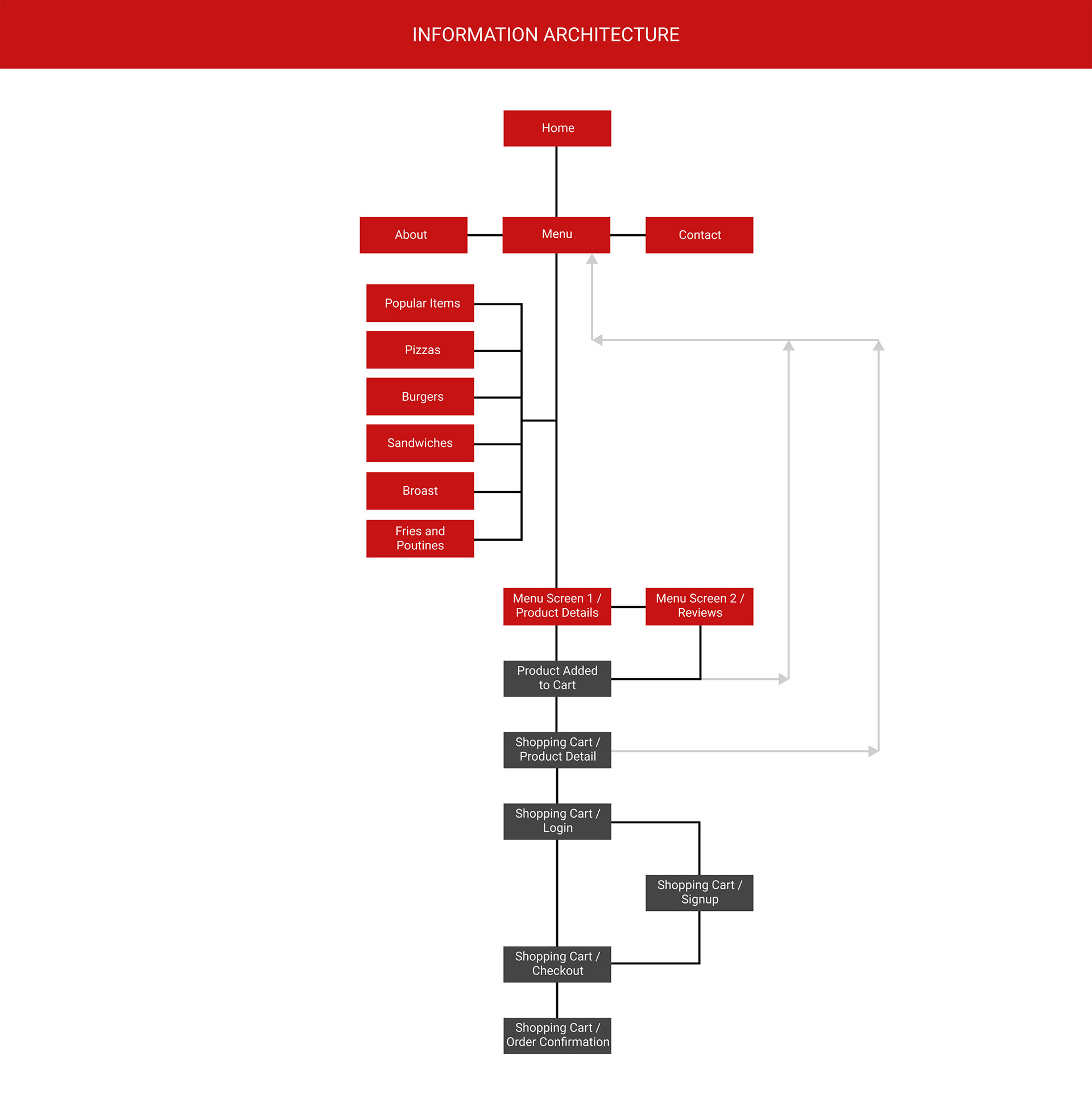
Information Architecture
The "Good Food" delivery website boasts a well-structured information architecture that enhances user navigation and accessibility. Below is an overview of the website's information architecture:
Navigation Structure:
1. Home: The website's landing page introduces "Good Food" and its offerings.
2. About: A section dedicated to sharing the story, services, and business team members.
3. Menu: The heart of the website, featuring an array of food categories and products available for order.
Contact: A page allowing users to get in touch with "Good Food" and access contact information.
Main Sections:
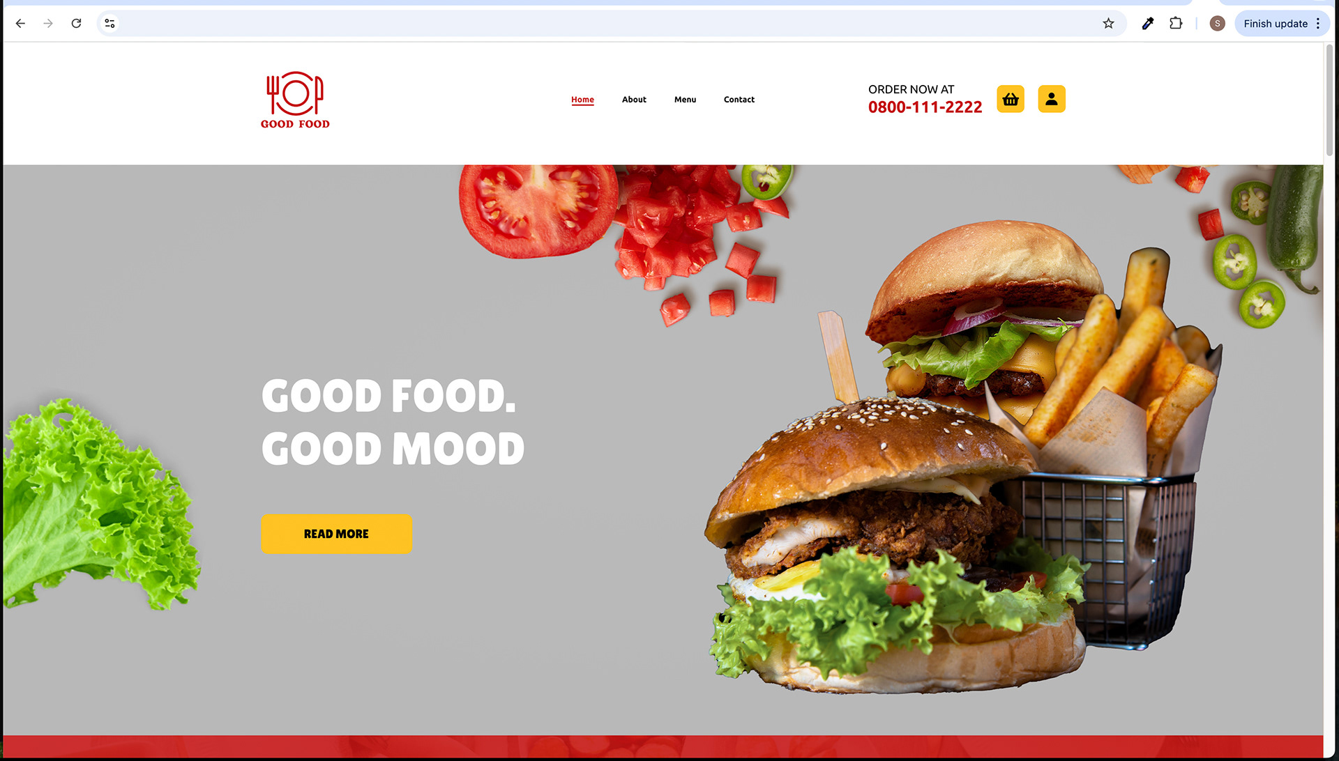
1. Home Page: The homepage serves as the initial point of entry, featuring the following key elements:
• Header with navigation menu and contact information.
• Hero image area showcasing mouthwatering dishes.
• Content area with information and popular food items.
• Footer with navigation links and social media icons.
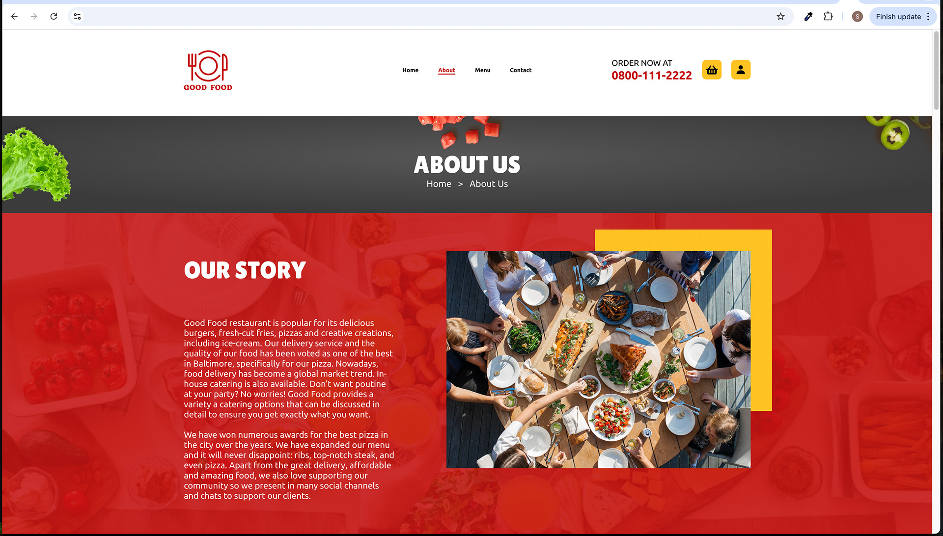
2. About Page: This section delves into "Good Food" 's backstory and services. It consists of:
• Header mirroring the site-wide navigation.
• Headline area with breadcrumbs.
• Content area presenting the company's story, services, and team members.
• Footer replicating the main site footer with additional sections for popular food items.
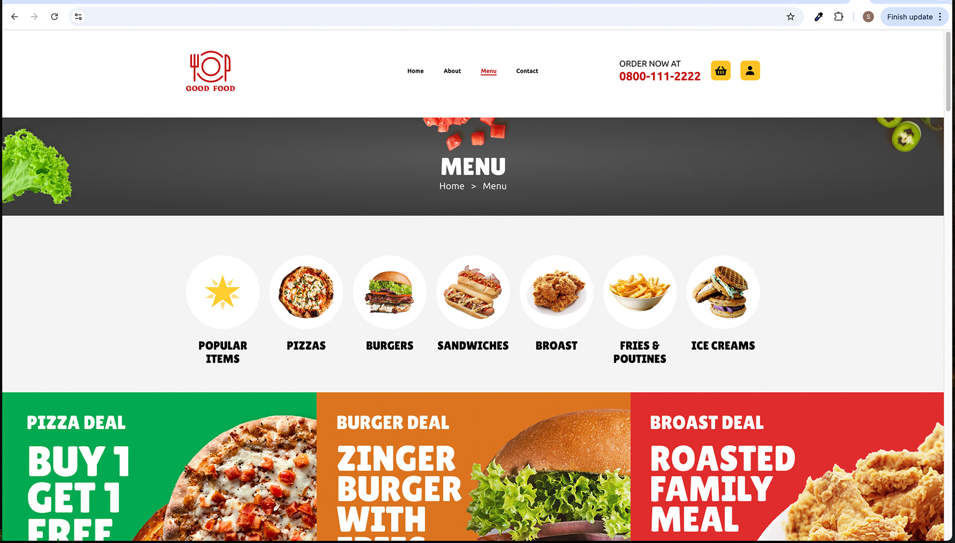
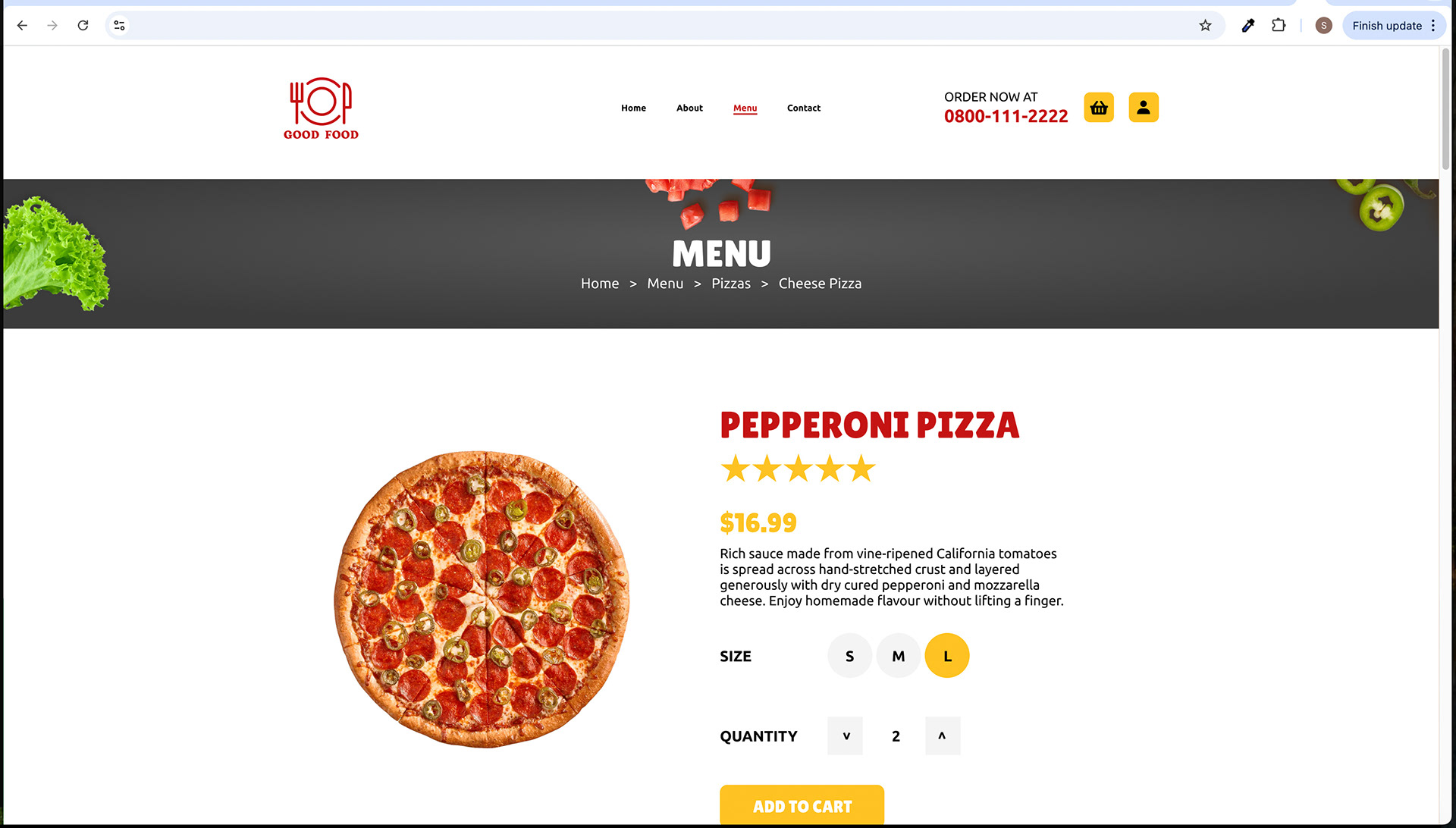
3. Menu Page: The menu section offers a comprehensive selection of food items, categorized as follows:
• Popular Items
• Pizzas
• Burgers
• Sandwiches
• Broast
• Fries & Poutines
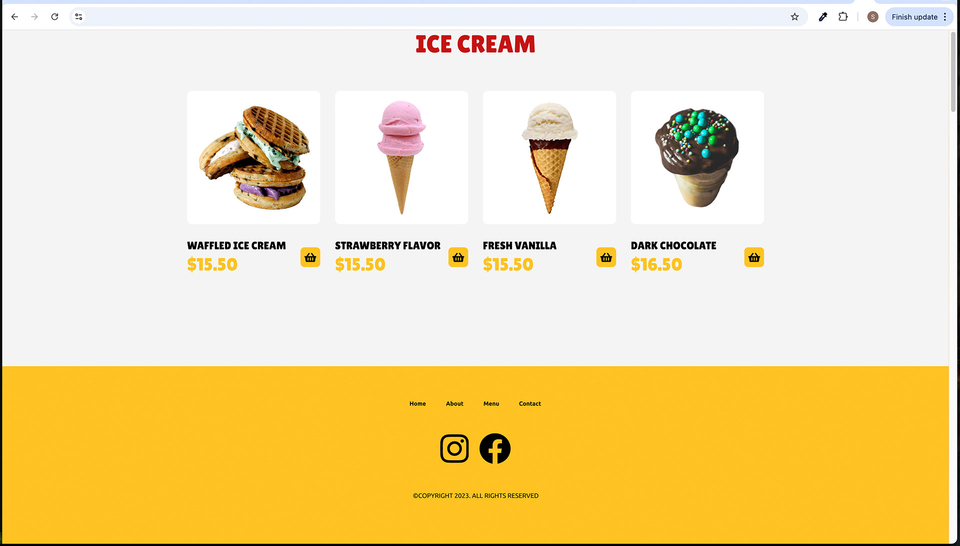
• Ice Creams
• Each category provides access to specific product details and reviews.
4. Contact Us Page: This page facilitates user inquiries and contacts with the business. It includes:
• A contact form for users to input their name, email, phone number, and message.
• Contact information is displayed in the right column.
Flow from Homepage to Order Confirmation Page:
1. Homepage: Users land on the homepage, greeted with an enticing hero image, popular food items, and a brief introduction to "Good Food." The menu and contact options are accessible through the header.
2. Menu Page: When users click on a menu category (e.g., Pizzas), they are directed to a subpage displaying the available items within that category. Users can click on specific products to access their details and reviews.
3. Product Details and Reviews: On the product details page, users can learn more about a chosen product, including its description, price, and reviews. They can add the item to their cart from this page.
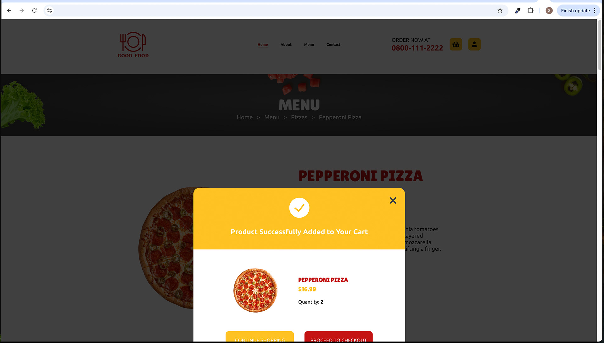
4. Add to Cart Page: After adding an item to the cart, a dialogue box confirms the addition. Users can choose to continue shopping or proceed to checkout.
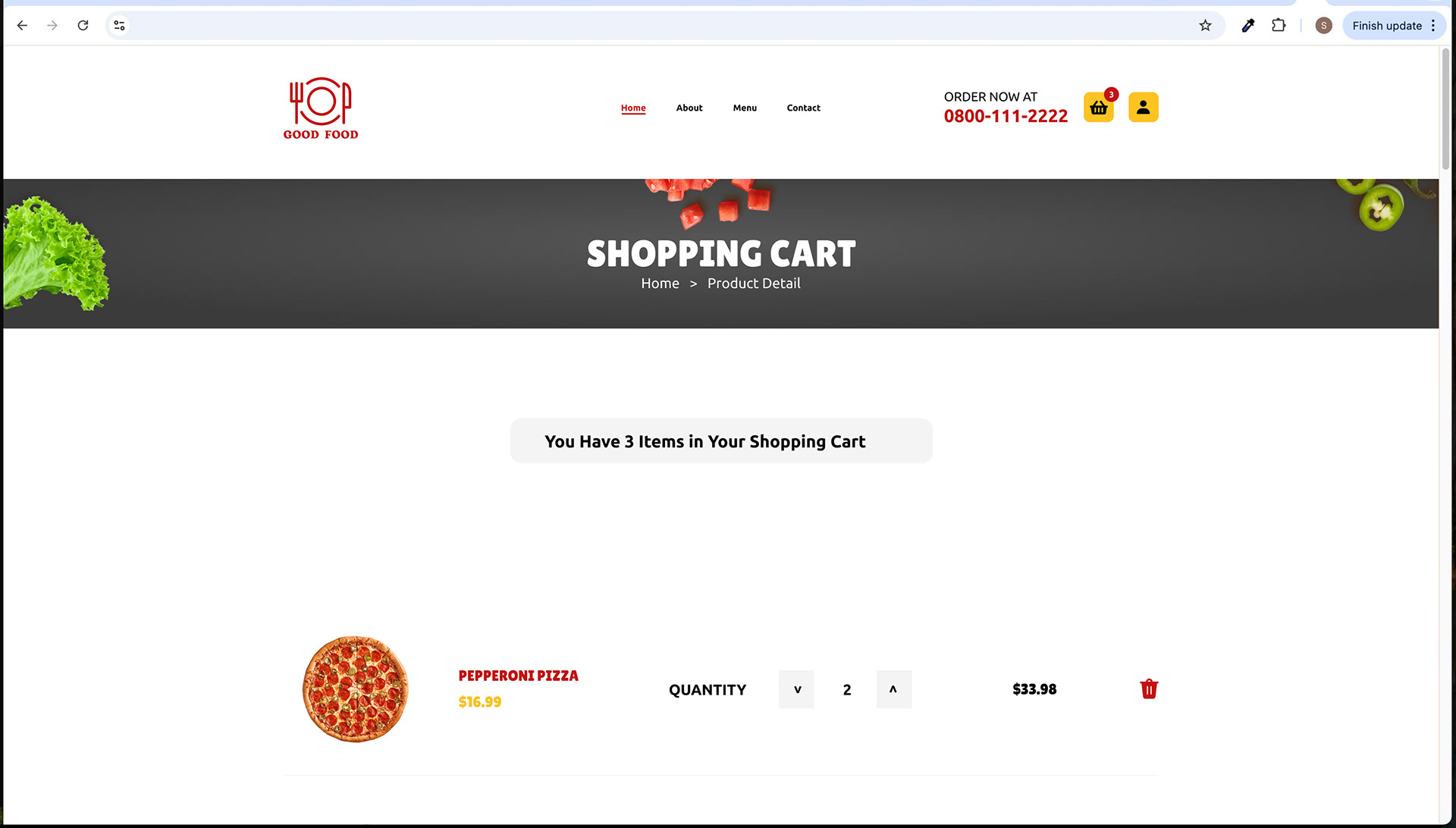
5. Shopping Cart: Clicking "Proceed to Checkout" directs users to the shopping cart page, where they can review their selected items, adjust quantities, and calculate the total cost.
6. Checkout Page: Users move to the checkout page, providing billing and delivery information. They can select their preferred payment method (Cash on Delivery or Credit Card).
7. Order Confirmation Page: Upon completing the checkout process, users are presented with an order confirmation page. It includes a summary of their order, order ID, shipping address, and a reassuring message indicating the order has been placed.
This information architecture ensures a logical and intuitive flow from the homepage to the order confirmation page, making the ordering process seamless and user-friendly for "Good Food" customers in Baltimore City, MD, USA.
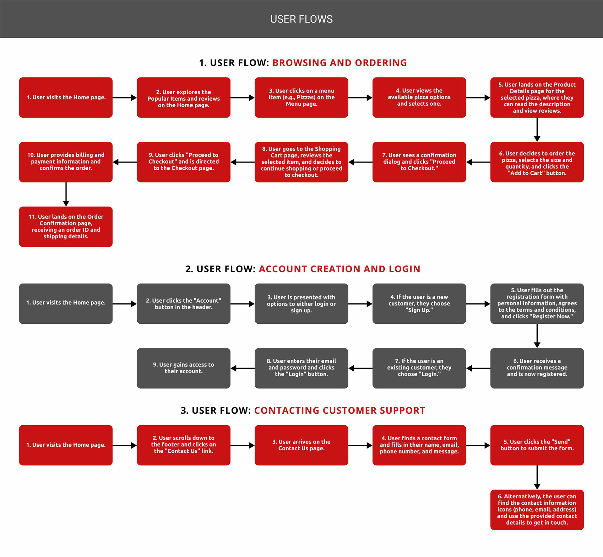
User Flows
Let's outline the user flows for the "Good Food" Delivery website:
User Flow 1: Browsing and Ordering
1. User visits the Home page.
2. User explores the Popular Items and reviews on the Home page.
3. User clicks on a menu item (e.g., Pizzas) on the Menu page.
4. User views the available pizza options and selects one.
5. User lands on the Product Details page for the selected pizza, where they can read the description and view reviews.
6. User decides to order the pizza, selects the size and quantity, and clicks the "Add to Cart" button.
7. User sees a confirmation dialog and clicks "Proceed to Checkout."
8. User goes to the Shopping Cart page, reviews the selected item, and decides to continue shopping or proceed to checkout.
9. User clicks "Proceed to Checkout" and is directed to the Checkout page.
10. User provides billing and payment information and confirms the order.
11. User lands on the Order Confirmation page, receiving an order ID and shipping details.
User Flow 2: Account Creation and Login
1. User visits the Home page.
2. User clicks the "Account" button in the header.
3. User is presented with options to either login or sign up.
4. If the user is a new customer, they choose "Sign Up."
5. User fills out the registration form with personal information, agrees to the terms and conditions, and clicks "Register Now."
6. User receives a confirmation message and is now registered.
7. If the user is an existing customer, they choose "Login."
8. User enters their email and password and clicks the "Login" button.
9. User gains access to their account.
User Flow 3: Contacting Customer Support
1. User visits the Home page.
2. User scrolls down to the footer and clicks on the "Contact Us" link.
3. User arrives on the Contact Us page.
4. User finds a contact form and fills in their name, email, phone number, and message.
5. User clicks the "Send" button to submit the form.
6. Alternatively, the user can find the contact information icons (phone, email, address) and use the provided contact details to get in touch.
These user flows encompass users' primary interactions with the "Good Food" Delivery website, from browsing and ordering to account management and contacting customer support.
Consistent navigation elements across all screens
In the "Good Food" Delivery Website redesign, consistent navigation elements are implemented across all screens to ensure a seamless and user-friendly experience. Users can easily find their way through the website with the navigation menu at the top, featuring links to the Home, About, Menu, and Contact pages. This uniform navigation structure enhances user familiarity and accessibility throughout their online food ordering journey.
Website Structure
Website Structure Overview:
The "Good Food" delivery website is meticulously organized to provide a user-friendly journey through its various sections and pages. This structure ensures a seamless experience for visitors interested in ordering burgers, pizza, snacks, and other delectable offerings. Here's an overview:
1. Home Page:
• Header with navigation menu, contact information, and user account options.
• Hero image area with an enticing tagline and CTA button.
• Content areas highlight popular food items and customer reviews.
• Footer with navigation links and social media icons.
2. About Page:
• Utilizes the same header as the homepage.
• Presents the brand's story and services and introduces the team members.
• The footer includes popular food items for easy navigation.
3. Menu Page:
• Maintains a consistent header design.
• Categories food items, including popular items, pizzas, burgers, and more.
• Allows users to explore specific food categories.
• Users can access individual product details and reviews.
4. Menu Screen 1/Product Details Page:
• Provides detailed information about a specific food item.
• Users can learn about product details, pricing, descriptions, and reviews.
5. Menu Screen 2/Reviews Page:
• Allows users to read customer reviews and ratings for a specific food item.
6. Add to Cart Page:
• Displays a confirmation dialogue when users add items to their cart.
• Offers options to continue shopping or proceed to checkout.
7. Shopping Cart/Product Detail Page:
• Shows selected items, quantities, and total costs in the shopping cart.
• Users can proceed to checkout or continue shopping.
8. Shopping Cart/Login Page:
• Provides a login form for registered users.
• Users can also log in using their Facebook or Google accounts.
9. Signup Page:
• Allows new users to create an account with personal information and preferences.
10. Checkout Page:
• Collects billing information and payment details for order processing.
• Offers payment options like Cash On Delivery and Credit Card.
11. Order Confirmation Page:
• Displays a confirmation message and order details after successful submission.
12. Contact Us Page:
• Provides a contact form for user inquiries.
• Also offers contact information, including phone numbers, email addresses, and physical addresses.
This structured flow guides users through the entire process, from exploring the menu to completing an order or contacting the "Good Food" team. The consistent design elements and straightforward navigation enhance the user experience throughout the website.
Home Page Design
The homepage of "Good Food" focuses on engaging users with a clean and inviting layout:
Header:
• Straightforward navigation menu (Home, About, Menu, Contact) in black with an active red highlight.
• Prominent contact information, including a red phone number.
• Quick access buttons for Cart and Account in yellow.
Hero Image Area:
• The background showcases appetizing images of burgers, fries, and salad on a grey backdrop.
• A white "Good food. Good mood" tagline on the left.
• A red "READ MORE" CTA button encourages further exploration.
Content Area:
• Energizing red background with semi-transparent restaurant dish images.
• Bold red headline: "Delicious and flavorful" with a welcoming "Welcome" on the left.
• Popular food items are displayed in two rows with titles, prices, and cart buttons.
• A banner highlights featured products (pizza, burger, broast) with prices.
• User reviews with avatars, review text, and a 5-star rating system.
Footer:
• Yellow footer with black navigation links (Home, About, Menu, Contact).
• Icons for Instagram and Facebook.
• Copyright information: "©COPYRIGHT 2023. ALL RIGHTS RESERVED."
The homepage's design blends visual appeal with clear navigation and enticing calls to action for a delightful user experience.
About Page Design
The "About" page of the "Good Food" delivery website is thoughtfully crafted to give users insights into the brand, its services, and the team behind it. Here's a detailed description of its layout and content:
Layout:
• Header: The header of the About page mirrors the consistent site-wide header, featuring navigation menu options and contact information.
• Headline Area: This section has a #3B3B3B dark grey background. It prominently displays the headline "ABOUT US" and includes breadcrumbs, allowing users to track their location on the site.
• Content Area: The content area of the About page is set against a red (#C51313) background, creating a dynamic contrast with the headline area. Here, users find essential information about the brand:
Content:
• Company Story: The About page presents the engaging "Good Food" narrative through a compelling image and text. The story highlights the brand's journey, values, and commitment to quality food.
• Services: A section within the content area focuses on the services provided by "Good Food." It employs three large white icons outlined with red lines to emphasize quality food, original recipes, and outstanding customer service.
• Team Members: Another prominent element of the About page is the "MEET OUR TEAM" section. This part of the page features four team members, each accompanied by a photo, their name, and their role within the organization.
Footer:
The footer of the About page maintains consistency with the primary site footer design. It includes sections for popular food items, ensuring seamless navigation back to the menu.
The "About" page effectively combines a visually appealing layout with engaging content to introduce users to the brand's story, emphasize its services, and provide a glimpse into the dedicated team members. This page plays a crucial role in building trust and connection with visitors, fostering a positive image of "Good Food" in the eyes of its audience.
Menu Page Design
The "Menu" page of the "Good Food" delivery website is designed to make it easy for users to explore and select their desired food items. Here's an explanation of its design, including food item categorization and the user journey:
Categorization of Food Items:
• Header: The header of the Menu page replicates the site-wide header, providing consistent navigation options and contact details.
• Headline Area: Similar to other pages, it includes a headline with breadcrumbs, guiding users through the site's structure.
• Content Area: This is where the primary menu content is displayed. The content area has a light grey background (#F4F4F4) and circular elements that categorize the food items, providing a visually appealing presentation. The menu categories include:
• Popular Items
• Pizzas
• Burgers
• Sandwiches
• Broast
• Fries & Poutines
• Ice Creams
Presentation of Popular Items:
• Popular Items: The "Popular Items" section is highlighted with a red (#C51313) headline at the top of the content area. It features two rows and three columns of popular food items, each presented with a title, price, and a cart button. This section aims to capture users' attention with enticing options right away.
User Journey to Product Details and Reviews:
• Food Categories: Users can click on any food category (e.g., Pizzas, Burgers) to explore a specific type of food. Clicking a variety takes them to a subpage displaying the available items within that category.
• Product Details: Upon clicking a specific food item, users are directed to a product details page. This page provides comprehensive information about the selected item, including its title, price, description, rating stars, size options, quantity selection, and an "ADD TO CART" button. The "PRODUCT DETAIL" tab is active, allowing users to access a more extensive description.
• Reviews: Users who wish to read reviews before deciding can navigate to the "REVIEWS" tab on the identical product details page. This tab provides additional insights into the product's quality and customer satisfaction.
Overall, the Menu page's design is structured to make it simple for users to explore different food categories, view popular items, and access detailed information about individual products. The presentation is visually appealing and user-friendly, ensuring a seamless experience for those looking to order on the "Good Food" website.
Product Details Page
The "Product Details" page on the "Good Food" website offers a comprehensive view of individual food items:
• Layout: The page features a clean, organized layout with a white background for clarity.
• Product Information: Users can find essential details about the chosen product, including its title (in red), price, description, rating stars, size options, quantity selection, and an "ADD TO CART" button in white on a yellow background.
• Additional Information: A red tab labelled "PRODUCT DETAIL" is active, allowing users to access more extensive information about the product if needed.
The Product Details page aims to provide users with all the necessary information to make informed choices about the items they want to order.
Reviews Page
The "Reviews" page on the "Good Food" website allows users to access valuable feedback and ratings from other customers:
• Layout: Similar to the Product Details page, this page maintains a white background for clarity.
• Product Information: Users encounter the exact product details on the Product Details page, including the title, price, description, rating, size options, and quantity selection.
• Reviews Tab: The "REVIEWS" tab is active on this page, enabling users to click and access customer reviews and feedback.
These separate pages work together to ensure that users can access essential product details and genuine customer reviews, enhancing their confidence and satisfaction while making food choices on the "Good Food" website.
Add to Cart Page
The "Add to Cart" page on the "Good Food" website incorporates a straightforward and visually distinct design:
• Dialogue Box: When users click the "ADD TO CART" button for a product, a small dialogue box appears on the screen. This dialogue box features a clear separation between its top and bottom sections:
• Top Section: Yellow background.
• Close the button (to dismiss the dialogue).
• Bottom Section: White background.
• Text notification: "Product Successfully Added to Your Cart" in black text.0
• Buttons:
• "CONTINUE SHOPPING" button: Yellow.
• "PROCEED TO CHECKOUT" button: Red.
This design ensures that the notification is easily noticeable against the white background, and users can choose to continue shopping or proceed to checkout based on their preferences, maintaining a user-friendly and visually appealing cart management experience.
Login Page
The "Login" page on the "Good Food" website is designed for simplicity and ease of use:
• Layout: The page utilizes a white background to maintain a clean and straightforward interface.
• Header: Consistent with the site-wide header, it includes navigation options and contact details.
• Headline Area: Displays the same headline and breadcrumbs as other pages, ensuring uniformity and easy navigation.
• Content Area: On the white background, users encounter the following elements:
• A red headline: "LOGIN TO YOUR ACCOUNT."
• A login form with fields for Email Address and Password.
• A "Forgot Your Password?" option for password recovery.
• A prominent red "LOGIN" button for submitting login credentials.
• Convenient options for social login, featuring "LOGIN WITH FACEBOOK" (in Facebook blue colour) and "LOGIN WITH GOOGLE" (in Google colour).
• A text link encouraging new users to register.
User Registration Process:
1. Users visit the "Login" page.
2. Existing users enter their Email Address and Password.
3. They can choose to recover their password if needed.
4. Users click the red "LOGIN" button to log in.
5. New users can also opt for social login with Facebook or Google.
6. New users who do not have an account can follow the link to the "Signup" page.
The login page prioritizes user-friendliness and accessibility, accommodating existing and new users with traditional registration and social login options on the "Good Food" website.
Signup Page
The "Signup" page on the "Good Food" website streamlines the user registration process:
• Layout: Similar to the Login page, it maintains a white background for clarity.
• Header: Consistent with the site-wide header, it includes navigation options and contact details.
• Headline Area: Displays the same headline and breadcrumbs as other pages.
• Content Area: On this page, users find the following components:
• A red headline: "ACCOUNT REGISTRATION."
• A registration form with fields for First Name, Last Name, Email, Password, and Re-Enter Password.
• Two grey checkboxes: "Receive Offers From Good Food" and "I Agree To The Terms And Conditions And The Privacy Policy."
• A prominent red "REGISTER NOW" button to complete the registration process.
User Registration Process:
1. New users visit the "Signup" page.
2. They complete the registration form by providing their First Name, Last Name, Email, and Password.
3. Users can choose to receive offers and agree to terms and conditions.
4. They click the red "REGISTER NOW" button to create an account.
The signup page prioritizes user-friendliness and accessibility, accommodating existing and new users with traditional registration and social login options on the "Good Food" website.
Checkout Page Design
The "Checkout" page on the "Good Food" website is meticulously designed to facilitate a smooth and secure transaction process:
• Layout: The page maintains a white background for clarity and a structured layout to ensure users can easily complete their orders.
• Header: Consistent with the site-wide header, it includes navigation options and contact details.
• Headline Area: Displays the same headline and breadcrumbs as other pages, offering a familiar and intuitive user experience.
• Content Area:
• Left Column - Billing Address:
• A red title: "BILLING ADDRESS."
• Form fields for users to input their First Name, Last Name, Street Address, Email, Phone, and an optional Order Note.
• Right Column - Order Summary:
• A red title: "ORDER SUMMARY."
• A list of selected products in the cart, each with its title, price, quantity, and total price.
• Subtotal and shipping cost calculations.
• Total price, ensuring transparency for users.
• Payment Method:
• A red headline: "PAYMENT METHOD."
• Two radio buttons for users to select their preferred payment method:
• "Cash On Delivery"
• "Credit Card" (active).
• Images of different credit cards for visual identification.
• Fields to enter Card Number, Security Code, and Expiration Date.
• Terms and Conditions:
• A checkbox: "By Clicking the Button, You Agree To The Terms And Conditions."
• Buttons:
• A red "REGISTER NOW" button to complete the order.
The checkout page's layout ensures users can efficiently input their billing information, choose their preferred payment method, and agree to the terms and conditions before finalizing their order. It provides a clear and secure environment for the transaction process on the "Good Food" website.
Order Confirmation Page Design
The "Order Confirmation" page on the "Good Food" website is thoughtfully designed to provide users with a reassuring and informative post-purchase experience:
• Layout: The page features a white background, ensuring clarity and readability of the content.
• Header: Consistent with the site-wide header, it includes navigation options and contact details.
• Headline Area: Displays the same headline and breadcrumbs as other pages, maintaining a seamless user journey.
• Content Area:
• A circular checkmark icon in action green colour indicates successful order placement.
• A bold black text: "YOUR ORDER IS PLACED" in Lilita One font, ensuring visibility and emphasis.
• A regular text message: "Hi John Brown," personalizing the confirmation.
• Additional regular text: "We have received your order. We will send you an email and SMS when your order is dispatched to your address."
• Two yellow areas with text information:
• On the left: "Your order ID: 678543675 Order Placed on 11-04-2023 at 03:15 pm."
• On the right: "Shipping address 313 W Madison St, Baltimore, MD 21201, United States."
The Order Confirmation page is designed to provide users with immediate feedback on their order status and delivery details, ensuring a positive and reassuring post-purchase experience on the "Good Food" website.
Contact Us Page Design
The "Contact Us" page on the "Good Food" website is designed to facilitate user communication with the business while maintaining a clean and organized layout:
• Layout: The page utilizes a white background for clarity and simplicity.
• Header: Consistent with the site-wide header, it includes navigation options and contact details for quick access.
• Headline Area: Displays the same headline and breadcrumbs as other pages, ensuring a cohesive user experience.
• Content Area:
• Left Column - Contact Form:
• A red headline: "CONTACT FORM."
• A user-friendly contact form, including fields for:
• Name*
• Email*
• Phone No*
• Message*
• A red "SEND" button for submitting inquiries.
• Right Column - Contact Information:
• Three white icons enclosed in red rounded rectangles:
• Phone, Email, Address
User Testing Process
The User Testing Process for the "Good Food" Delivery Website involved several key steps to ensure the website's usability and effectiveness. First, a representative group of users, including our personas Emily, Alex, Sarah, and John, were recruited. Participants were asked to perform various tasks, such as selecting food items, customizing orders, and completing the checkout process, while providing real-time feedback. Observations, user feedback, and task success rates were meticulously recorded and analyzed to identify pain points and areas for improvement. This valuable data guided iterative design enhancements to address user concerns and improve the overall user experience, resulting in a more user-centric and effective website.
POP Testing
1. Sketch Creation:
• Initial screen layouts and functionalities were sketched on paper.
2. Interactive Elements Identification:
• Interactive elements like buttons and links were marked on the paper sketches to define user interaction points.
3. Digital Transition:
• Paper sketches were converted into a digital format using Figma for design refinement.
4. Defining Interactions:
• Interactive hotspots were added to the digital screens using Marvel's POP feature to replicate user interactions.
5. User Testing:
• Users engaged with the interactive prototype, completing specific tasks while their interactions were observed.
6. Collecting Feedback:
• User feedback was gathered as they interacted with the prototype, focusing on identifying potential pain points.
7. Refinement and Iteration:
• Refinements to the digital screens were made based on user feedback and suggestions.
8. Iterative Testing:0
• Multiple rounds of iterative testing with updated screens ensured ongoing improvement of the design.
This approach allowed us to create a dynamic and user-friendly prototype for the "Good Food" Delivery Website, with a focus on user interactions and feedback throughout the design process.
Iteration on the designs based on user feedback and usability testing
Iterating on the designs based on user feedback and usability testing is an essential phase in optimizing the "Good Food" Delivery Website. After conducting usability tests, we observed users navigating the website and gathered specific feedback. This feedback informed various design refinements, such as streamlining the checkout process to reduce steps, clarifying product descriptions, and implementing a more intuitive navigation structure to minimize complexity. By iteratively addressing these specific pain points identified through user testing, we aimed to create an even more user-friendly website that meets the needs and expectations of our diverse user personas.
Visual Design Elements & Branding
Typography
The "Good Food" website utilizes a well-considered combination of fonts to enhance readability and aesthetics:
Lilita One:
• H1: 67 px
• H2: 50 px
• H3: 36 px
• H4: 24 px
• H5: 22 px
• Button text: 18 px
Ubuntu:
• H6: Bold, 24 px
• H7: Bold, 21 px
• H8: Bold, 20 px
• Breadcrumb Nav: Regular, 19 px
• Comment: Regular, 19 px
• Regular Text: Regular, 18 px
• Comment: Regular, 17 px
• Comment (Mixed): Regular, Bold, 17 px
• Copyright text: Regular, 13 px
• Main Menu: Bold, 12 px
• Button text: Bold, 20 px
• Form text: Regular, 16 px
Logo Design
The "Good Food" logo combines a wordmark and a symbol, creating a visually appealing and recognizable brand identity:
Wordmark (Good Food):
• Design: Symmetrical and balanced.
• Font: Utilizes the "Rundeck" font.
• Color: Red (#C51313) for the wordmark.
Symbol (Plate, Knife, and Fork):
• Design: Also symmetrical and balanced.
• Outline: Red (#C51313), maintaining uniformity with the wordmark.
The logo's aesthetically pleasing design represents the website's focus on delivering high-quality food. Combining the wordmark and symbol creates a memorable and professional brand identity for "Good Food."
Color Palette
The colour scheme used for the "Good Food" website is thoughtfully chosen to evoke specific emotions and enhance the user experience. Here's an explanation of the colour palette and its significance:
Yellow (#FFC222):
• Significance: Yellow is associated with warmth, friendliness, and positivity. It often stimulates happiness and optimism, creating a welcoming atmosphere for website visitors.
• Application: Yellow is prominently used for buttons, highlights, and essential call-to-action elements throughout the website, ensuring that users can quickly identify and interact with key features.
Red (#C51313):
• Significance: Red is a bold, attention-grabbing colour that symbolizes passion, excitement, and urgency. It can stimulate appetite and convey the idea of delicious food.
• Application: Red is used for various essential elements, including the wordmark in the logo, headlines, active menu items, and specific vital buttons. It draws users' attention to critical information and creates a sense of urgency when needed.
Black (#000000):
• Significance: Black signifies sophistication, elegance, and formality. It strongly contrasts against lighter backgrounds, enhancing readability and visual hierarchy.
• Application: Black is used for text, icons, and various UI elements, ensuring information is easily readable and well-organized.
Light Grey (#F4F4F4) and White (#FFFFFF):
• Significance: Light grey and white create a clean, minimalistic backdrop, promoting clarity and simplicity. They evoke feelings of cleanliness and purity.
• Application: These colours are used for backgrounds, ensuring that content stands out clearly and that users can easily navigate the website. Light grey is also used for certain text elements.
Grey (#B8B8B8) and Dark Grey (#3B3B3B):
• Significance: Grey tones add depth and contrast to the design. Dark grey can convey a sense of professionalism and stability, while lighter grey provides a neutral background.
• Application: Grey tones are used for background elements, navigation, and subtle visual accents, ensuring the website's design remains visually balanced.
The colour palette of "Good Food" combines warm and inviting hues like yellow and red with neutrals like black, grey, and white to create an engaging and user-friendly interface. It complements the brand's identity and enhances the overall user experience by guiding users' attention and conveying the website's theme of delicious food delivery.
Visuals and Screenshots
Visuals and screenshots in the "Good Food" Delivery Website Case Study represent the design elements and layout of the website visually. They are strategically placed to illustrate critical pages and elements, including the header, hero image area, content area, footer, buttons, navigation menu, and contact information.
These visuals also showcase the colour palette (yellow, red, black, grey, white) and font choices (Lilita One and Ubuntu) used on the website. Additionally, they highlight mobile responsiveness, user interface elements (CTAs, forms, icons), the checkout process, and contact information.
In summary, visuals and screenshots enhance the case study by providing a visual context for the discussed design elements, improving reader comprehension.
Prototype
The Figma demo was implemented.
The implementation of the Figma demo in the design and development process of the "Good Food" Delivery Website was a comprehensive and dynamic step in crafting an exceptional user experience. This digital prototype was instrumental in visualizing the website's interface and interactivity. Notably, the Figma demo incorporated animation effects, such as smooth transitions between screens and interactive elements, adding a layer of engagement and realism to the user testing process. These animations aimed to simulate real-world interactions, allowing users to navigate the website as if it were a live application.
During the user testing phase, participants interacted with the Figma demo, performing specific tasks and scenarios. This hands-on approach provided invaluable insights into the user experience, enabling us to identify pain points, usability issues, and areas for improvement. Users' feedback played a pivotal role in the iterative design process, guiding refinements to the website's layout, content presentation, and interactive elements.
The iterative nature of testing and design adjustments ensured that the Figma demo evolved to meet the evolving needs and preferences of the users. User feedback was instrumental in enhancing the overall usability, functionality, and aesthetics of the "Good Food" website, resulting in a more user-centric and visually appealing final product. This implementation process, with a focus on animation effects and iterative improvements, was key to achieving the goal of providing a seamless and engaging experience for users.
Wireframes
Wireframes and Navigation Elements
In the "Good Food" Delivery Website project, the creation of wireframes and the integration of navigation elements were essential stages in shaping the site's overall structure and user experience. Wireframes provided a visual blueprint of the website's layout, highlighting key components and content placement.
The wireframes incorporated consistent navigation elements across all screens, ensuring a uniform and intuitive user journey. These elements included a persistent header with menu links, a shopping cart icon, and account access options. Footer navigation with links to essential pages like Home, About, Menu, and Contact enhanced user-friendliness.
Furthermore, wireframes identified content sections and information architecture, such as product categories (Pizzas, Burgers, etc.), product details, reviews, and the checkout process. The wireframes facilitated the arrangement of interactive features, like buttons for adding to the cart, proceeding to checkout, and viewing order history.
The navigation elements, including menu links and icons, were strategically positioned for easy access, enabling users to explore the website seamlessly. Overall, wireframes and navigation elements served as foundational components in the development of a well-structured and user-friendly "Good Food" website, ensuring a coherent and intuitive user experience.
Artboards
App screens
The "Good Food" Delivery Website features a range of app screens designed to provide an engaging and seamless user experience. These screens are thoughtfully crafted to cater to various user interactions and needs, ensuring the smooth navigation of the website. Some of the key app screens include:
1. Home Screen: The Home Screen sets the first impression with a clean layout and a visually appealing hero image showcasing burgers, fries, and other food items. It features a prominent navigation menu, a call-to-action button, and popular food items with pricing. This screen aims to capture users' attention and encourage exploration.
2. Menu Screen: The Menu Screen is structured for easy food selection. Users can navigate through categories like Pizzas, Burgers, and more. Each food item is presented with a title, price, and an "Add to Cart" button, simplifying the ordering process.
3. Product Details Screen: The Product Details Screen provides users with in-depth information about their chosen food item. Users can view the title, price, detailed product description, user reviews, size options, quantity selection, and an "Add to Cart" button. This screen is crucial for informed decision-making.
4. Reviews Screen: The Reviews Screen allows users to explore feedback from other customers, helping them make confident choices. Users can read reviews, view star ratings, and access product details for an enriched decision-making process.
5. Cart and Checkout Screens: The Cart and Checkout Screens ensure a smooth transaction process. Users can review the products in their cart, adjust quantities, see the total price, and proceed to checkout. These screens maintain simplicity and clarity in the ordering process.
6. Login and Signup Screens: The Login and Signup Screens offer secure access to user accounts and allow new users to register. They include forms for entering email, password, and personal details, ensuring a streamlined user account management process.
7. Order Confirmation Screen: The Order Confirmation Screen provides a reassuring summary of the placed order, including order ID, date, shipping details, and a checkmark icon indicating a successful order. This screen assures users that their order has been processed.
8. Contact Us Screen: The Contact Us Screen enables users to reach out for support and inquiries. It features a contact form and displays essential contact information like phone numbers, email addresses, and the physical address.
These app screens are meticulously designed to align with user needs, offering a cohesive and user-friendly experience throughout the "Good Food" Delivery Website. The screens' simplicity, clear navigation, and well-organized content are intended to enhance user satisfaction and encourage seamless interactions.
Conclusion
Learning Outcome
The "Good Food" Delivery Website project has offered valuable learning outcomes throughout its design and development process. Some key takeaways include:
1. User-centred Design: The project reinforced the importance of focusing on the needs and preferences of the end-users. By conducting user interviews and creating user personas, we gained insights that informed the design decisions, ensuring a user-centred approach.
2. Information Architecture: Understanding the significance of a well-structured information architecture became evident. The clear navigation elements, concise menus, and straightforward ordering process contribute to a more intuitive and enjoyable user experience.
3. Iterative Design: The iterative design process was a crucial learning point. Gathering user feedback, making refinements, and conducting usability testing in multiple rounds allowed us to continually improve the website's design and functionality.
4. Usability Testing: We recognized the value of usability testing as an essential tool for assessing the website's user-friendliness. It provided actionable insights into user interactions and pain points, which led to enhancements in the design.
5. Wireframing and Prototyping: The use of wireframes and digital prototypes through Figma enabled us to visualize the website's layout and functionality effectively. These tools were pivotal in conveying design concepts and gathering user feedback.
6. Animation Effects: The inclusion of animation effects, like smooth transitions between screens and interactive elements, proved to enhance the overall user experience. It added a layer of engagement and sophistication to the website.
7. Feedback Incorporation: Learning to listen and adapt based on user feedback was a fundamental aspect of the project. Every piece of feedback contributed to refining the website and making it more user-friendly.
8. Consistent Design Elements: We recognized the significance of maintaining consistency in design elements, such as colour schemes, typography, and navigation structures, to create a unified and professional appearance.
9. Problem-Solving: The project involved identifying and addressing various challenges, including complex website navigation, ambiguous product descriptions, and lengthy checkout processes. These challenges served as opportunities for creative problem-solving.
10. Collaboration: Effective collaboration within the project team was essential to its success. The synergy of different skill sets and expertise resulted in a comprehensive and well-rounded final product.
These learning outcomes have not only contributed to the development of the "Good Food" Delivery Website but also equipped the team with valuable design and user experience principles that can be applied to future projects. The focus remains on delivering user-centric, well-structured, and visually appealing websites that provide exceptional experiences for visitors.
Key Takeaways
1. User-Centric Approach: Placing the user's needs and preferences at the forefront of the design process was fundamental in creating an intuitive and engaging website.
2. Collaborative Teamwork: Effective collaboration among designers, developers, and stakeholders fostered a smoother project workflow and more successful outcomes.
3. Usability Testing Impact: Conducting usability testing yielded invaluable insights into user behavior and pain points, driving continuous improvements.
4. Iterative Design Philosophy: Embracing iterative design allowed for ongoing enhancements and ensured the final product was refined to meet user expectations.
5. Interactive Elements: The strategic use of animations and interactive features significantly elevated the website's visual appeal and overall user experience.
6. Structured Information Flow: A well-organized information architecture contributed to easier navigation and smoother user journeys within the website.
7. User Persona Integration: Crafting and referencing user personas served as a compass for tailoring the website to the specific needs and desires of the target audience.
8. Prototyping for Feedback: Prototyping played a pivotal role in collecting early feedback, enabling data-driven design decisions and a more user-centric end product.
Results and Impact
1. Increased Conversion Rates: The prominent and clear calls to action (CTAs) throughout the website, such as "ORDER NOW," could have led to higher conversion rates. Data analytics might show increased completed orders compared to the previous design.
2. Reduced Cart Abandonment: The user-friendly and transparent checkout process and the detailed order summary might have decreased cart abandonment rates. User feedback and analytics data could reveal a decline in users abandoning their carts during checkout.
3. Improved User Satisfaction: A well-structured information architecture, intuitive navigation, and an aesthetically pleasing design can enhance overall user satisfaction. User feedback or surveys might reveal positive sentiments regarding the website's ease of use and design.
4. Enhanced Mobile Experience: The website's mobile responsiveness could have improved engagement from users accessing the site on smartphones and tablets. Metrics might show increased mobile traffic and longer mobile session durations.
5. Better Accessibility: Ensuring compliance with accessibility standards could lead to a more inclusive user base and potentially positive feedback from users with disabilities who appreciate the website's accessibility features.
6. Brand Recognition: The consistent use of the brand's colours and logo design could improve brand recognition and recall. This might be reflected in user surveys or feedback mentioning the website's visual identity.
To accurately assess the impact of the design on user engagement and conversions, it's advisable to conduct A/B testing, analyze website analytics data, and gather user feedback over time. This data can provide valuable insights into the specific outcomes and improvements resulting from the design changes to the "Good Food" website.
Conclusion
In this case study, the design of the "Good Food" delivery website for burgers, pizza, and snacks in Baltimore City, MD, USA, was explored in detail. Here are the key takeaways:
1. Project Overview: The "Good Food" website aims to provide an online platform for ordering various food items, including pizzas, burgers, sandwiches, breast, fries, poutines, and ice cream. Its target audience is residents of Baltimore City, MD, USA.
2. Information Architecture: The website is structured with straightforward navigation, including sections like Home, About, Menu, and Contact. Subpages guide users through product details, reviews, cart management, and checkout.
3. Website Structure: Each page, from the Home page to the Order Confirmation page, has a consistent layout with a header, hero image area, content area, and footer. A specific colour scheme and font choices (Lilita One and Ubuntu) maintain visual consistency.
4. Mobile Responsiveness: The website is designed to be responsive and accessible on various devices, ensuring a seamless experience for users on smartphones and tablets.
5. User Experience (UX) Considerations: The design prioritizes easy navigation, clear calls to action, and a logical flow through the website. Visual hierarchy, contrasting colours, and accessibility considerations enhance the user experience.
6. Results and Impact: While specific data or user feedback is not available, the design changes made to the website are expected to positively impact user engagement, conversions, and overall user satisfaction.
7. Conclusion: The "Good Food" website's design successfully addresses its goals of providing a user-friendly platform for food delivery in Baltimore City. It incorporates intuitive navigation, clear design elements, and mobile responsiveness, contributing to a positive user experience and potentially improved business outcomes. Ongoing monitoring and data analysis will be essential to assess the full impact of the design on user engagement and conversions.